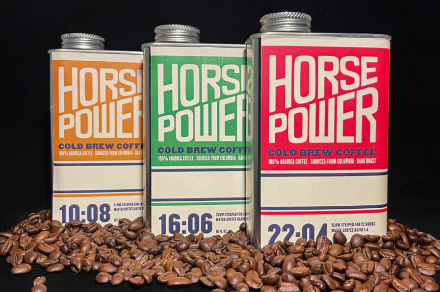
Vasavi Bubna’s Gold-winning project, “Horsepower Cold Brew Coffee,” revs up the caffeine world with a nod to vintage motor oil cans. In her typography class at the School of Visual Arts, Vasavi embraced creative constraints and brewed up a bold, metaphorical design that imagines coffee as the fuel that powers people through their day—and night. Inspired by hand-drawn typography from retro gas stations and auto shops, she crafted a concept where roast ratios mirror the technical specs of motor oil. Her work brings energy and creativity to life with packaging that’s just as strong as the coffee envisioned inside.
By: Vasavi Bubna, Former Student, SVA, & Associate Designer, COLLINS
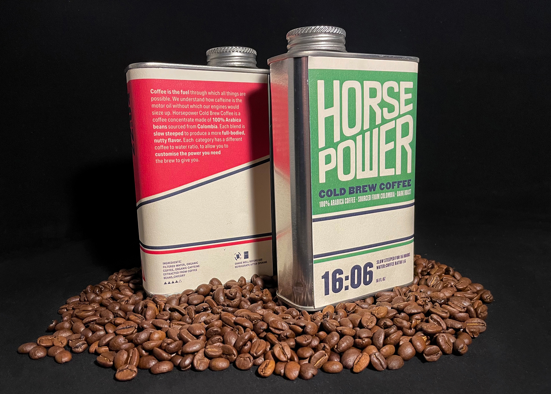
Just like a car’s engine would seize up without motor oil, many people cannot make it through the day without their caffeine fix. Coffee, for many, feels like “pouring fuel into the engine.” Inspired by vintage motor oil cans, “Horsepower Cold Brew Coffee” depicts coffee as a fuel for humans.
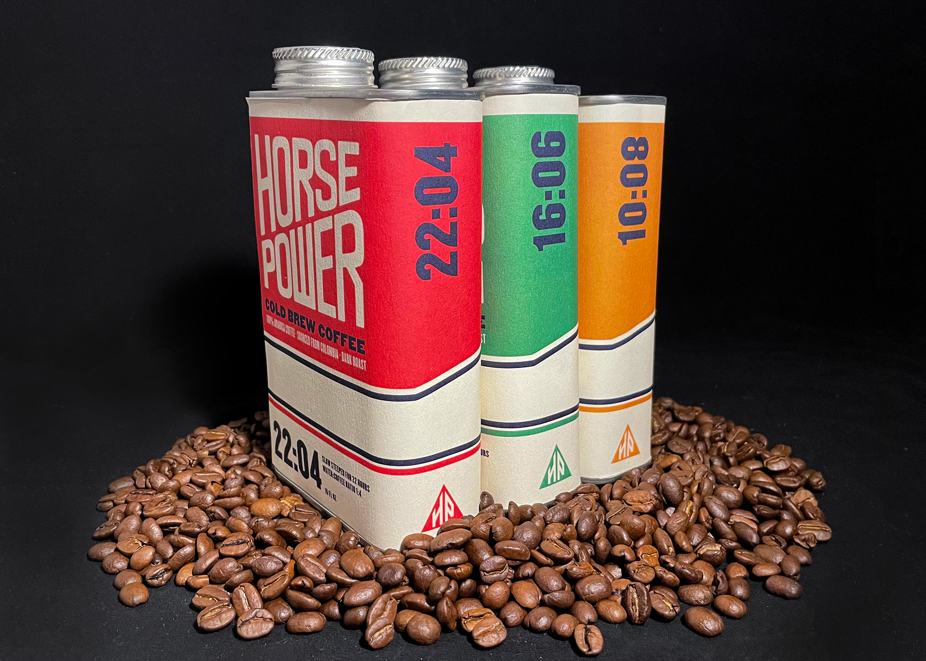
Like every exciting project, this one started with extraordinary creative constraints. In my typography class with Professor Justin Colt at the School of Visual Arts, we had to pick out one chit each out of two hats. One chit described a broad packaging category, and the other had a random word or phrase on which we had to base our concept. I picked “beverages” and “light and dark.” I started out by narrowing down on a specific beverage. I wanted to design packaging for a beverage that I enjoy drinking, and so, in the days of very little sleep and an unhealthy amount of caffeine, my choice came down to coffee or energy drinks. I chose coffee because I found an interesting angle to tie it to “light and dark,” interpreting that as day and night. While coffee is an AM beverage for most, for students like me pulling consecutive all-nighters, it is a crucial PM drink too—in fact, it was my fuel. This realization made the cogs in my head turn, making me equate coffee to gasoline, which keeps automotives going.
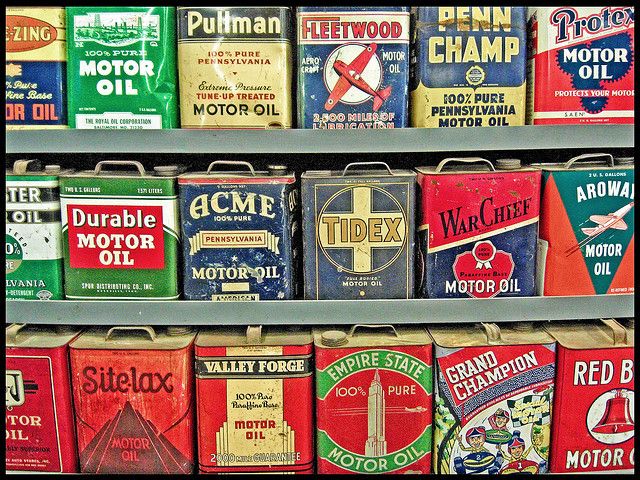
I have always been a massive nerd for vintage hand-drawn typography, especially in packaging. The idea of gasoline drew me to vintage motor oil tins and their stunning lettering. I scoured through the school library and the internet to create a collection of motor oil packaging that I found compelling. As someone with no driver’s license and no knowledge about cars, my next step was understanding what all the words and numbers on these packs meant and how I could relate them to coffee. I learned all about operational viscosity and the ratio of gas to oil. I also pulled visuals of autobody shops, gas stations, and gas receipts, which I could riff off. Research is probably the most essential part of the creative process for me, as it helps me immerse myself in the category’s world and accurately represent it.
I quickly knew I wanted to package the coffee in tin cans, and thus decided to make it cold brew, which is usually sold in larger quantities in liquid form. The name “Horsepower” came from the world of cars, too—a measurement used to calculate an engine’s power. In physics, though, the word refers to the rate at which work is done, which made me think of how I work much quicker while sipping a giant mug of coffee.
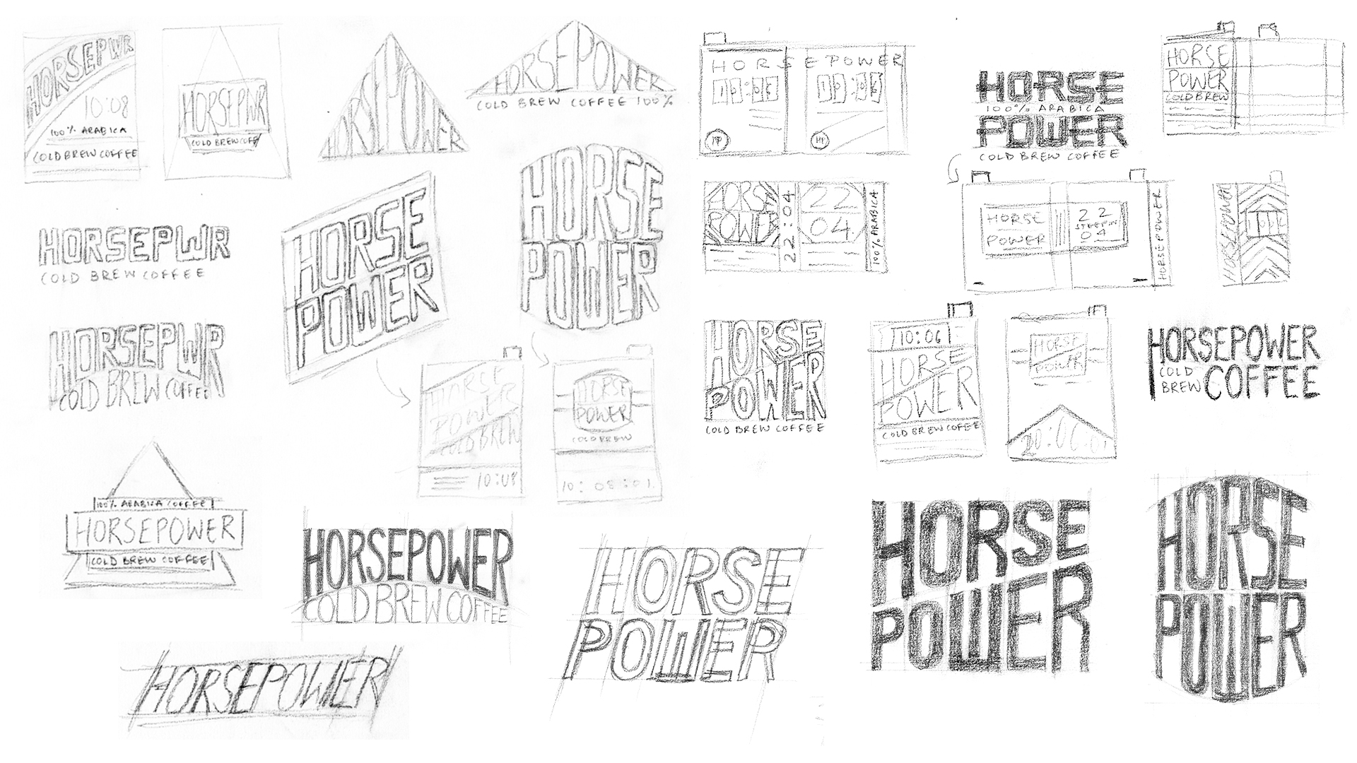
Using the images of motor oil packaging as inspiration, I sketched over 50 different variations of hand-lettered wordmarks, and with the help of Justin and my classmates, I selected one and refined it. I then brought in details based on my learning about motor oil. I added ratios on each package to represent the roast and brew intensity like how motor oil has mixing ratios on the front of their tins. I created a maker’s mark for the spine of the tin and added some iconography. To push the concept further, I made cards with serving instructions to go with each coffee tin, which were heavily inspired by the vintage gas receipts I had collected in my research phase. I also added a set of funnels to drive home the idea of an autobody shop.
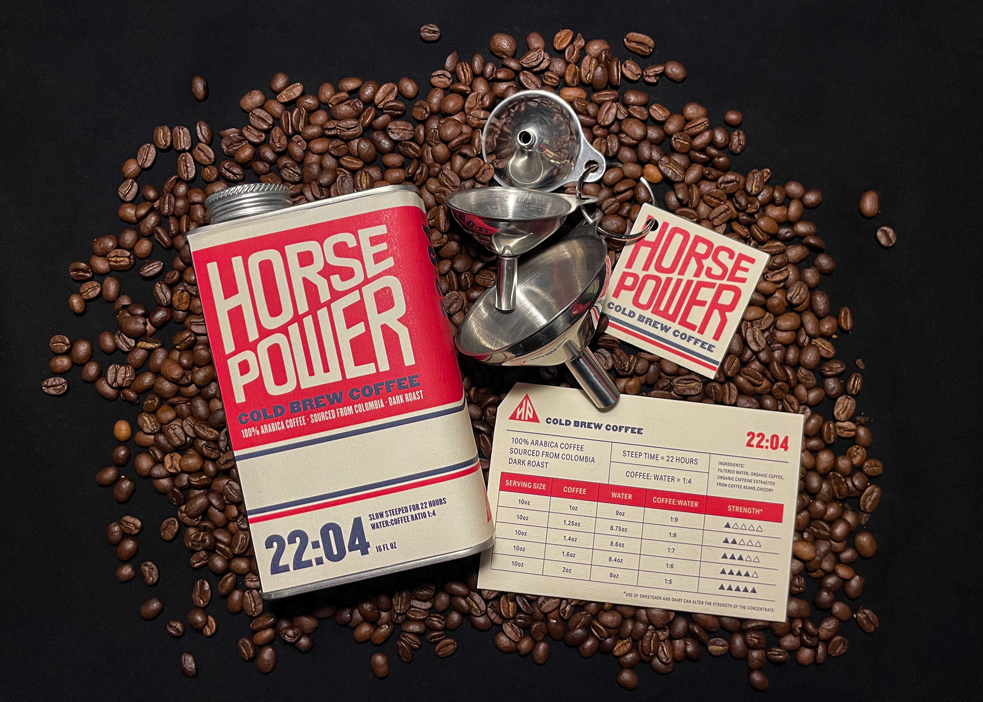
This project is probably one of my favorite in my entire student career because of how much fun I had with it. I actually sourced the metal tin cans from a wholesaler and physically crafted the packaging. I got to photograph the final product myself in a makeshift studio in my living room, which allowed me to art direct the final look and feel of the product photographs. Personally, I am a huge advocate for creative constraints because they lead to the most exciting solutions, and this project, to me, is a representation of just that. I would have never come up with this metaphorical packaging concept had I not pulled two little chits out of a hat. Thank you, Justin, for your creative assignment!
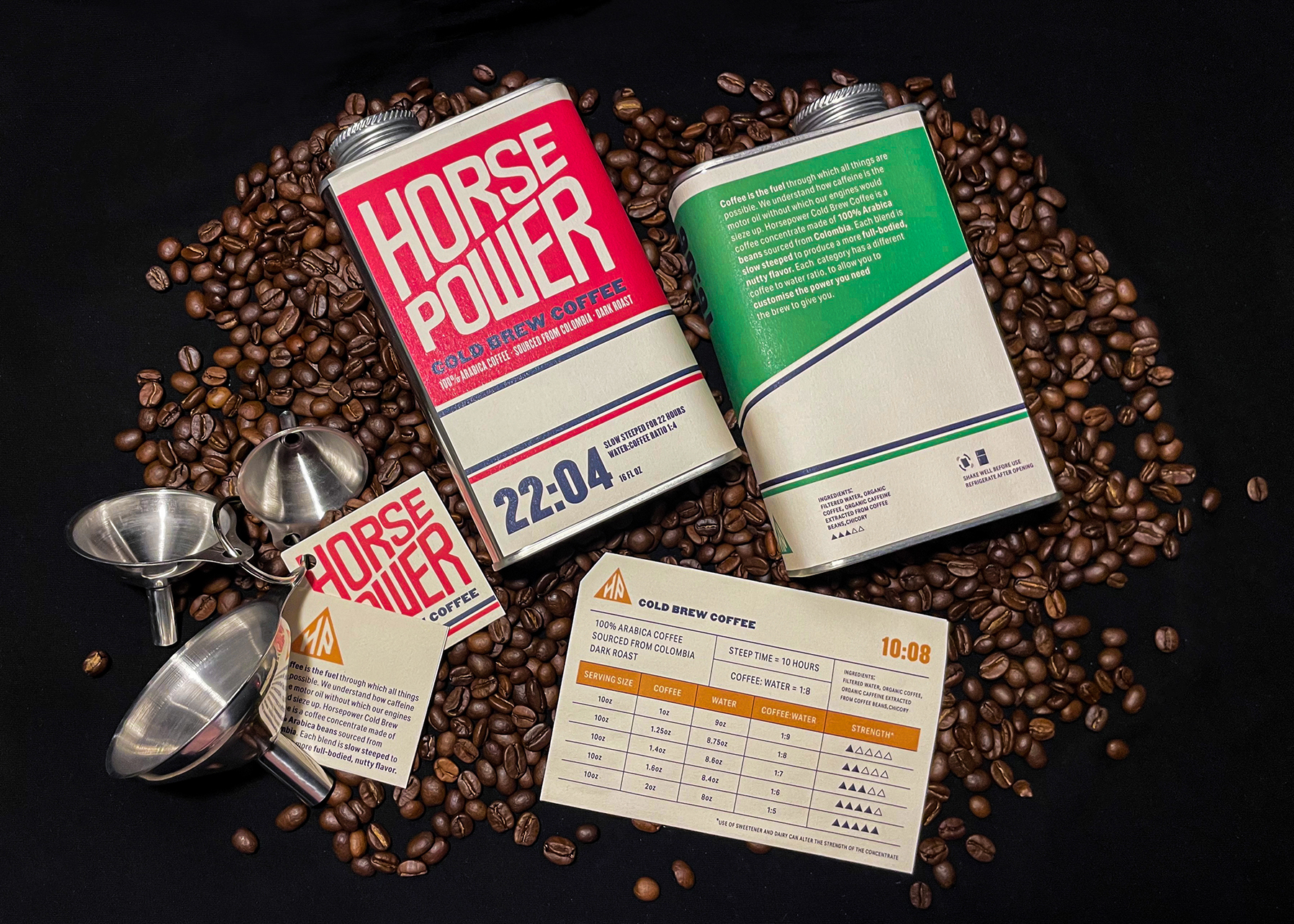
While working for real clients is a whole different world—often with much less freedom to play with crazy ideas—my journey with research and experimentation before I begin designing has taught me important lessons I utilize daily at work. It has allowed me to throw myself into new worlds, absorb as much information as possible, and draw inspiration from theoretical concepts and visual references. Looking back at my student work always makes me smile because it is the physical manifestation of my journey as a graphic designer, and even though there are probably a hundred things I would change on each project, looking back, I wouldn’t know to make those changes unless I had gone through this journey.
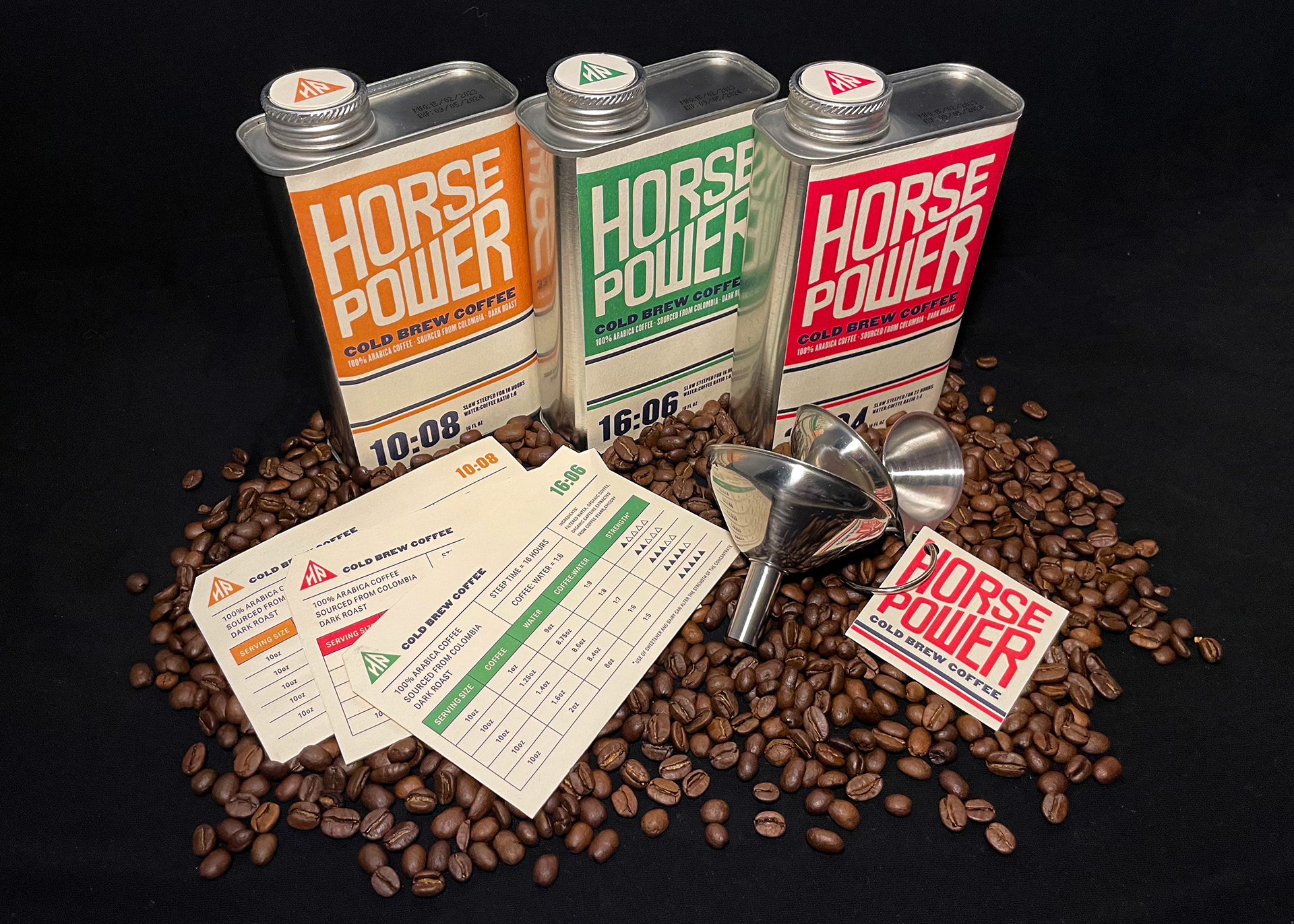
I’m Vasavi Bubna, and I recently graduated from the School of Visual Arts with a BFA in design. I am currently working in the role of an associate designer at COLLINS in New York. I was born and raised in Mumbai, India, an electric city jampacked with culture and color. This has manifested into my work in the form of purposeful, considered chaos. I seek to cultivate audacious narratives through design.
