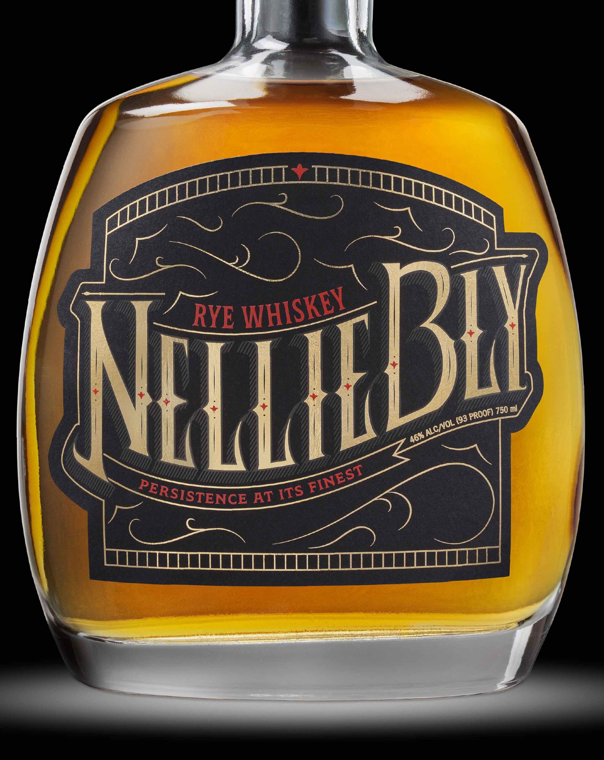
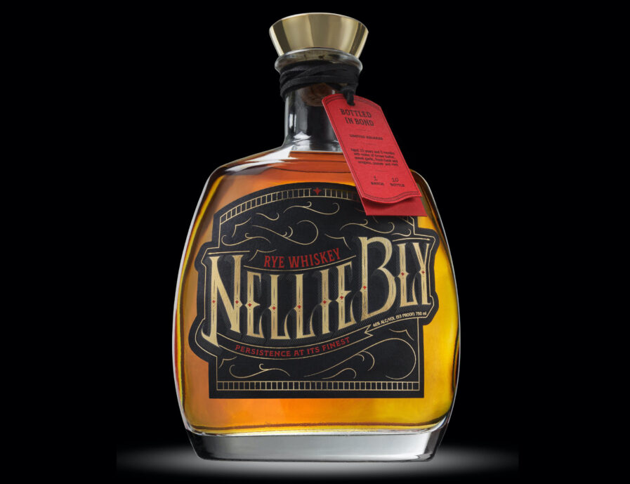
For her whiskey label design project, MAD School of Design student Judith Rios selected hand lettering with a Victorian flair and named it in honor of the pioneering journalist Nellie Bly, who revolutionized investigative journalism in the late 19th century.
By: Judith Rios
The brief to create this liquor bottle label was pretty open-ended. It simply stated: “Hand letter a liquor bottle label based on the Victorian Era.” Sounds easy enough right? But like anything designed, it’s a little more complex… While the brief was open-ended, another question I had to ask myself to reach the final outcome was “What makes a good liquor bottle? What story would make people gravitate towards the bottle?”

With all of this in mind, I started researching. I first started with general research about the Victorian era to understand the culture of that time period. One of the things I found most interesting was the relationships between the public sphere and the private sphere, especially when it came to the role of women in society. Once I understood the Victorian world, I started researching Victorian stories and icons. It was then, that I discovered Nellie Bly. She was a woman journalist who broke away from societal expectations and shined a light on injustices. I decided this bottle would be dedicated to her. Her story is one people would resonate with. The last portion of research I did had to do with the look and feel of the label. I research Victorian typography, liquor bottle labels, liquor bottle tags, and liquor bottle shapes.
From here, I started sketching and sketching and sketching. In between sketches, I brainstormed more. I changed the bottle I originally planned to use, changed the name for the label, and what parts of Nellie’s story to highlight. But through all of this, “NellieBly Rye Whiskey” was born!
For this bottle, I focused on the headlining article Nellie is most known for, “Ten Days in a Mad-House.” To write this article, Nellie faked insanity to infiltrate New York’s Insane Asylum. Due to the revelations made in her expose, government officials committed an additional million dollars annually toward care for the mentally ill. On the label, the name—NellieBly—extends beyond the label to symbolize how persistent she was. The letterforms are tall and sharp to insinuate a creepy nature. Lastly, the little red flowers on the stem of each letter are inspired by the architectural details of the asylum building and represent the days she spent uncovering the truth. With this bottle of whiskey, may we all gain the spirit of Nellie Bly in the pursuit of speaking our truth.
Judith Rios is a designer who uses strategic thinking and empathetic design to bring stories to life and create unique branded solutions. She tends to start every project by asking, “Whom am I designing for, and what do I want them to feel?” In her opinion, one of the best parts of design is that you can naturally gather inspiration and research through lived experiences. Judith believes design has the power to bring people together. She hopes to one day be a leader within the design industry and continue to use design as a tool for inspiration.
Social: Instagram, LinkedIn


