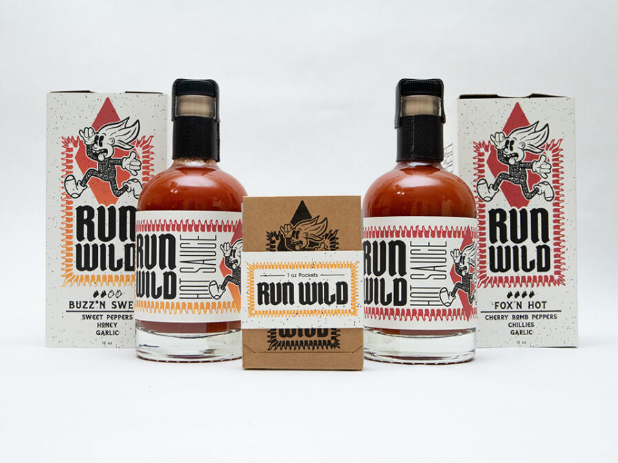
In the realm of product design and packaging, it’s the creative minds that dare to defy convention that make an impact. Our spotlight for the New Talent 2024 early entries shines on one such rising star: Julieta Gazzoni, a design student at California State University, Fullerton, who has chosen to challenge the status quo of a seemingly ordinary market: hot sauce. Brace yourself to embark on a fiery journey with Gazzoni’s project, “Run Wild Hot Sauce,” a work that promises to make buying and using hot sauce an adventure rather than a mere routine.
By: Julieta Gazzoni
The context is hot sauce, and we want to attract Millennials and Generation Z cusp the most. However, the target audience is between 16-57 years old.
Research shows that no gender is more likely to buy hot sauce than the other. Research also shows that no one stares at a bottle of hot sauce like they do at a box of cereal. The problem is that the experience of buying hot sauce is not that exciting. For example, with a cereal box, there are games, sayings, or quotes on the back, but the whole box gets looked over visually when we sit there eating cereal because it’s fun! That experience is missing in hot sauce. Yes, it’s a small bottle, and the ingredient list takes up a bit of room, but the bottle is a canvas. I don’t know about you, but after I buy and take home a hot sauce bottle, I never really look at the bottle design again.
While doing research, I also noticed that there wasn’t a distinct class of hot sauce. For example, when picking out wine, there are plain and fancy types, but hot sauce has this plateau that makes them all feel similar. So already at the market, I knew that I wanted to create a line that feels elevated but not too elevated.
From here, I started brainstorming and made a bubble mind map using my research from online and in person. My mind map allowed me to come up with “Run Wild Hot Sauce,” inspired by cigar packaging and antiques that were delivered hundreds of years ago on ships in wooden crates. What I love about the way cigars are packaged is the attention to detail when it comes to the small labeling and the ability to individualize them when they come in a box. The same goes for shipments on old ships, though I was more focused on the materials used and wanted to incorporate texture into the “Run Wild” packaging. When it came to visual design, I looked into early 1900s packaging and saw a lot of ornamental designs. I felt that I had to use a decorative border to give the hot sauce packaging a vintage look. With these takeaways, I slowly started to create the “Run Wild” packaging.
Creating the logo for this project was freeing. Looking at other companies’ logos, I saw a lot of human figures and typographic logos. When thinking about the brand name, I thought about what hot sauce makes me do and feel. I thought about how I want to keep water on hand when ingesting fiery hot sauce, and when it isn’t in reach, I just run wild. BAM! “Run Wild” Hot Sauce was born. Since I wanted “Run Wild” to attract both younger and older generations, I created a 1930s rubber hose-style mascot that is friendly and comedic. I drew the hair as fire as a way to connect the cartoon to the hot sauce and use the hair as spicy indication levels on the packaging. Originally the cartoon had shoes on, but I changed it to wear socks as the phrase “May knock your socks off!” came to me while I was discussing the project with a friend.
The final typeface used for the logo was inspired by propaganda posters from WWI. Since I felt that hot sauce does a great job of testing someone’s strength, why not choose a typeface that’s barbaric? Two extra typefaces—a sans serif and spur serif—were used to collate information and for the logo to stand out separately.
Having three hot sauce bottles for this project seemed a bit repetitive to me, so I decided to create two bottles and one on-the-go sauce packet because I love hot sauce on the go. For the packaging that carries the bottles and the packet, I designed them to function like a matchbox. I used 100lb cardstock and kept the colors neutral since the design had a lot going on while giving off a rustic feel. Diamond cutouts are incorporated on the side to show layers and the heat level. When slid open, the bottles are in a canvas bag wrapped by a band created by drafting paper and cardstock inspired by a cigar band. To add elegance, faux leather is added to secure the bottlecap and allow for a comfortable pour when holding the bottleneck. The to-go packets are simpler and meant for easy access and portability. Since it has a matchbook design, it can stand on a table while grabbing a packet or stay closed for transporting.
These three products show a hot, medium, and mild level, and give customers an experience through design and layered packaging.
Julieta Gazzoni‘s love for design came when she bought hand wipes that she didn’t need while standing in a retail store line. To this day, she has no memory of even using them, but the fact that she bought them because she was attracted to the design meant something to her. That was the day she realized she wanted to be a graphic designer and create work that would make people stop and stare. Based in Orange County, she recently graduated from Cal State University-Fullerton with a B.F.A in graphic and interactive design. Julieta loves that she is able to combine math and art together since graphic design incorporates both. When she has free time, Julieta likes to daydream about going on a road trip and search on Google Earth.


