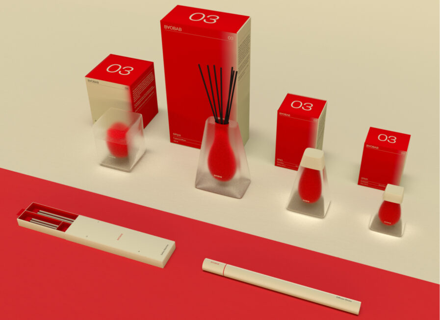
In the New Talent 2024 Awards, Jocelyn Zhao from ArtCenter College of Design has etched her name in gold with her transformative project rebrand of the Baobab Collection. Under the guidance of Gerardo Herrera, Zhao’s project seamlessly marries the rich heritage of African culture with cutting-edge design elements. Her reinterpretation of the Baobab Collection’s home fragrance line is a nod to the iconic baobab tree—a symbol of life and resilience in the African savannah—and a forward-thinking approach to sustainable packaging design.
By: Jocelyn Zhao, Design Intern, 2×4, & Former Student, ArtCenter College of Design
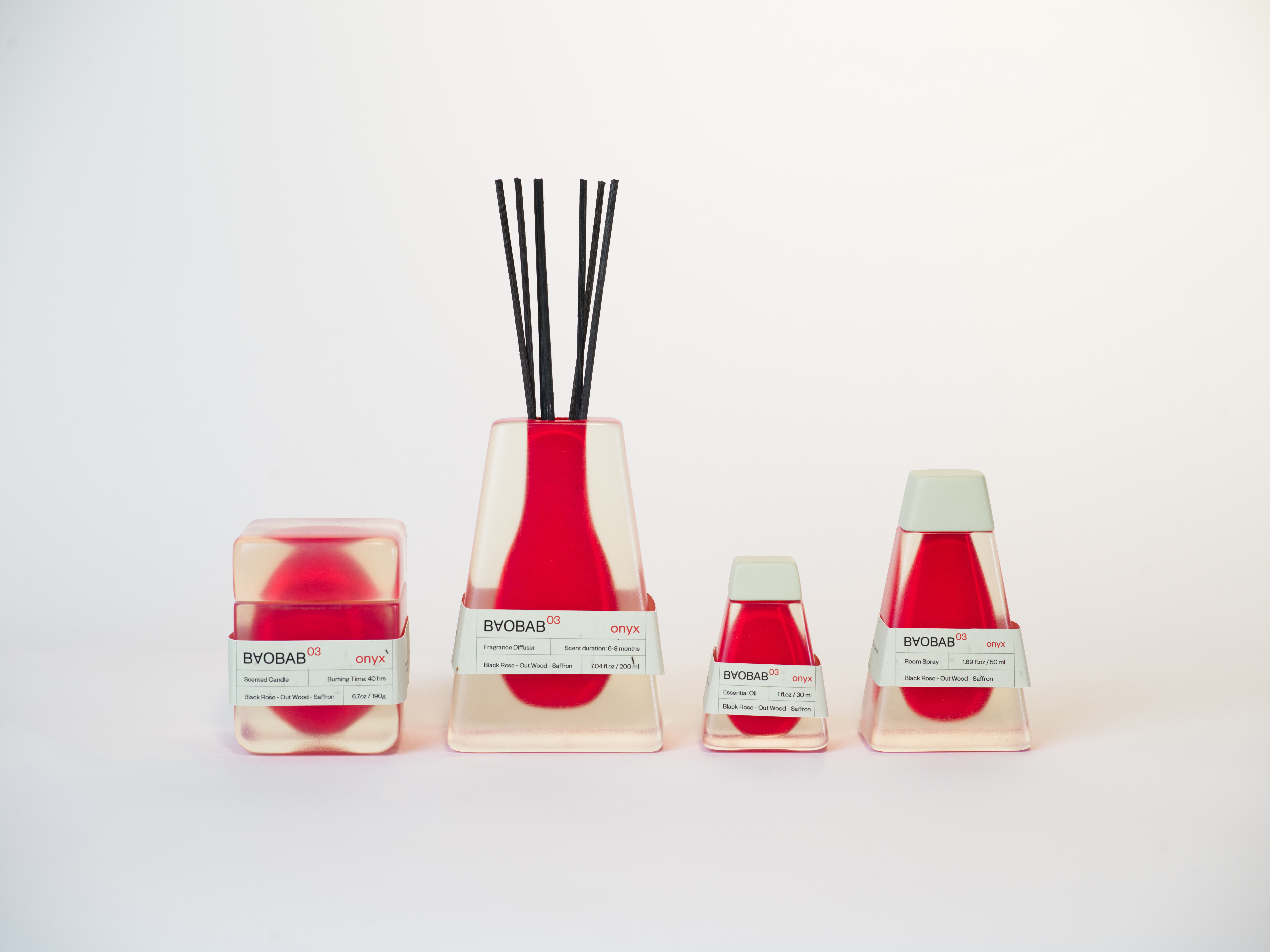
Rebranding Baobab Collection’s home fragrance product line was an exhilarating journey, giving me a vibrant canvas to play with forms, structures, colors, and materials. My goal is to create a luxurious aesthetic that resonates with the heart of African landscapes.
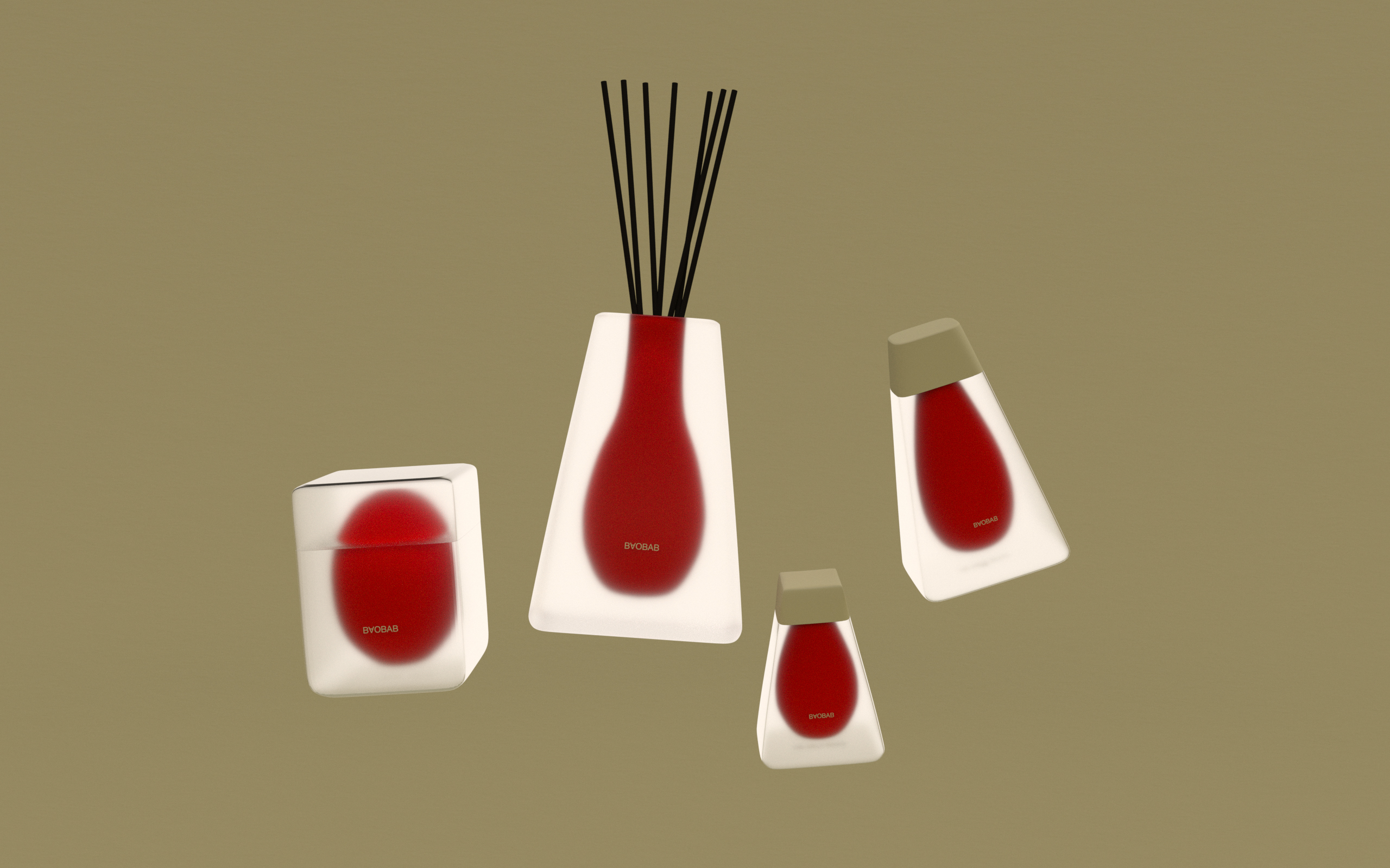
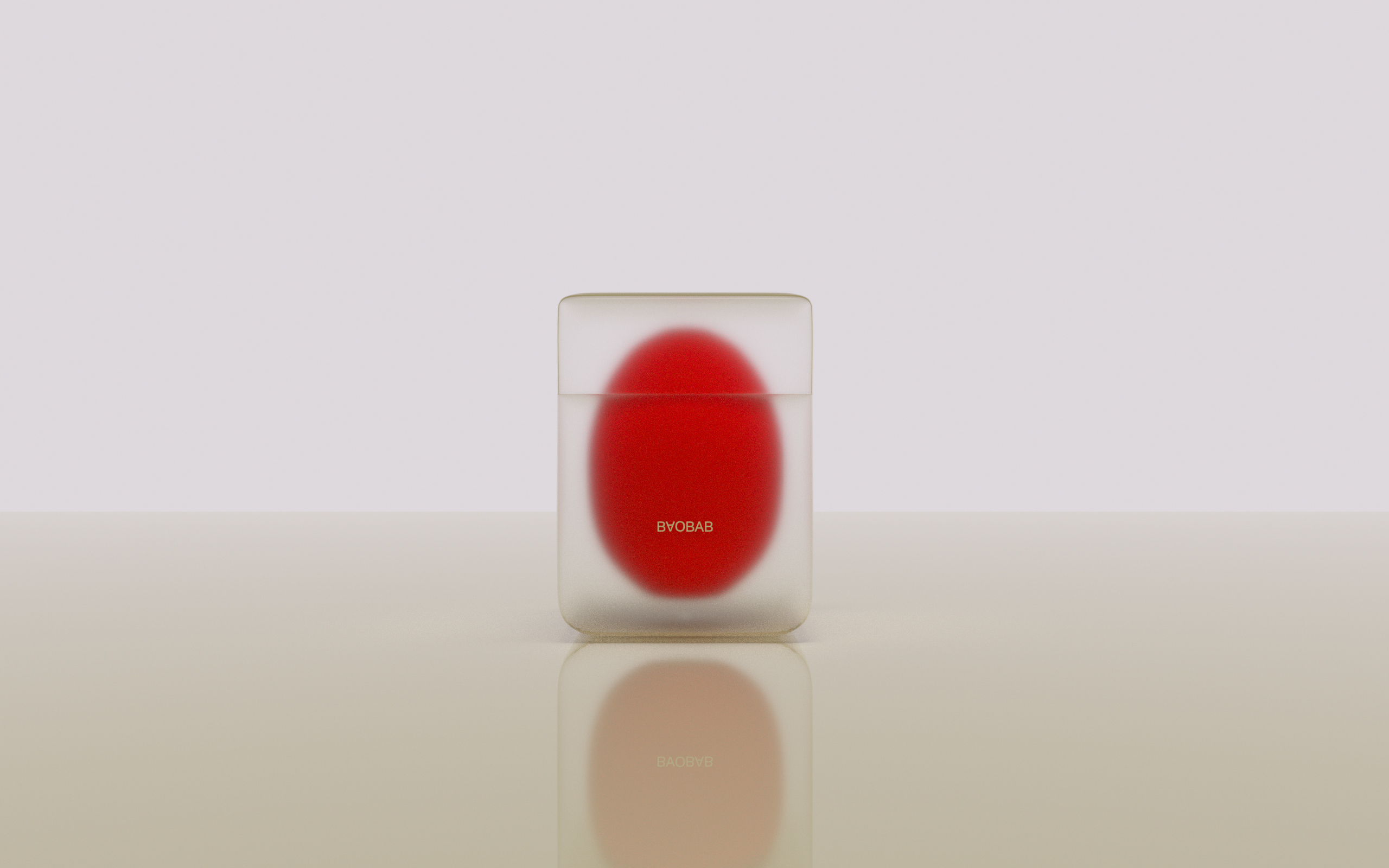
The most inspiring part of the project was the form-making phase. I delved into various shapes to capture the essence of African culture, which is the collection’s core inspiration. The baobab tree, with its enchanting hollow forms, eventually stole the show. Imagine a tree trunk capable of storing up to 300 liters (66 gallons) of life-sustaining water—a true miracle in the harsh, dry climate of the African savannah. This remarkable feature became the heart of my design.
The new packaging, showcasing the iconic tree hollow, symbolizes strength and vitality, bridging the gap between faraway grasslands and the consumer’s home. The slogan: “Bring the miracle to your home, let vitality sprout,” encapsulates this connection beautifully.
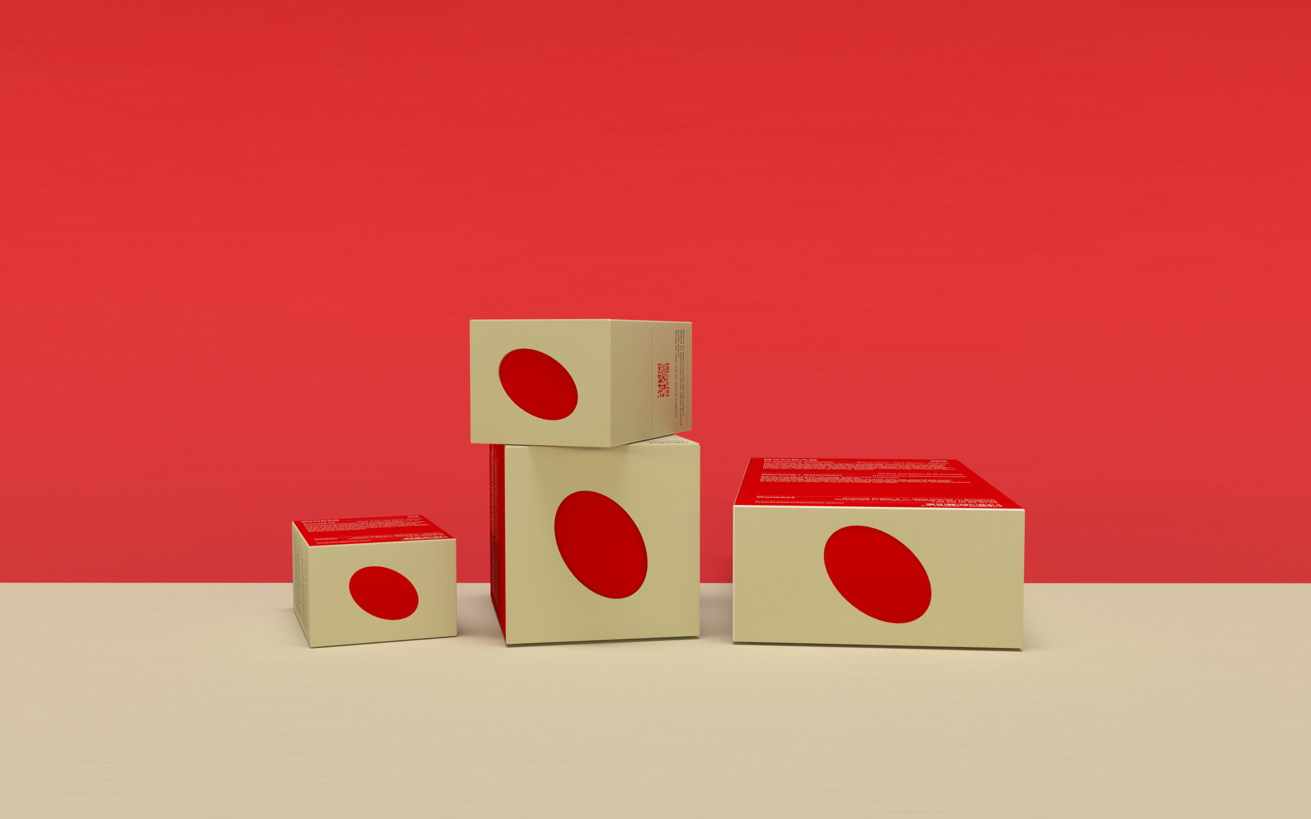
Revamping the logo was equally thrilling. Inspired by the baobab—often called the upside-down tree because its branches resemble roots—I crafted a design that is modern, minimal, and culturally rich. It stands in stark contrast to the old logo, bringing a fresh, contemporary touch to the brand.
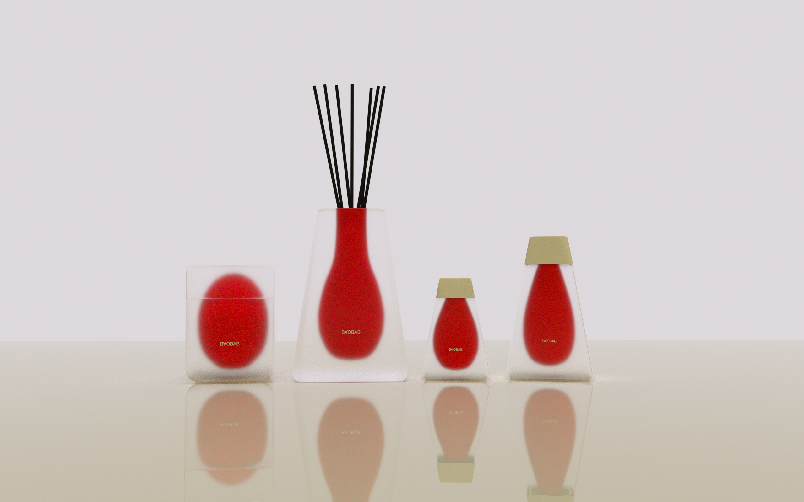
My research into market trends revealed Millennials and older Gen Z as the driving force in the fragrance industry, with a rising demand for gender-fluid, modern aesthetics. This insight became central to the project. I focused on form-making to enhance the user experience, integrating the cavity theme across the product line.
The design process involved deep dives into color theory and user experience, utilizing color coding to simplify navigation and boost brand recognition. The aim was to imbue the products with a sense of modern therapy, appealing to eco-conscious young consumers. To quickly captivate customers with the baobab tree story, the design emphasizes a rich tactile experience and rapid narrative comprehension.
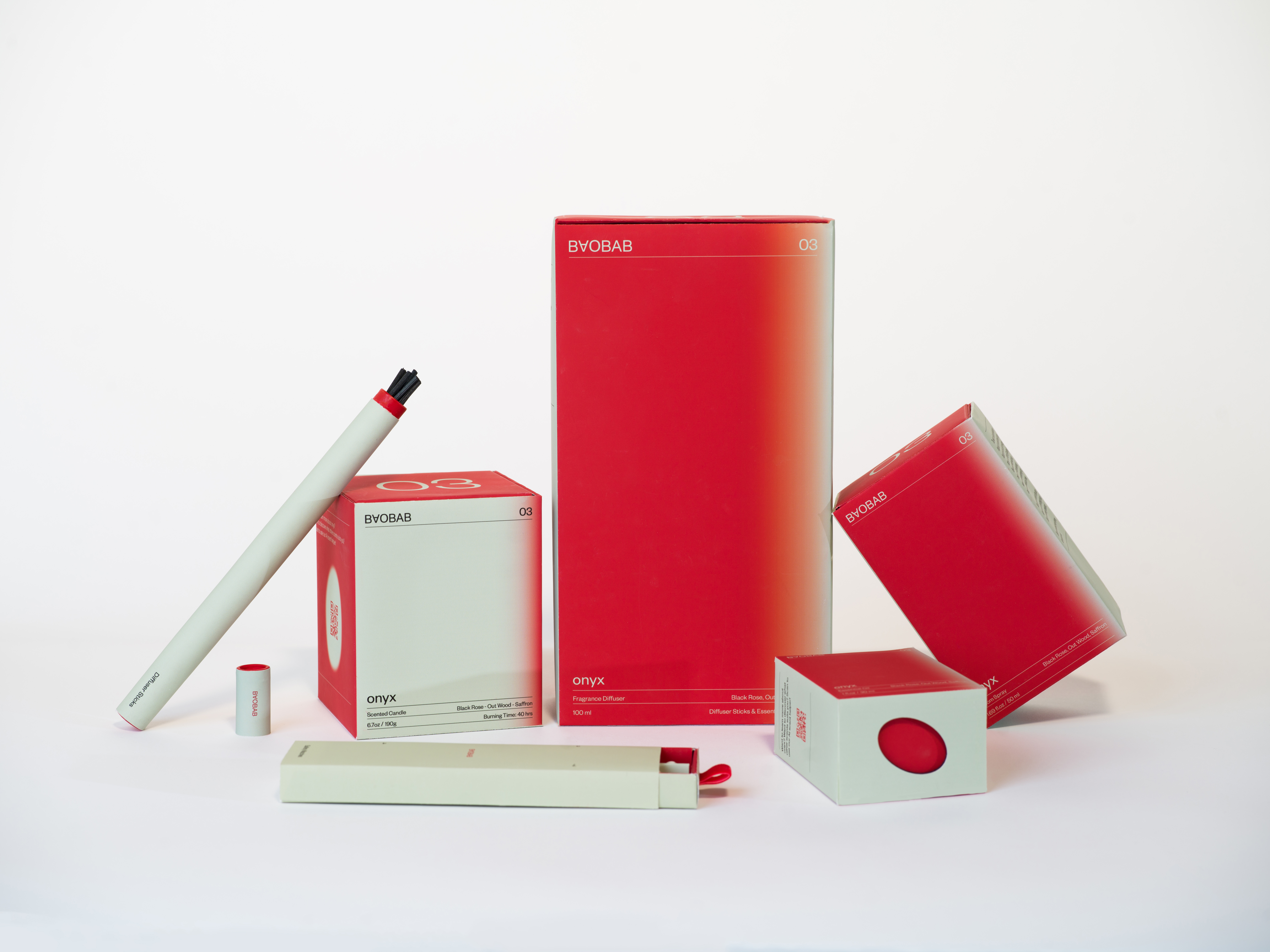
The most challenging part? Physical model-making is a first for me. Yet, it was an incredible learning curve. I mastered 3D printing, spray painting, Kongsberg cutting, and rub-down transfer techniques.
This project is a milestone in my design journey, enhancing my skills in form-making, ensuring brand consistency, and perfecting color schemes that resonate with consumers. It sharpened my abilities in both digital modeling and rendering, solidifying my technical prowess and creative expression in sustainable CPG packaging design.
Hi! I’m Jocelyn Zhao, a graphic designer based in New York with an emphasis on branding, transmedia storytelling, computer generative design, and spatial experience design. Through my work, I desire to evoke feelings and experiences, to leave a lasting imprint on the senses and emotions of those who encounter it. When I touch and smell a new book or observe the unexpected juxtaposition of materials in fashion, my senses come alive. It deepens my connection to scent, texture, and color, infusing vitality into design and inviting viewers to engage both visually and tactilely. This approach serves as a bridge that seamlessly connects the tangible with the digital realm.
