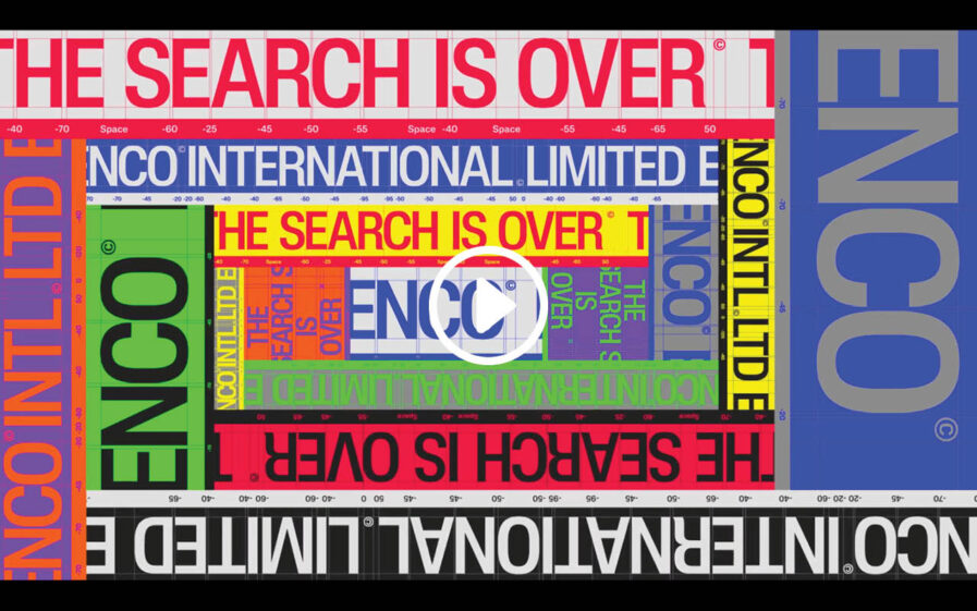
ArtCenter College of Design’s Alan Xu doesn’t just see design—he lives it. His Platinum Award-winning project, “ENCO INTERNATIONAL LIMITED Brand Montage,” under the guidance of Professor Ming Tai, reimagined a local agency’s identity into a global powerhouse. With a seamless blend of motion graphics, typography, and a meticulous logo system, Xu’s work stands out as a brand that’s as versatile as it is dynamic. This is just an example of the future of design—bold, boundary-pushing, and distinctly Alan Xu.
By: Alan Xu, Student, ArtCenter College of Design
In Ming Tai’s Type 5: Motion course, the objective was to rebrand an existing institution by creating a fresh identity and showcasing it through a 60-second brand montage. This included logo lockups, typography, posters, collaterals, social media, the website, and other brand elements.
From the start, this project was an uphill battle. The original institution lacked a clear brand mission and visual identity, and to make matters worse, its website went offline for construction halfway through the project.
During the brainstorming phase, I often felt I had chosen the wrong institution to rebrand. But I knew that the solution usually came right before the breaking point—and it did. The lack of a solid foundation turned out to be an opportunity. With nothing in place, I could create everything from scratch. I decided to transform the small local creative representative agency into ENCO INTERNATIONAL LIMITED, a global creative nexus with a mission and network that extends far beyond just Seoul, South Korea.
However, two new challenges emerged. The first was that rebranding a local agency into a global one required a versatile and flexible identity to appeal to a broader audience. The second challenge was balancing the showcase of the creatives the agency represents while maintaining a solid brand presence, ensuring neither overpowered the other. The solution was a dynamic and encompassing identity system, featuring a versatile color palette, a cohesive typographic approach, and striking motion elements. This ensured the brand had both a timeless presence and the adaptability to evolve with changing trends.
The outcome? All the blood, sweat, and tears poured into this project paid off. “ENCO” went on to win over ten international awards, including Top 3 in Young Ones TDC, winner in Communication Arts Design Annual, and a Platinum award in Graphis New Talent. This project taught me a valuable lesson: every setback and obstacle is an opportunity in disguise. Sometimes, the solution lies in approaching the problem from a different perspective.
I’d like to extend my heartfelt thanks to my incredible professor and department chair, Ming Tai, his teaching assistant, Hanson Ma, and all the friends and family who supported me throughout this project. It wouldn’t have been possible without them.
Logo
Designed with the intention of flexibility on different dimensional surfaces and screens, “ENCO INTERNATIONAL LIMITED” comes with three main logo variations: ENCO (short), ENCO INTL LTD (mid), and ENCO INTERNATIONAL LIMITED (full).
“ENCO” also comes with three sub-logo variations, which are used restrictively and situationally, such as in captions or to further create contrast and hierarchy.
Typography
“ENCO” strictly uses three typefaces from two font families. First, Lateral Condensed Medium is used for headings and display; second, Lateral Standard Medium is used for subheads and body copy; and third, Basier Square Mono is used for captions.
The three typefaces come together naturally, creating contrast and hierarchy in every design within the identity.
Color
Color plays a significant part in “ENCO’s” identity. “ENCO” has a diverse and flexible color palette consisting of three primary and six secondary colors. With an extensive color palette also comes unique restrictions to maintain order and consistency while retaining flexibility. All colors are labeled with specific pairings, and no more than two colors exist at once within a single composition (unless in particular situations).
Motion
All of “ENCO’s” motion can be described as quick, crisp, and clean. Kinetic typography plays a significant role in “ENCO’s” identity; it acts as an attention-grabber and a transition from one piece of information to the next.
Conclusion
“ENCO INTERNATIONAL LIMITED”’s visual identity is designed from the ground up to harness contrast, hierarchy, and flexibility, ultimately becoming an identity that can stand against the test of time and change with it.
Alan Xu is a graphic and motion that creates elegance and distinction through simplicity, reducing color and form to the bare bones and then using that medium in the best way possible to create fascinating results. He is also the designer, organizer, and host for ArtCenter’s Design Speaker Series, where he invited and hosted over 20 renowned designers from around the world and designed over five extensive campaigns for the series. Alan is currently studying at the ArtCenter College of Design in LA.


