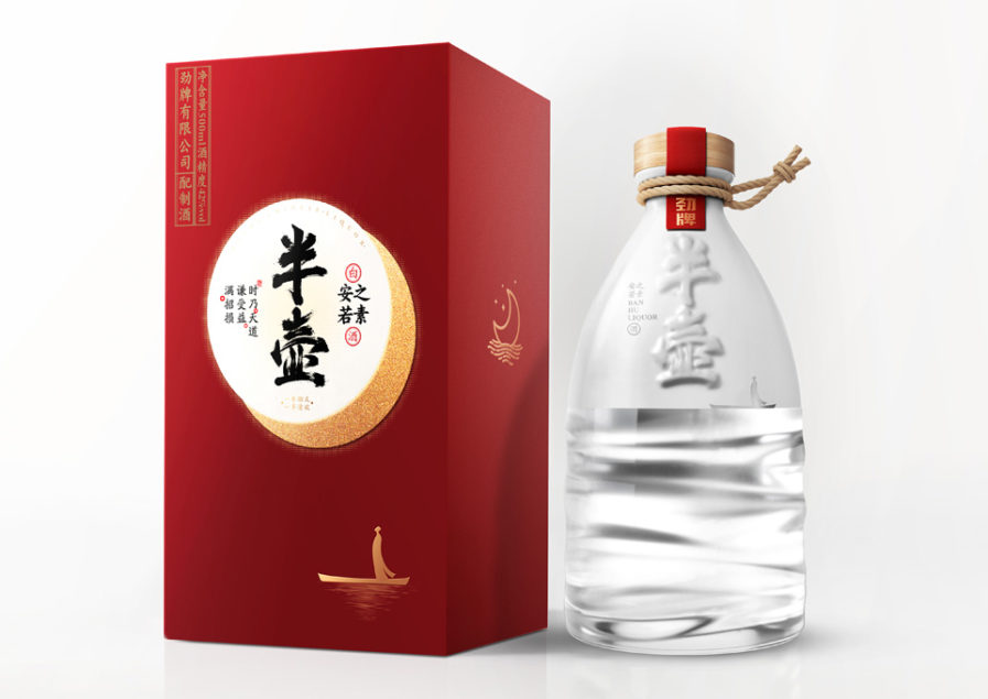
Chinese agency, Shenzhen Lingyun Creative Packaging and Design Co., Ltd., developed an intriguing bottle design (above) for their client Jingpai Co., Ltd. Designed by Xiongbo Deng, they submitted it as their entry titled, “BanHu” to the Graphis Packaging 10 competition. The name BanHu literally means ‘half bottle.’ They chose this name for the product because it aligns with an ancient Chinese philosophy that says: things in excess overflow in the opposite direction. Just as the moon wanes and affects the tide of the ocean.
The bottle itself mimics the flow of water up until it becomes a white color. There is also a small image of a sage looking up at a carving of the name of the product as his boat rests on the surface of the water as if he is looking at the moon. This packaging is pleasant to look at and would be a unique addition to any wine shelf.
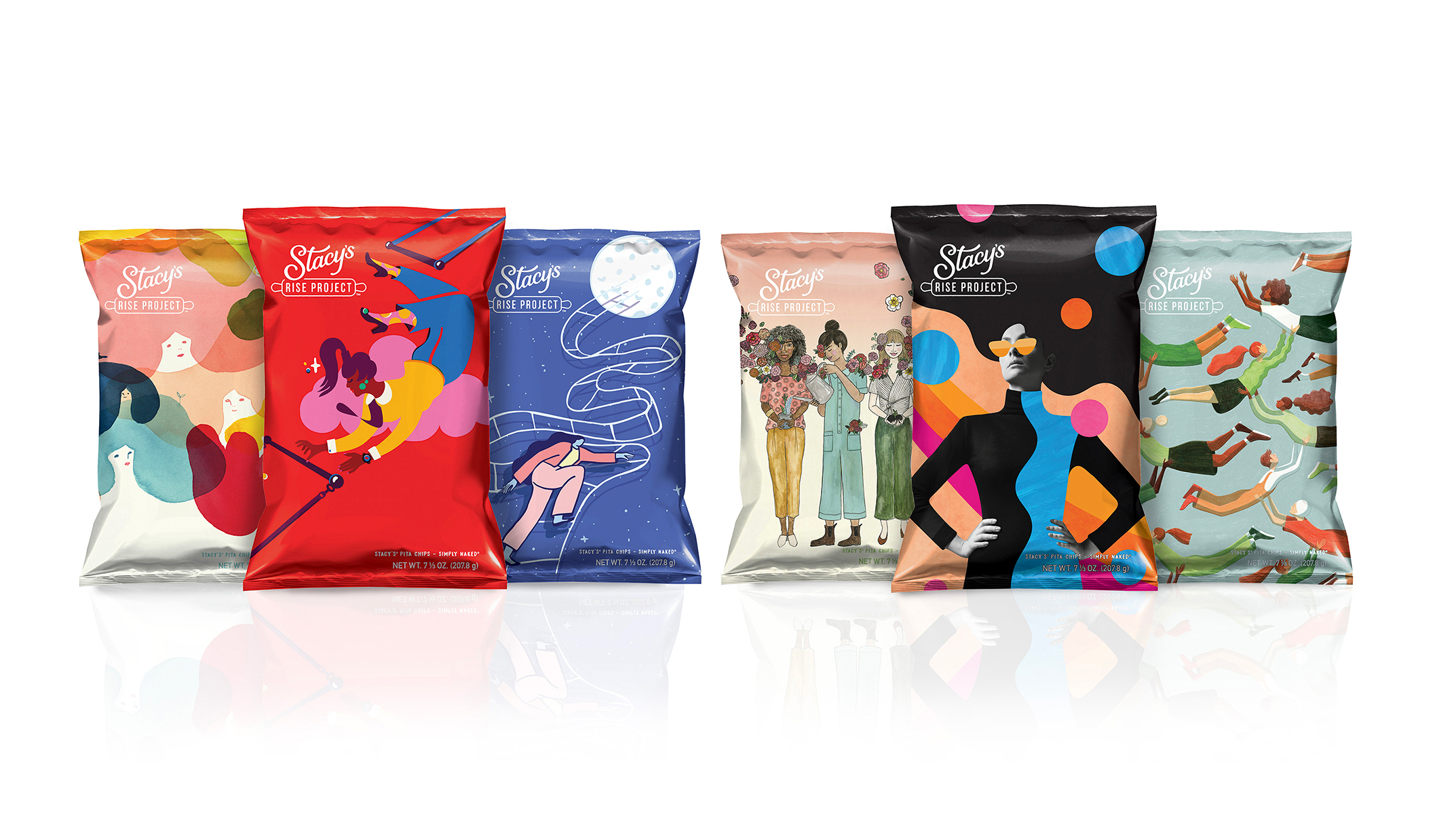
PepsiCo Design & Innovation makes another submission to the competition with their above chip packaging “Stacy’s Rise Project 2019 LTO.” In this entry, they show off six different limited edition chip bags as part of their ‘Rise Project,’ each with its own unique illustration. PepsiCo wanted to reinforce the message behind Stacy’s Pita Chips as a brand founded by a female entrepreneur that supports hard-working women.
So for Women’s History Month in March 2019, PepsiCo recruited six different female artists to represent a particular stage in a business women’s life. You can read more about how they interpreted and chose each artist in the credits of the entry! The ‘Rise Project’ helps fund micro-grants for women entrepreneurs and encourages women to meet their challenges head-on.
You can share your unique packaging with the world by entering the Packaging 10 competition! ENTER HERE.