If the ongoing COVID-19 pandemic has got your travel bug biting harder than ever, “meet” Graphis in Mill Valley for this week’s featured Design Annual 2022 entries!
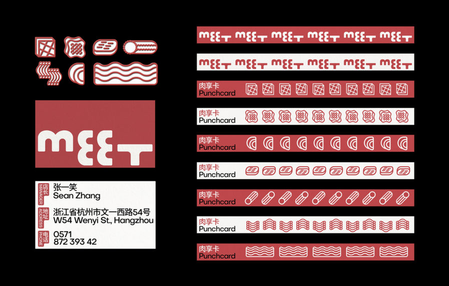
Meet is a Korean barbecue restaurant in Seattle, Washington. They were looking to target young people as their main customer base, but to do so they desperately needed an update of their brand. Enter Mengchao Wuof Formoj Studio! Formoj is a “shape obsessed creative studio” operating out of New York City and Shanghai. They have won several awards, including a Silver Award here at Graphis for our Branding 7 Competition. Formoj worked with their client to better express their vivid brand image and promote the various meats in their restaurant.
Wu took a very creative approach in “Meet Rebrand” (above) taking inspiration from the natural geometries found in grilled meats; beef tongue as a circle, pork neck as a rounded rectangle, and beef rolls as a cylinder. Wu also took advantage of the most basic graphical element, the grid, to represent the grill marks, bringing in an unexpected but logical element. The various shape combinations and patterns gave the geometries a playful and strong final touch.
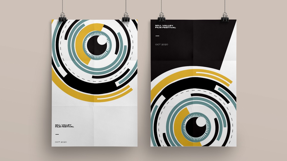
Let’s travel from Seattle to California for our next entry from designer Kelly Bernard,under creative direction from John Butler from Butler, Shine, Stern & Partnersin Sausalito, California. BSSP is an independent advertising firm that was established in 1993, and for over twenty-five years they have come to be recognized as one of the best mid-size agencies in the country. Bernard is the art director and a designer at BSSP, and when the Mill Valley Film Festival asked BSSP to design a poster for them, she took inspiration from film itself.
“Film is essentially how one sees it,” says Bernard. “It sheds light on humanity, and to some extent, the eye of the beholder. The camera, therefore, becomes our eyes. It shows us things we may or may not know.” With pops of yellow, teal blue, black, and white, “Mill Valley Film Festival Poster” (above) plays with our own perceptions and created a design that reads as both an eye and a camera lens. Simple typography brought the whole thing together. Bernard’s clever design paid off — the posters were widely liked, and there were even several requests from festival-goers for their own copy.
Travel bug not quite satisfied? Journey to even more worlds on our main website by checking out other entries in our Design Annual 2022competition!