A Dutch marketing firm gets a makeover, and a digital card tugs at your heartstrings with these Design entries!
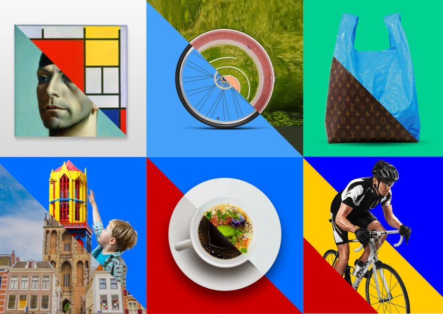
Updating your brand for the modern world doesn’t have to mean leaving behind the cultural identity that made you who you are. “Utrecht” (above), a Design 2022 platinum-winning entry revitalizes a Dutch marketing firm’s classic brand while still incorporating the foundational cultural values the company holds dear, all thanks to the team at Total Design.
Utrecht Marketing is a marketing firm that prides itself on bringing together the people and culture of its community through their work. With core values of inclusivity, sustainability, and balance, Utrecht Marketing strives to promote and represent the spirit city that is so integral to their lives. As times changed and Ultrecht Marketing’s clientele became increasingly international, the company turned to Total Design to further develop the style Utrecht Marketing has fostered since its founding and bring the company into the international marketing world.
Total Design emphasizes the concepts of unity and connection in their design for Ultrecht Marketing’s new brand. The logo and corporate identity are based on the coat of arms of Utrecht. The U resembles a shield, while the diagonal red area refers to the story of Saint Martin who cut his cloak in two to share with a beggar, which symbolizes two important brand values for Utrecht, “sharing and connecting”. This symbol continues throughout Utrecht Marketing’s new brand alongside stunning color and clever photography to form a distinct, cohesive identity.
