Depending on the design, posters can be as simple or complex as you can make them. In this week’s blog post, we take a look at four thought-provoking works layered in carefully-chosen colors, repetitive shapes, and sharp symmetry.
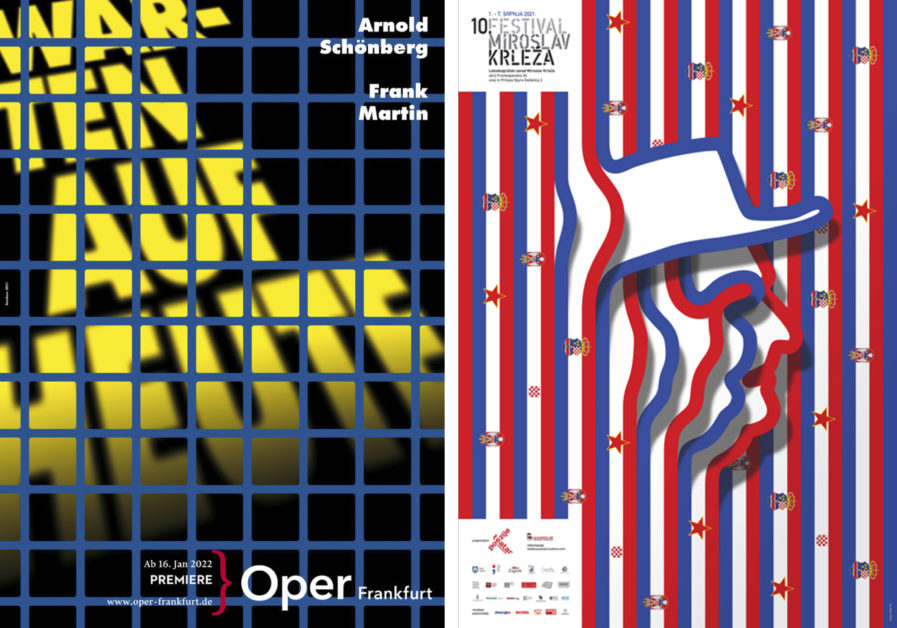
German Graphis Master Gunter Rambow has made it no secret that he loves the opera; one of his most frequent clients is the Frankfurt Opera. Established all the way back in 1782, the company has hosted the premier of multiple different operas such as Inferno (based off of Dante’s Divine Comedy) and Caligula (based off the 1945 play by French author Albert Camus), and its theater is considered one of the best in the world. The best deserves the best, and Gunter gives his all for each poster he makes for them, such as this Silver-winning 2023 poster “Warten auf Heute (Waiting for Today)” (above, left).
The opera it’s promoting, directed by David Hermann, is a combination of four works by composers Arnold Schönberg and Frank Martin. Given the tagline “One man, one woman. Marriage, everyday life, life,” Waiting for Today examines questions about the passing of time and the development of two individuals and how marriage connects them. Given the overall appearance of the poster, one thinks any connections formed might not be the best. A blue grid, like a wire cage, covers the entire poster. Behind it, the yellow title looms at a slant, dissolving into shadow at the bottom. Though a simple design, there is a sense of menace to it that the viewer can only confirm if they see the show. Plenty of people did see it as the finished poster was shown on poster pillars all over Frankfurt.
Though he is an American Graphis Master now, Mirko Ilic started his career in his native Croatia, an Eastern European country that sits across from Italy on the Adriatic Sea. While not as prominent as other European cultures, Croatia call a talented array of artists its own, no more so than Miroslav Krleža, the country’s most celebrated writer. Born in 1893 in Croatia’s capital Zagreb, he first served as a soldier and fought in World War I. His writing career took off after the war ended thanks to leftist literary and political reviews, and he eventually founded what we now know today as the Miroslav Krleža Institute of Lexicography with support from revolutionary and statesman Josip Broz Tito. He wrote numerous novels, short stories, poetry, and plays before dying in 1981.
To commemorate the 40th anniversary of Miroslav’s death, Mirko designed “10th Festival Miroslav Krleža” (above, left) for a Miroslav Krleža festival hosted by Teatar Poezije, or Theater of Poetry, a Croatian artistic organization that deals with the affirmation of poetic speech through various forms. Miroslav’s face is drawn in profile, wearing his well-known and distinguished hat. Drawing inspiration from one of the author’s most famous novels, The Flags, Mirko shapes Miroslav red, white, and blue lines (the colors of the Croatian flag). Stuck between the lines are all the incarnations the Croatian flag went through during his lifetime. It’s a patriotic piece, showing obvious pride and love in a crucial cultural figure.
