This week’s new entries take a stylish spin on death and horror, but there’s nothing to be afraid of … except maybe how good this work is!
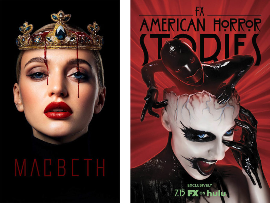
Carmit Haller is a visual communications designer and the owner of Carmit Design Studio based in Belmont, California. For the past two decades, she has been working as a lead graphic designer in the fields of consumer market, high-tech startups, and luxury real estate though her passion lies in poster design and typography. Heller’s poster submission features the designer’s take on the Shakespearean tragedy “Macbeth” (above, left), which centers around a Scottish general who is told by three witches that he is destined to be the King of Scotland. Goaded by his wife, Macbeth kills the king for his throne and ends up leading the couple down a dark path of corruption, ambition, and guilt.
Haller chose to portray Lady Macbeth as the face of the play, considering she’s just as integral to the plot as Macbeth is: power-hungry and highly calculating, she comes up with the perfect plant to seduce her husband into killing the king to ensure her spot on the throne. Using that aspect of seduction, Heller portrays Lady Macbeth as a beautiful, alluring, and powerful figure. The inclusion of blood on the crown represents both the act of murder and the guilt she carries by the end of the play. The play’s title was created with a thin and angular typeface, with the apex and arms of the letters altered in order to accentuate the conflict of gender dynamics throughout the play.
Next up is a promotional poster by Graphis Master firm ARSONAL for the FX Show “American Horror Stories” (above, right), an anthology series spin-off of the popular show American Horror Story that follows a different horror story in each episode. Since the first two episodes harken back to the house and rubber man possession from season one of AHS, the client wanted the art to as well, and also show the rubber man’s possession of the girl in a way that would read as creepy instead of silly.
To do this, the agency explored various ways of combining the character in a possessed state with the rubber man emerging out of her and/or intertwining with her. To reference the artwork for season 1, the agency brought the slick, shiny, red latex elements into the background, and also applied those same techniques to the girl, giving her skin a plastic appearance similar to a mannequin. This campaign mirrored the same bold palette and iconography of the season 1 American Horror Story poster and was equally provocative, attracting the original series’ fan base while piquing the interest of new prospective viewers.


