If the state of the world has you screaming for justice and peace, this week’s Protest Posters 2 entries are for you, with our featured designers tackling important issues with eye-catching designs.
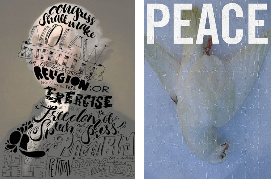
First today is Katie Bellofffrom the studio of McCandliss and Campbell, and her “1st Amendment Poster” design (above, left). Belloff was commissioned by The People of the United States, and inspired by the First Amendment of the United States Constitution. Wanting to portray the powerful words in poster form, Belloff created bold, hand-lettered typography and overlaid it on a classic photo of George Washington, the first President of the United States and one of America’s Founding Fathers. The typography is dynamic and striking and draws even more attention when laid upon one of the most famous figures in American history. According to Belloff and her colleagues at McCandliss and Campbell, people love the poster and have already begun requesting protective frames!
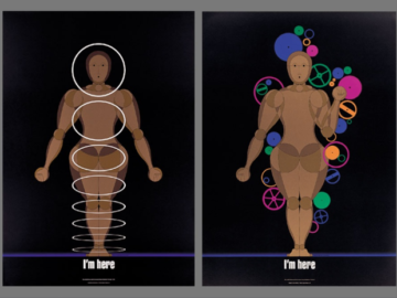
Next is “Peace,” (above, right) designed by Marlena Buczek Smith. A self-commissioned piece, the poster features a puzzle piece overlay on top of a photo of a dove.“Peace” is printed on top in large white letters, making her message decisively and irrevocably clear. Buczek Smith uses a simple design to advocate for a complex issue; in using puzzle pieces, she suggests that everyone around the world must pitch in if we want longtime peace. Peace requires multiple actions from multiple people, and we are all part of the puzzle.
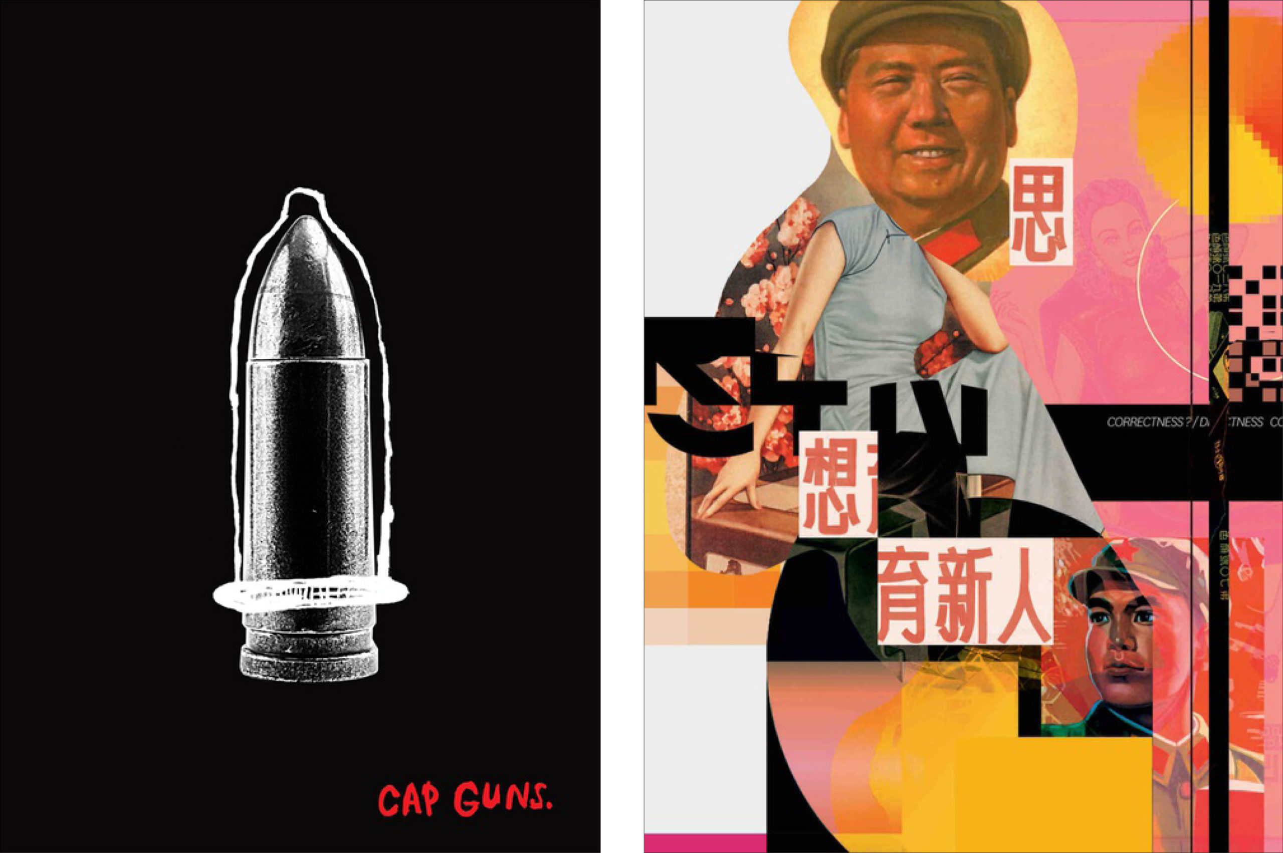
“Cap Guns” (above, left), another self-commissioned submission, was designed through collaboration by Australian designers Paul Garbettand Danielle de Andrade. Garbett and de Andrade are the co-founders of Garbett Designin New South Wales, Australia, where de Andrade also serves as creative director. The independent studio specializes in brand strategies, graphic design, image-making, and new media. They set out to tackle the complex and controversial topic of gun control for this poster, which features a photograph of a bullet with a condom sketched over it. The only color in the piece is the red text near the bottom right, which also provides the poster’s title. With gun violence proving an ever-present problem, Garbett and de Andrade are using their craft to speak up about this issue.
Last but not least is “Thinking Makes New People,” (above, right) designed by Zheng Wang. While an American designer, Wang was intrigued and inspired by the era of former Communist leader Mao Zedong in China. Mao’s political philosophy and dictatorship still influence modern-day China, and “Thinking Makes New People” was and still is one of the most popular political slogans from the era. To this day, Mao is worshipped like a god by many in China, but Wang states that his image in the younger generation is becoming blurred. The woman’s body in the middle of the design is from the packaging of cigars in China during the same time as Mao’s rule, and Wang compares the spreading of propaganda like “Thinking Makes New People” to the spreading of these ads. He deliberately separates the Chinese characters; he says that “思想” or “thinking” is the most important and the source for all the other, and “it is directly from Mao’s head.” This political propaganda covers glamour and beauty and showcases fantasy as both irresistible and poisonous, just like the beautiful women on the cigar packaging.
For more information about these and other eye-catching designs, check out Graphis’ main website for more entries in our Protest Posters 2competition.