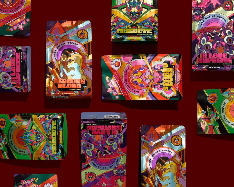
Drink designs remain some of the most popular entries for our Packaging 10 competition, and this week’s two new entries don’t disappoint!
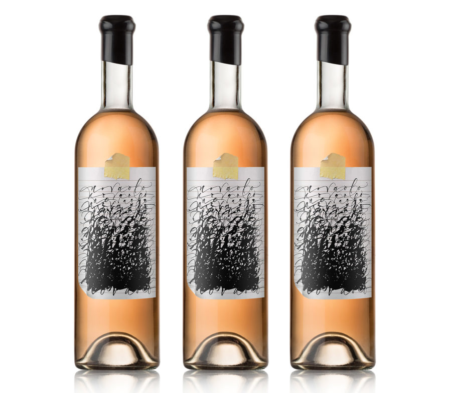
If you’re a wine connoisseur, try a sip of “Novaolo” (above). This wine brand pays homage to the two matriarchs of the winemakers’ Polish and Sicilian families by combining their maiden names together. Their loss of last names helped shape Novaolo’s brand identity, making their wine a drink about obscured identities. Michael Hester from the design firm Pavement used this concept to create a tongue-in-cheek set of die-cut labels shaped like torn pieces of notebook paper filled with sophisticated calligraphy scribbles that gradually become unreadable. For a drink as fine as wine, such a ‘messy’ label may seem odd, but the end result stands apart with its originality and unrefined simplicity, drawing consumers in who want to solve the mystery behind the label.
