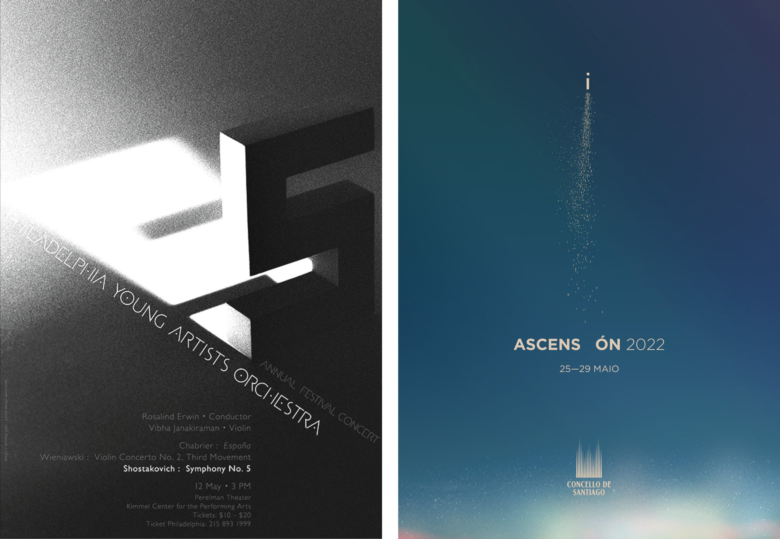
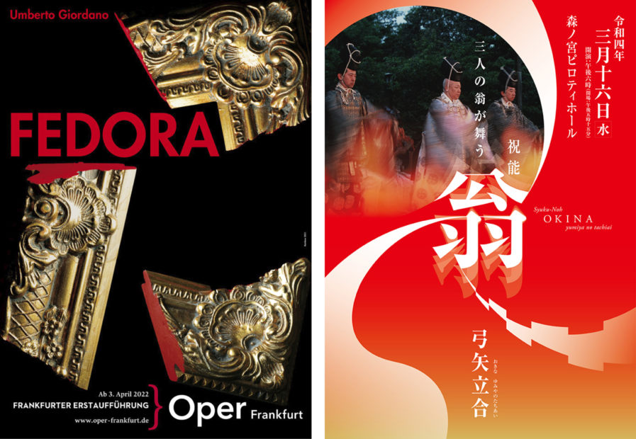
This week, we have a combination of former and current competition entries, with two gold-winning posters from our 2023 Poster Annual, and two new entries from our 2024 Poster Annual Awards Competition. Each of the posters showcased this week uses simple yet eye-catching designs to advertise various shows, festivals, and performances in a way that intrigues and invites the viewer to join them for the show.
Our first gold-winning entry comes from Gunter Rambow and was created to advertise a showing of “Fedora” (above, left) at the Frankfurt Opera in Germany. The opera tells the story of the Russian princess Fedora who sets out to seek revenge on the man who murdered her fiancee but ends up falling in love with him. The poster utilizes a motif of a broken frame, meant to symbolize the breaking up of the princess’ “picture-perfect” engagement. She dreams of happiness with her lover, but this desire remains nothing more than just a dream; even if he had not died, it is revealed that he was having an affair. The black background is simple and draws attention to the picture frame, while the stark red of the breaks and the text hint at blood and how this will be a dramatic and likely tragic story.
Today’s other gold-winning entry, “Noh OKINA” (above, right), is from designer Youhei Ogawa and his firm OGAWAYOUHEI Design. The poster advertises a new theater hall owned by the entertainment group Dance West, as well as a Noh show to celebrate the theater’s opening. Noh is a major form of classical Japanese dance-drama that dates back to the 14th century and integrates masks, costumes, and various props in a dance-based performance. Viewers get a hint of this with the three performers on the poster. Graphics representing three different dance rhythms circle inward to the kanji character for “Noh” at the center of the poster. The poster’s design works as a visual representation of the expression in the performance, and the color choice is also ideal, as red, white, and gold are considered the most auspicious colors in Japan, making them ideal for a festive poster such as this one.
