With over 550 entries, our Packaging 10 competition was a resounding success! Though the competition may be over, we still want to share a couple of favorites with you.
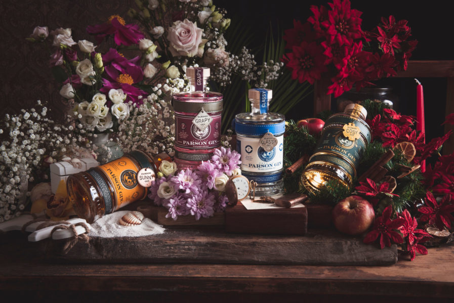
“Parson Gin” (above) is an alcohol inspired by the creator’s Parson Russel terrier dog that spent most of his time in the popular rooftop bar managed by his owner. Out of love for his canine companion, who happened to be named Gin, the creator creating exceptional premium gin and named it after his dog. With delicious flavors such as Sunny (mango, pineapple, papaya, and passion fruit) and Grapy (grape jurka with a hint of juniper berries), the brand is perfect for experience hunters who want “to adventure into something special.”
The bottle packaging is something special too, and was designed by Slovenian design firm Trampolin Multidisciplinary Studio for Spirits of the Alps, a high end online alcohol boutique and the offical online distributor for Parson. No bottle is completely alike; not only do the label colors differ depending on the drink type, but so does the woodcut logo, featuring an adorable image of Gin the dog wearing various hats. Another clever bottle accent is the leather coller wrapped around the glass, on which hangs a dog tag baring the name of the drink. All together, the Parson Gin bottles tell the company’s story and are a tangible product for consumers that stands out amongst competitors.
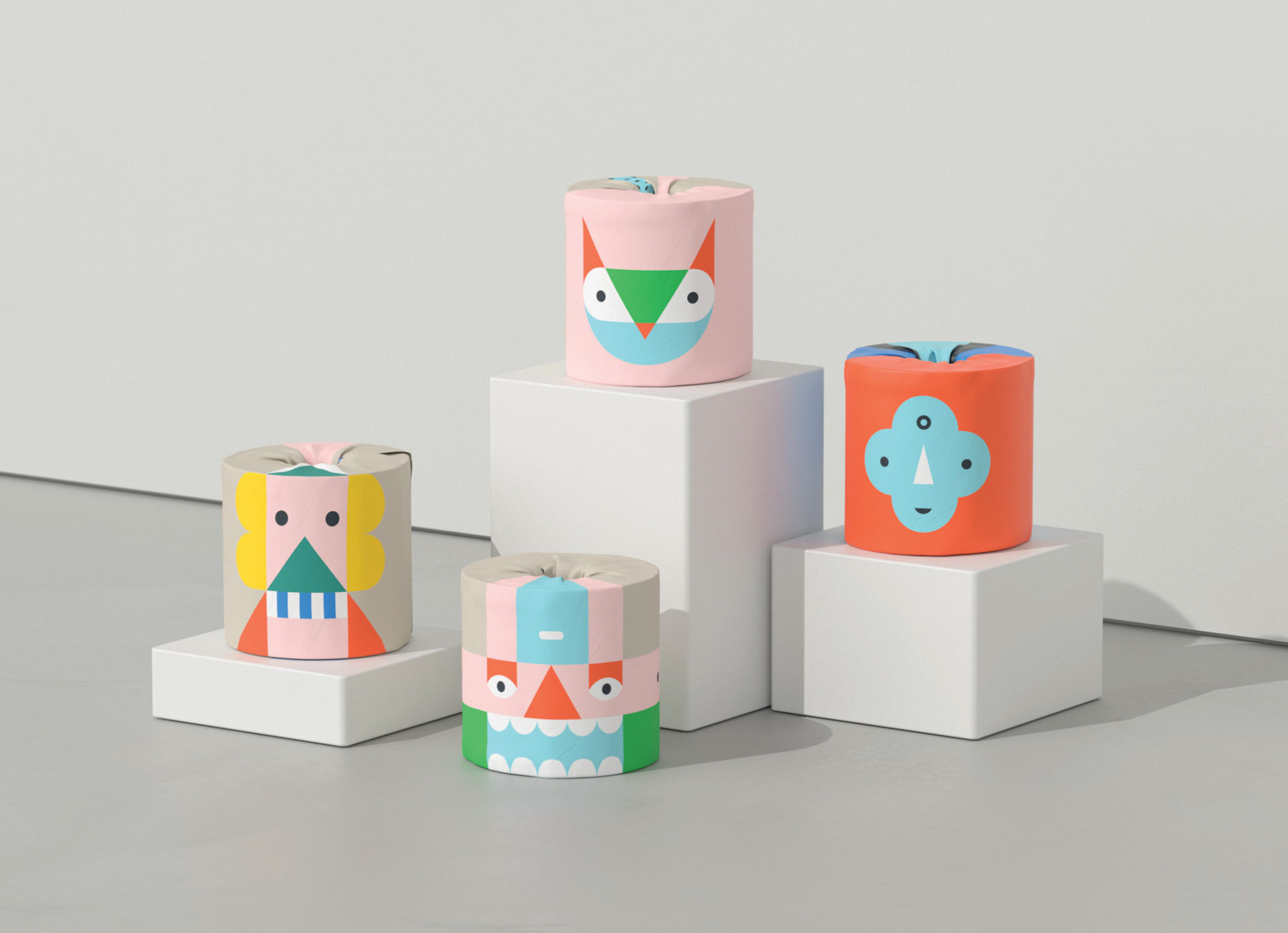
Toilet paper is used by millions every day, and it might be the last thing that you think would receive a proper packaging makeover, or even need one in the first place. In a creative change to get their brand out into the world, “Who Gives a Crap” rebranded to attract new customers to their toilet paper outside of the Australian market. While the name is hilarious, the company is serious in their goal to provide access to toilets to people all over the world, donating 50% of their profits to building toilets for those in need. In order to continue and grow their charitable business, they reached out to Australian design firm Studio Garbett for help.
“Play Edition” (above) created colorful, abstract packaging for Who Gives a Crap, transforming the typical plain white toilet paper wrapper with graphic shapes and colors as they depict stylized people, animals, and creatures. From the side, the wrapped toilet paper looks like large building blocks, and could totally be played with before use, which is what the studio wanted. “The Play Edition was designed to engage young and old in play. The idea for the range was inspired by children’s mix-and-match books — in that they can be stacked in different ways to make whimsical characters,” Studio Garbett said. “To take this idea further, the outer carton can be recycled and made into a stage for even more fun.”
To discover other amazing packaging entries from our Packaging 10 competition, visit graphis.com.