Designs with Soul: Latest New Talent 2022 Entries

Music and food are essential parts of life; one nurtures the body, the other strengthens the soul. Both are the focus of this week’s New Talent entries, who show great artistic talent in their design work!

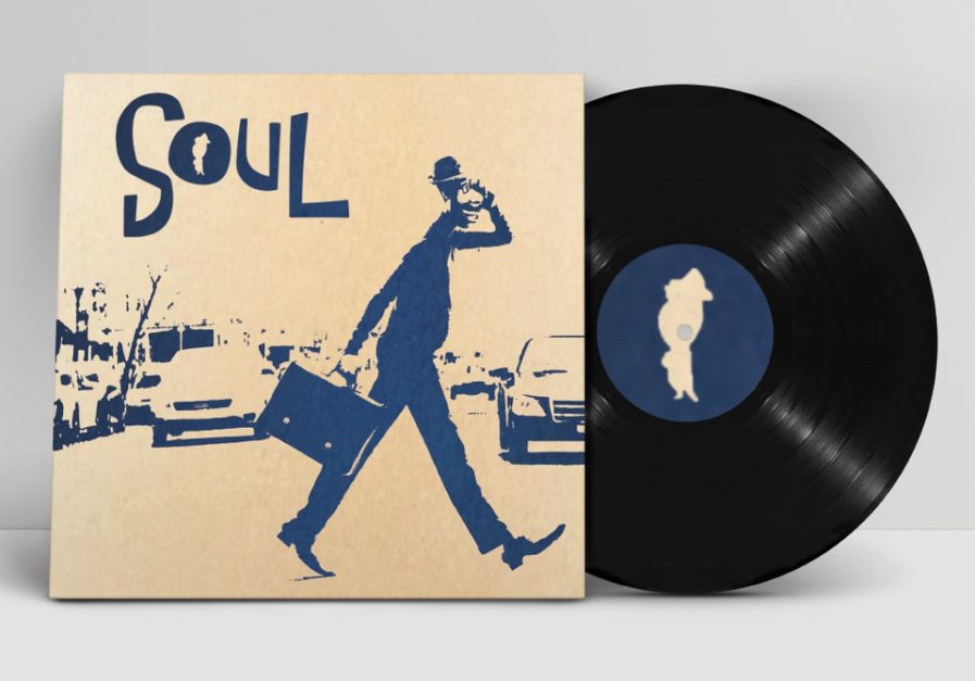
Pixar Animation Studios is a powerhouse in the world of animated films, producing one classic after another ever since it released its first feature film Toy Story in 1995. One of its more recent films is Soul, which came out last year. Featuring the voice acting talent of actor Jamie Foxx, the movie tells the story of Joe Gardner, a middle school music teacher who wants to make it big as a jazz musician. After an accident puts him in a coma, Joe must work together with 22, an unborn soul, to reunite his soul and body.

Disney’s Soul – Album Art and Movie Poster” (above) was designed by Keerthikeyan Dakshinamurthy from the Miami Ad School. A self-initiated student project with no professor assisting, Dakshinamurthy set out with this project to create a new reimagined version of both the album art and the movie posters for Soul. Generally a minimalist when it comes to his design approach, Dakshinamurthy decided to create a minimalistic cyanotype illustration for this series by using Photoshop and Illustrator. Against a basic beige background, the navy images stand out and are reminiscent of silkscreen prints, making great use of negative space to depict Joe and his surroundings. While his work was never actually published or used as promotional material, Dakshinamurthy was pleased with the final results.
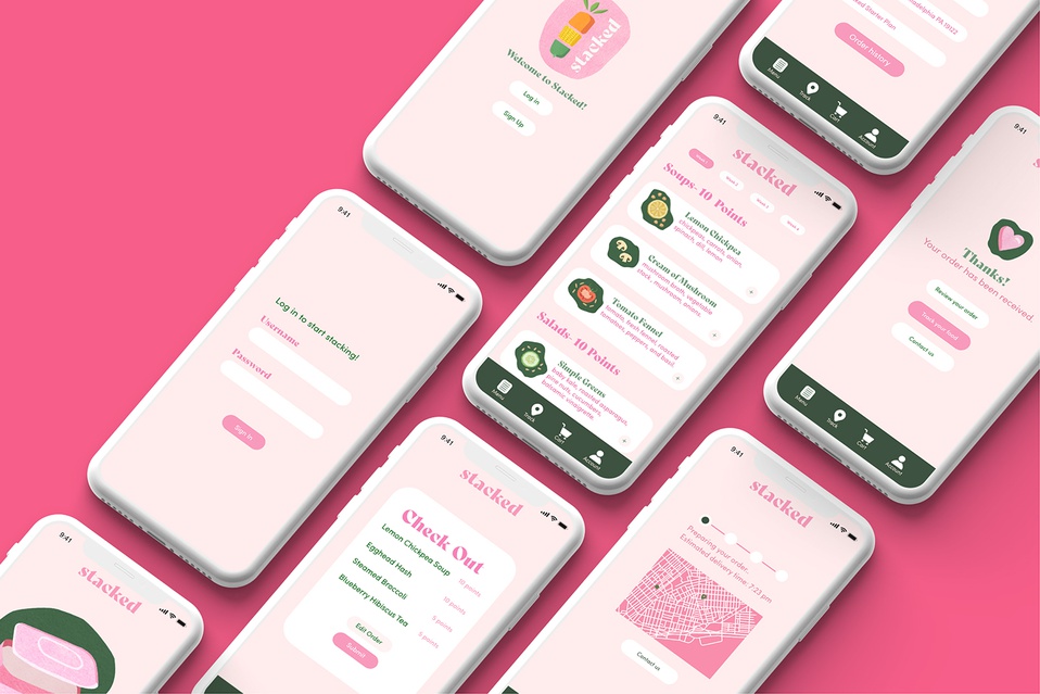
Going out to eat can be fun, but it can also be a hassle. During the COVID-19 pandemic, many restaurants had to temporarily close their doors, though many managed to get by thanks to take-out options. Yet take-out has its own challenges, as Rachel Bernstein, a student at the Tyler School of Art and Architecture at Temple University, discovered when working on “Stacked” (above). She was tasked by professor Abby Guido to create a concept and branding for a restaurant that could overcome the challenges of working with take-out during the COVID-19 pandemic. Within her groups, Bernstein did her research on the problem and eventually came to the solution to create a take-out-only restaurant.

The entire process began with the logo design. Bernstein knew that she wanted to have a concept that incorporated sliced stacked vegetables that showcased a fun and playful personality, but she struggled at first with such a direction since she wanted to make sure she had a solid foundation before she jumped from a sketch to a refined logo. However, as soon as she started to play around with construction paper textures, the concept came into clear view. She loved the style so much, she decided to stick with it through her whole brand, illustrating menu items for the app and using this style in her t-shirt, bike, packaging, and business card design.

As a result of this project, Bernstein explained she was able to learn more about the UX/UI process and expand her skills in branding and illustration, all while addressing the problem of sustainability and take-out during COVID restrictions. “This project helped me to become a more well-rounded designer and work with a team to tackle a goal,” she said.

To submit your own New Talent work, visit graphis.com.

Author: Graphis

Leave a Reply

Your email address will not be published. Required fields are marked *