Everyone knows the saying, “a picture is worth a thousand words,” and one of the best things graphic design can do is speak out. This week’s featured Protest Posters 2 entries are grabbing megaphones and raising their voices for issues across the globe.
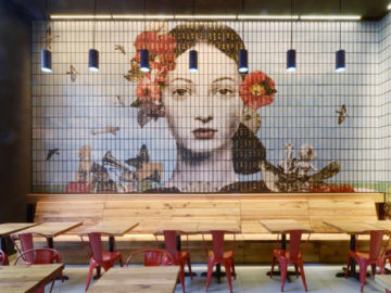
First up today is Graphis Master Boris Ljubicic and his design “+ – =” (above, left). Ljubicic is the founder of STUDIO INTERNATIONAL in Croatia, and is best known for his signage and logos. He self-commissioned this piece to illustrate the unnecessary hardships politicians place upon simple decisions due to their refusal to accept the controversial proposals that come up every election. Ljubicic takes the mathematical problem “+ – =” and turns it into a political problem, arguing that politicians could make decisions much more easily. To convey this message, he turns the symbols into a face; the plus and minus make up the eyes while the equal sign functions as a mouth. The addition of eyeglasses, Ljubicic says, is to represent transparency and clarity, because all political decisions need that.
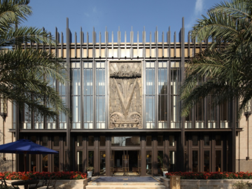
Next is “Humanity (Black = White)” (above, right) designed by Turkish designer Ceren Caliskan. Caliskan studied graphic design at Marmara University in Istanbul before completing her Masters at Dokuz Eylul University in Izmir and Nottingham Trent University in England. She was commissioned by Speak Up to create a poster illustrating “humanity.” Caliskan made her design rather simple, using black, white, and silver with her own special twist. “Humanity” is written in the middle of the poster with a black and white gradient transition. When the poster is turned to four sides, it is possible to read “humanity” over and over again. By designing her poster this way, Caliskan conveys a message of equality for all. After the Speak Up completion, her poster went on to be exhibited throughout Mexico.
