These packaging designs are out of this world! In today’s Packaging 10 Competition entries, these two very special products show us just how much thought goes into the simplest aspects of package design with names that befit life among the stars.
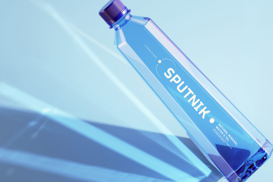
The design created by Mushkina Kate for “Sputnik” (above) did just that. Named for the famous satellite of the same moniker, the design of the Sputnik Mineral Water bottle is largely inspired by the 1957 Sputnik Satellite. The agency shared that in creating the design for Sputnik, they chose to focus a great deal on modern technologies, as that is the takeaway they wanted for their consumers. The shape of the bottle is made to resemble a satellite as a symbol of progress and to reinforce the idea that Sputnik remains modern, especially as it pertains to the labs and technologies they use to produce water. When it comes to the label, the agency opted for a minimalist design in the form of lines representing the orbit of a satellite rotating around the center of gravity. This was done to express both the purity of the water and the advanced nature with which this product was produced. Many of the design choices with the Sputnik Mineral Water bottle are subtle, yet still remind the consumer of a world beyond our own.
