In a time of crisis, a bold label brought a region together. When the winemakers of Ticino, Switzerland, faced plummeting sales during the COVID-19 pandemic, twelve producers united around a singular mission: to create a high-quality, affordable regional wine that could stand in for imported options on local restaurant tables. The result was “Uniti”— a collective Merlot Ticino DOC bottled under one striking label designed by Gottschalk+Ash Int’l.
Partner and designer Mattia Conconi approached the project not as a branding exercise, but as a cultural statement. Marrying a powerful typographic presence with a subtle regional symbol—the merlo (blackbird)—the design channels the graphic immediacy of political posters while honoring the quiet elegance of Swiss craftsmanship. For this visionary work, “Uniti” earned a well-deserved Platinum in the Graphis Packaging 10 Awards.
By: Mattia Conconi, Partner, Gottschalk+Ash Int’l
The Uniti project was developed as a response to the commercial challenges faced by winemakers of the canton Ticino during the COVID-19 pandemic. The objective was to create a collective wine that could serve restaurants with a regional alternative to imported products—one that was high in quality, affordable, and symbolic in nature.
Twelve winemakers came together, bottling their Merlot Ticino DOC under a single label. The project was a collaboration of multiple institutions and was supported by public funding, which enabled the wine to be sold at a competitive price.

G+A was commissioned to find a name and design the label. The design challenge was to speak on behalf of an entire sector, across different producers, without favoring any one’s identity. We were inspired by the collaborative nature of the undertaking, but even more by the opportunity to bring people back together again and to celebrate life after a long period of social distancing.
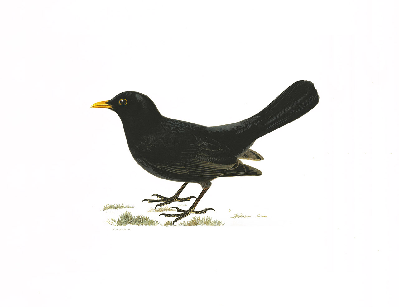
When we first received the brief, my partner Sascha and I explored approaches separately. Sascha revisited a symbol we had introduced years earlier: the blackbird (merlo in Italian), which we proposed as a quiet but meaningful sign rooted in local culture. The Merlot grape is believed to be named after this bird, which favors this fruit. I proposed a bold, typographic approach and a strong name—something that could immediately stand for the unity of the project. That’s when it clicked. The combination of the two ideas—the scale of the name and the subtlety of the bird—created something more than expected.
One plus one made three: The fusion of two distinct ideas produced a third level—more memorable, more resonant, more precise. This is the kind of amplification we often seek in our work. In communication, we try to create space for tension, precision, and, when it works, a kind of elegance.
Uniti’s visual approach is deliberately striking, bold, large-scale, and impossible to miss on the table or shelf. Its vertical layout and typographic weight borrow from the tradition of political posters: direct, public, and uncompromising. At the same time, the use of traditional hot-foil stamping adds warmth, tactility, and refinement, referring to the craftsmanship and elegance of the regional wine culture.
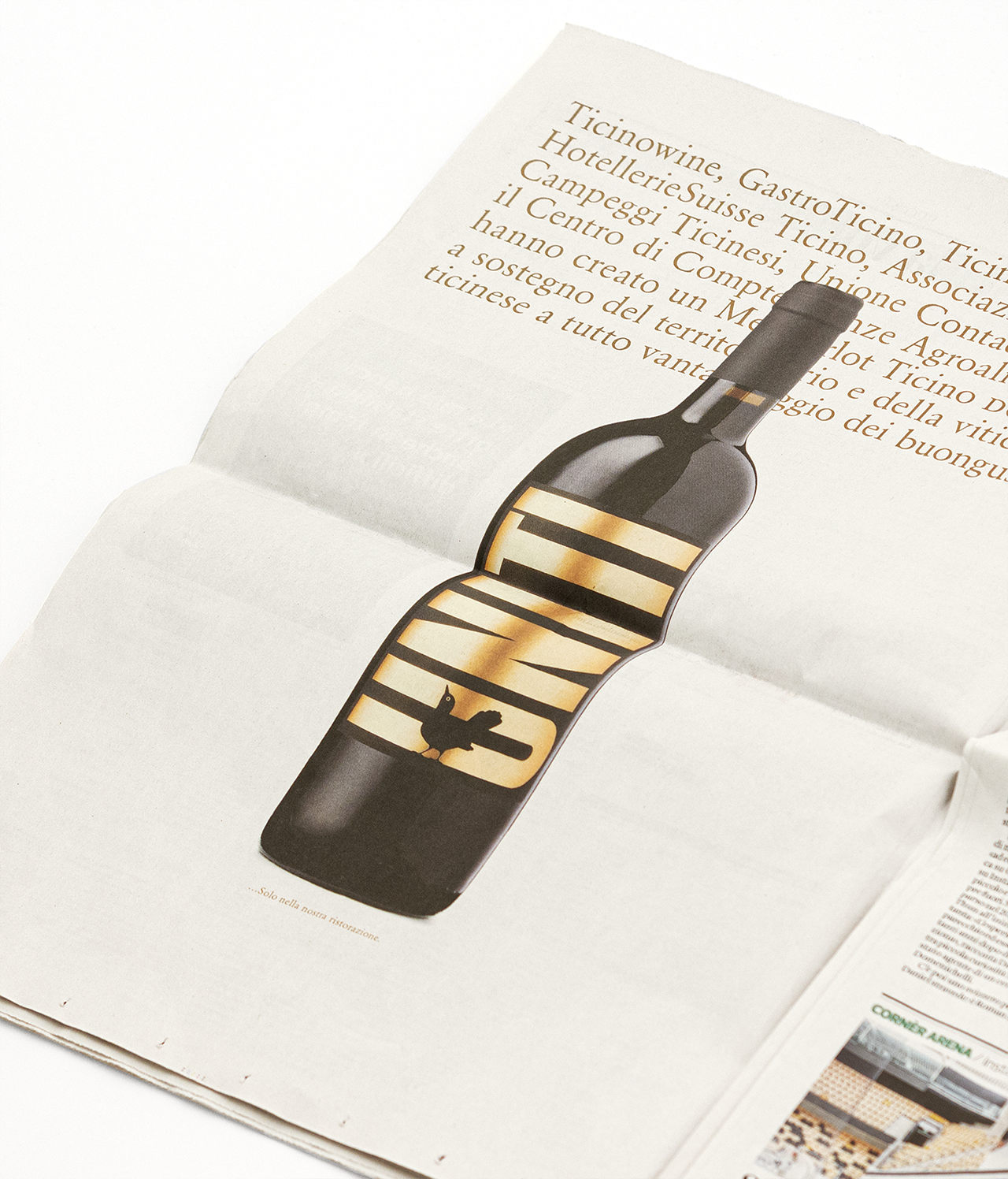
At the base of the label stands a blackbird, modest in size. It’s a symbol that doesn’t dominate, but anchors the story—a small but rich detail bringing nature, place, and viticulture together. There are no additional marks on the bottle. A name that is a slogan. No logo—just a symbol. Small and proud.
One thing that surprised us was how all stakeholders aligned behind the concept. With so many institutions and producers involved, we anticipated lengthy discussions and compromise. Instead, the clarity of the idea was the strongest confirmation that the design was right.
Over four decades, Gottschalk+Ash Int’l’s founders, Fritz Gottschalk and Stuart Ash, have played a leading role in taking Swiss design out to the wider world. Today, this approach dominates international design culture. It simply stands for a specific attitude that is applied worldwide. Its key characteristics: honesty, sustainability, masterful craftsmanship, and deep dimensional visual literacy.
The firm’s second generation, Mattia Conconi and Sascha Lötscher, carry this heritage philosophy forward, building on a prevailing foundation of strategic thinking, rigorous intellectual attitude, attention to detail, and passion for design.
Our approach proceeds from the conviction that strategic communication is first perceived by the eye, that successful solutions are surprisingly simple, that they are always compelling mentally and visually, and that they are rendered at a human scale.