With design work ranging from classic illustration to typography, logos, and icon design, Daniel Pelavin is known for his restrained yet sophisticated vocabulary of geometric forms, bold, rich colors, and letterforms that are inspired by a range of 20th-century cultural memorabilia. It’s this command of color and style that makes Pelavin a Graphis Master!
Pelavin was born and raised in Detroit, Michigan. Though he earned his BA in advertising and MFA in graphic design, he credits various apprenticeships with local art studios, along with his high school industrial arts classes, as his most valuable sources of training. His designs have been the subject of various books and magazines, and he’s also an instructor of illustration, design, and lettering, has written many articles on design practice and education, and has presented his work at design organizations and universities throughout the United States.
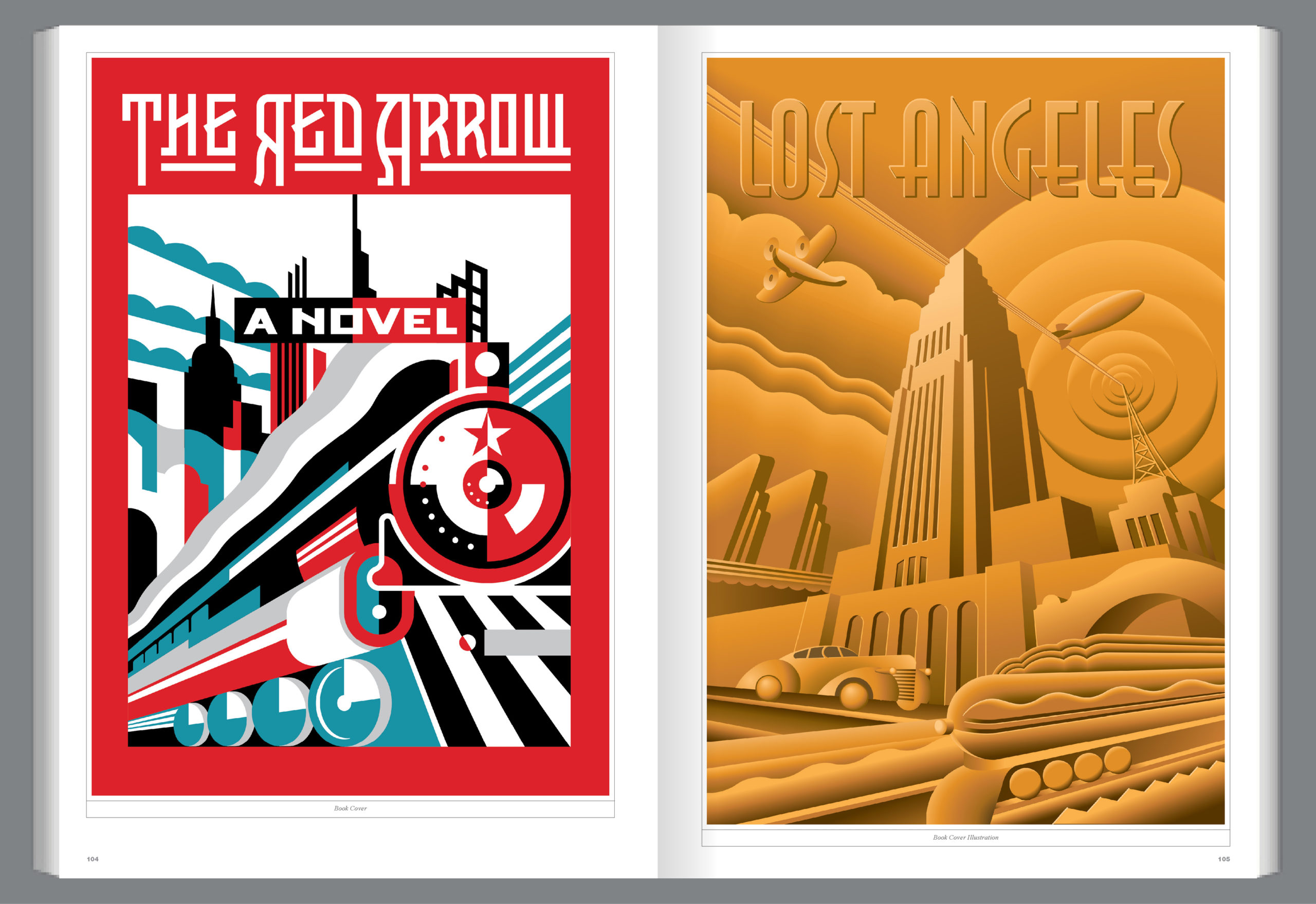
Pelavin’s hard-edged, bold style has been featured on everything from magazine and book covers to packaging. Whether it’s a postcard from sunny Costa Mesa (above, left) or a first-aid kit designed for the Top Doctors issue of Rhode Island Monthly (above, right), Pelavin’s clients can always count on his work to be colorful and fun. However, Pelavin always remembers the classic styles that paved the way for designers like him, and has never shied away from 20th-century forms, colors, and typefaces that are reminiscent of pop art and Art Deco styles, like in his book cover designs for The Red Arrow (below, left) and Lost Angeles (below, right).