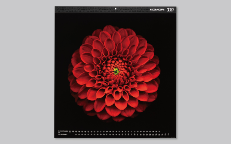
For any creative who has had the pleasure of seeing their work transformed by the skilled hands of a print craftsman, the tactile allure of a well-crafted print piece is undeniable. This sentiment is vividly brought to life in the “2023 Komori Calendar,” designed by TOPPAN INC. to commemorate the centennial of the Komori Corporation, a printing press manufacturer in Japan. Merging advanced printing techniques with breathtaking floral imagery by renowned photographers, this calendar challenges the digital norm and redefines sensory limits for print visuals. Honored with a Gold Award in the 2024 Graphis Design Awards, this calendar reminds us why, in a world of fleeting digital images, the permanence and texture of print are irreplaceable. Read on to learn how this exceptional calendar design champions print’s timeless beauty and tangible quality.
By: Masahiro Aoyagi, Designer & Art Director, TOPPAN INC.
This is a series of art calendars that have been disseminated for many years, making full use of the variety and rich texture of high-value-added printing expressions produced by Komori Corporation’s printing presses (UV printing, 8-color + coater unit). The 2023 edition, which marks the 100th anniversary of the company’s founding, was produced as a token of our gratitude to our customers and of our hopes and expectations for the future.

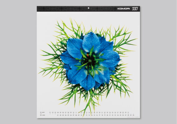
To expand the range of expression and experiment with a variety of print approaches for this special year’s calendar, we have used seven photographs of flowers by three internationally renowned photographers (Kate Scott, Jirawat Plekhongthu, and joSon) as the motifs. Each of the three photographers used their own interpretation and technique to capture the beauty of flowers, and there were many variations in color and texture.

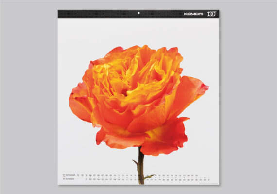
The beauty of the flowers’ original shapes, the smooth changes in color tones, the three-dimensional composition and color contrast with the painted water, and the presence or absence of background color can create a great many expressions just by expressing them as they are.
In addition, the effective use of special colors and the application of embossed varnish, gloss varnish, and matte varnish add a more complex three-dimensional effect and texture to the calendar, creating a calendar full of charm that cannot be expressed digitally but is only possible with the realistic material of printed matter.
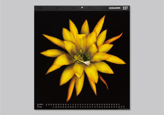

The trial-and-error process that led to the final product was a very meaningful experience in the making of this series. Sometimes, the expression we seek does not work out, but other times, we come up with an expression we did not anticipate. The more we repeat the process, the more it makes us think about what kind of expression we will try next time.
Masahiro Aoyagi is an art director and graphic designer. Since 1998, he has worked in the creative department of TOPPAN INC. He has worked on the art direction of corporate calendars and various other tools related to corporate branding, specializing in value-added printing and expression in printed materials using special processing. He is a member of JAGDA. He has won various awards, including three Graphis Platinum Awards; Gold, Silver, and Photography Awards at the Gregor International Calendar Awards; Gold, Silver, and Bronze Awards from BtoB Advertising; the Benny Award at the Premier Print Awards; and the Prime Minister’s Award at the All Japan Calendar Competition. He is also the winner of the All Japan Catalogue and Poster Competition.


