Sandstrom Partners: On Packaging
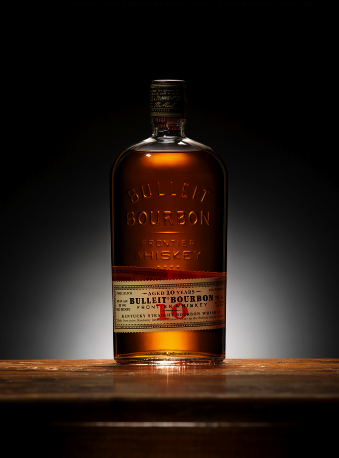
Tasked with reviving the brand of Bulleit Bourbon, a five-generation distillery in Kentucky, Portland-based Sandstrom Partners knew its success depended almost solely on packaging and shelf presence. So when the agency unveiled a design that not saluted the Bulleit family legacy, but accentuated the elegance of the whiskey bottle itself, the results were not surprising. Since its launch in 1999, Bulleit has enjoyed rapid and uninterrupted growth, placing it in stiff competition with Jack Daniel’s and Jim Beam, according to their website.
Graphis felt that this exquisite brand design had a place in our 2014 competitions as well, which is why we are pleased to award Sandstrom Partners a Platinum in our Graphis Design Annual 2014.
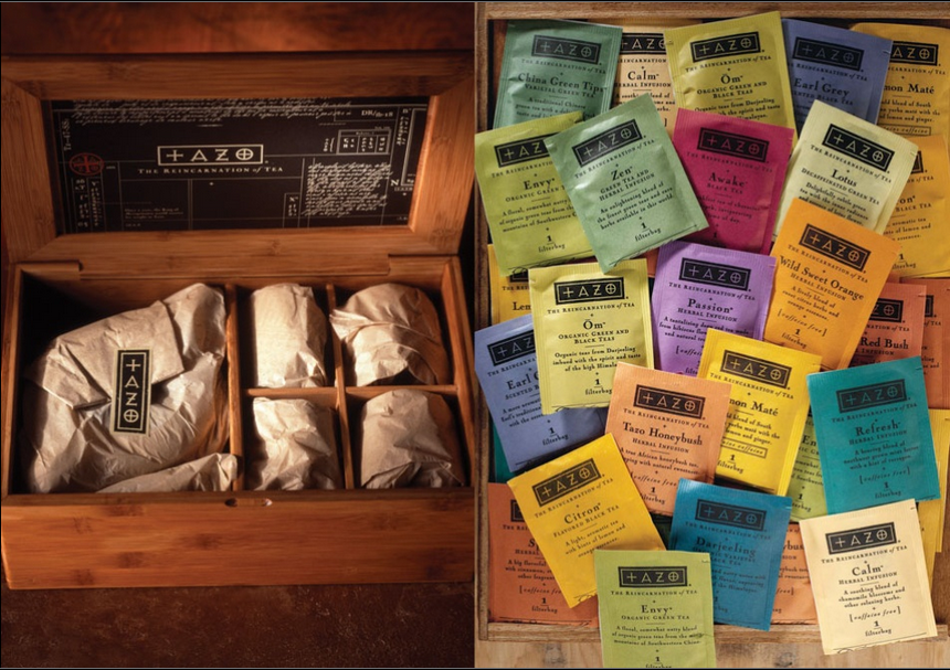
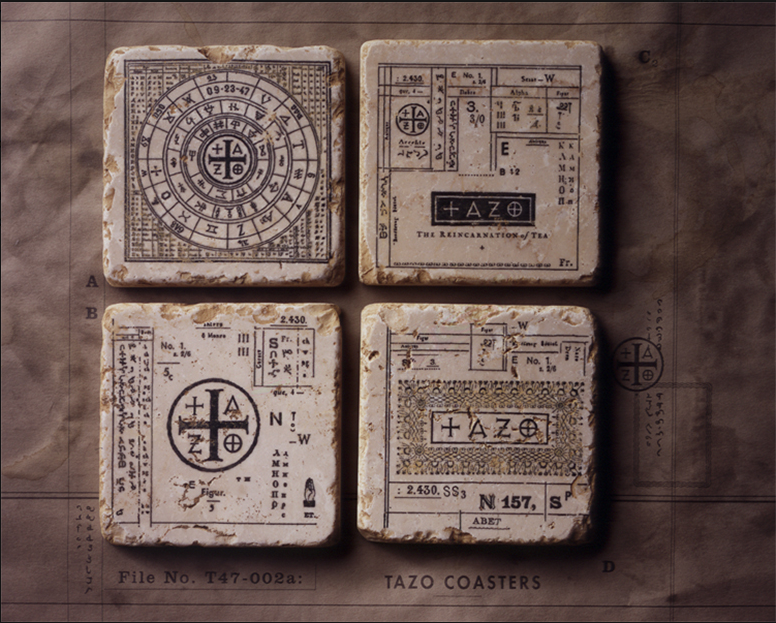 Executive Creative Director of Sandstrom Partners, Steve Sandstrom is a Graphis Master who has been represented in Packaging 8, Design Annual 2003 and Logo Design 7. His Tazo Tea: Branding Editorial was featured in Branding 5 and has been awarded numerous Graphis Platinum, Gold and Silver awards for other work.
Steve created the aesthetic, identity, promotions and packaging for St-Germain, a start-up french liqueur that has become one of the most distinguished brands in the spirits world. His firm played a key part in the resurrection of a nearly bankrupt Converse, an American athletic shoe brand. But perhaps his most significant achievement is his founding of Tazo, an award-winning tea company that spurred change in American perceptions about tea and would eventually be bought out by Starbucks.
In Packaging 8, Graphis asked Sandstrom to introduce the edition with an essay on packaging, which offers a look into his theory behind the work:
My deodorant has racing stripes on it. It looks more like a product that I might have purchased at an auto parts or sporting goods store instead of at the supermarket. I hadn’t given much though to these racing stripes before. I’m not exactly sure why this motif emblazons the face of this particular product, but it must have something to do with appealing to my masculine subconscious. Maybe the stripes are meant to represent or inspire an active lifes
tyle. An active lifestyle could create more perspiration, thus creating the need for more deodorant. Maybe the stripes are just an icon of machismo — a quick glance will let you know this stuff is for real men. Fast men. There is even a brand of deodorant called Speed Stick. Personally, these racing stripes and speed references don’t make me or my armpits feel any faster.
Many personal products for men are packaged with a similar approach — shaving products, in particular. From razor blades to shaving foam, racing stripes and other designs of speed seem prevalent. I wonder if anyone in the deodorant business has ever questioned this design solution or considered any other options.
There is nothing repulsive about the deodorant packaging on the retail shelves today. Nothing that looks terrible or threatening that it keeps one from purchasing any of it. There is nothing really good about it either. It is all about the same…I believe this kind of packaging and perception of product parity can be an opportunity for a brand to use design as a tremendous marketing weapon to help separate one product from the rest.
When a company adopts the strategy to apply thoughtful design to their packaging it can improve a brand’s image and market position by projecting its uniqueness and quality and by positively affecting how people feel and respond toward it. And sometimes it can create a shift in the entire category…Shouldn’t deoderant aspire to do better too? Isn’t it time for doderant to raise up its ugly self and move beyond the cotton swabs and dental floss, out of the shame of dark cabinets and drawers and on to the open bathroom counter of respect next to that fine cologne? I say it’s time for designer deodorant. And then it’s onward to the exclusive shelves of airport duty free stores. Let the shaving foam follow.
The Design Annual 2015 competition features the most compelling and influential design of the year. Prizes consist of gold and platinum awards, with winning entries published in the Design Annual 2015. To submit your own work to the Design Annual 2015 competition, click here.
To check out more work by Steve Sandstrom, click here.
Designer: Steve Sandstrom
Category: Packaging
Title: ‘Bulleit Bourbon Aged 10 Years’

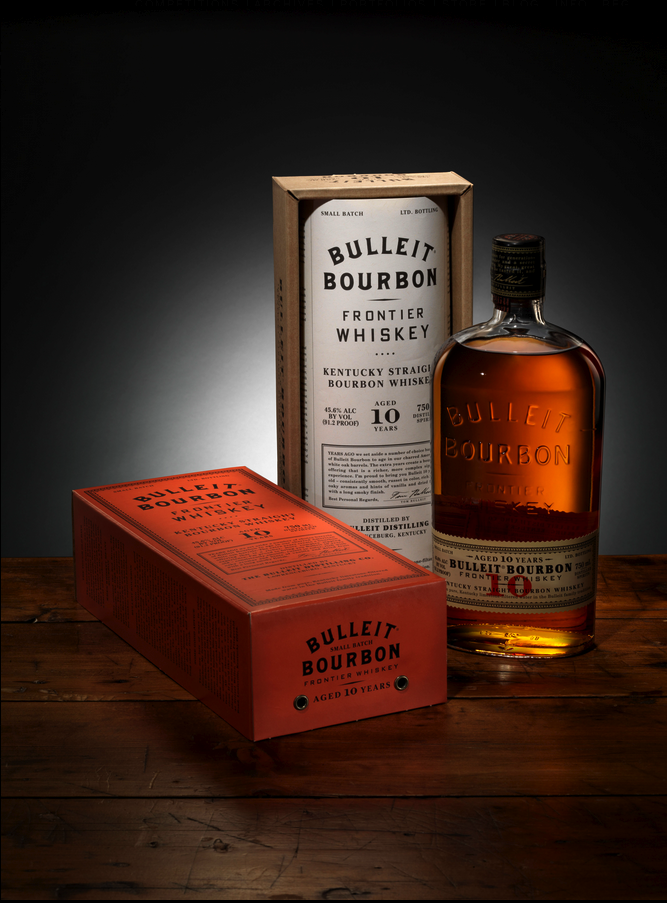

Congratulation to the Platinum Winner Spotlight Winner Sandstrom Partners! Great work Guys.