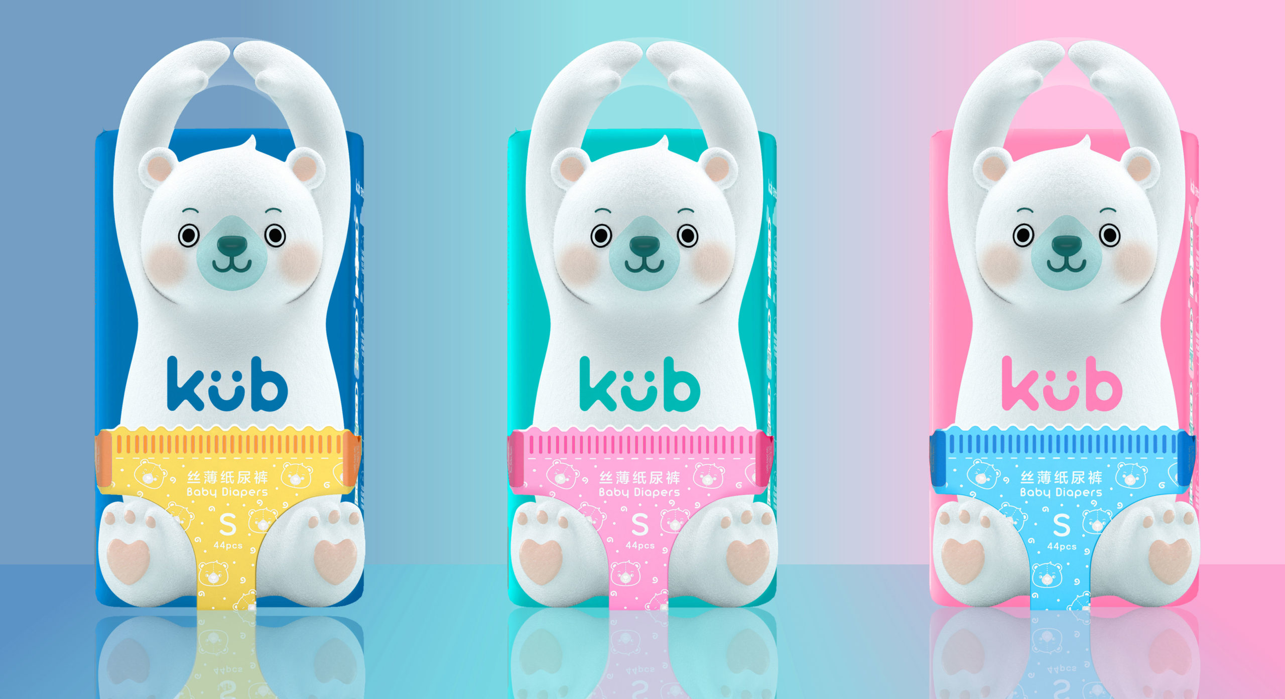
Are you thirsty for new packaging designs? Our Packaging 10 competition is still accepting new designs that range from cool and bold to absolutely adorable, and this week we’re sharing two entries in hopes to inspire others to compete and share their eccentric, clever designs.
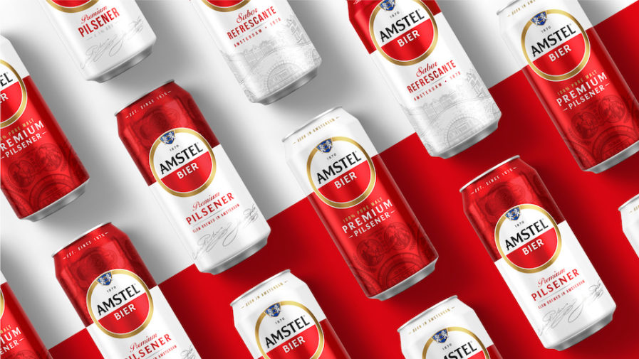
Who doesn’t love a nice, cold beer after a hot summer day? Found in 115 markets, “Amstel” is instantly recognizable; however, the brand’s essence was being devalued by substantial clutter and incoherence. The company needed some new flair to spice things up while maintaining its recognizable features. Amstel partnered with Elmwood designer Kyle Whybrow to rebrand the beer’s packaging. The idea was to amplify Amstel’s two key features: the iconic circle, and the red and white split. Whybrow re-crafted and elevated Amstel’s logo in the new identity, inspired by the rich history of the brand yet keeping it appropriate for a modern market. The newly refined Amstel typography was inspired by the best examples of the brand marque from over the years.
Three campaigns were established for the brand: ‘Born from better beer’, ‘Born in Amsterdam,’ and ‘Born from friendship’. These sayings honor an ingredient, a heritage, and a story of friendship respectively. This resulted in a series of illustrations on the packaging that championed the brewing process, including the Amstel River with its iconic bridge and the founders’ signatures.
