Want to promote your latest single or get a new look for your company? Look no further than these Design Annual 2022 competition entries!
Mike Hughes is the owner of Mike Hughes Freelance Art Direction in Quebec, Canada. Prior to starting his own design firm, he has worked in advertising for over nineteen years, including at Butler, Shine, Stern, and Partners. He has a background in art history, graphic design, metal-smithing, music, filmmaking, and photography. He has won several honors and awards since starting his own firm, including a Silver Medal from Graphis’ Poster Annual 2020 for his design for the Mill Valley Film Festival.
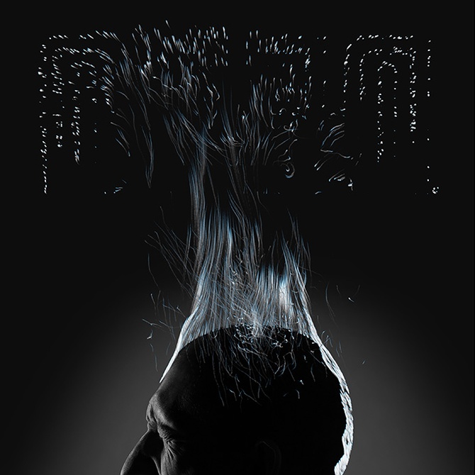
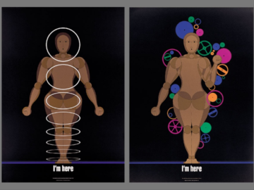
He designed “Mount Deed: Combusted” (above) for his band and their single. The goal of the project was to design an image that portrayed the message of the song, which is about the human spirit leaving the body after cremation. Cremation and the human spirit are conveyed in a way so as to be interpreted as light leaving the body; however, the light also transforms into a fire and, ultimately, stars at the top of the design. The stars cluster together to begin forming the Mount Deed logo.
As a result of Hughes’ design, “Combusted” went on to become the number one song on Mount Deed’s EP, has made it onto curated Spotify playlists, and has been downloaded multiple times through iTunes.
Ryo Shimizu is a graphic, UX, UI, and industrial designer, as well as the founder and CEO of Balloon Inc. In 2003, he graduated from Public University Corporation Nagoya City University, majoring in design and architecture. He started his career working at the OUZAK DESIGN FORMATION, in 2013 he established Ryo Shimizu Design Office. Five years later, he established Balloon Inc. He is also the design director of the TEDxKyoto since 2012.
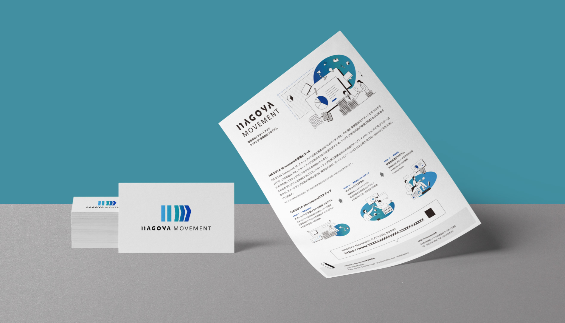
Shimizu was tasked to rebrand the NAGOYA Movement with a new overall art direction, symbol, logotype, and website design. The NAGOYA Movement, a government program that promotes co-creation with business companies in order to encourage the growth of start-ups. Established businesses and start-ups are paired up to create new “movements” through co-creation and by making and supporting long-term relationships.
With the word movement in mind, he created “NAGOYA Movement Brand Design” (above). The business’s initials were placed in an abstract rectangle, which was shaped as if it were moving toward the upper right to evoke movement. A gradation of different hues, from light blue to green and dark blue, evokes more movement as well. the brand through color. The original logotype design is a mixture of uppercase and lowercase letters to ensure readability and is intended to encompass a variety of values.