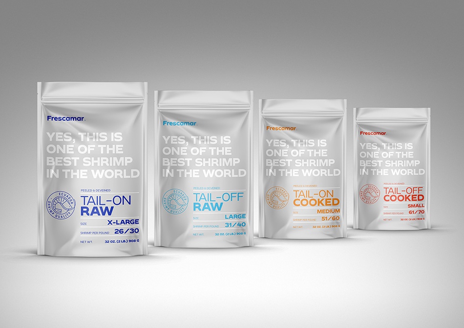
Delicious together and apart, coconut and shrimp are the featured products this week for the latest entries in our Packaging 10 competition, and these designs are good enough to make our stomachs growl!
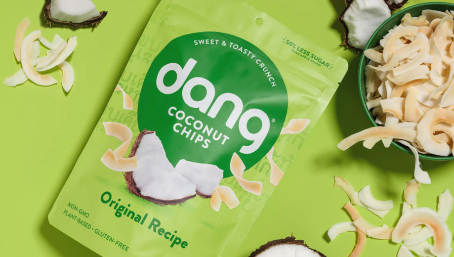
First up is the “Dang Packaging Redesign,” (above) made for Dang Foods by California-based Chase Design Group. Chase Design has studios in Los Angeles, Seattle, New York, and the UK, and has decades’ worth of hands-on experience through their vast and diverse team. Thus, they were the perfect choice when Dang Foods wanted to redesign its packaging. Dang’s snacks are inspired by their founder’s Thai-Chinese/American heritage and recipes from Mama Dang herself. Chase Design wanted to celebrate these cultural roots and the uniqueness of their products while also wanting to keep Dang from falling into either of the two categories that other Asian-inspired products often fall into — “overly stereotypical” and “modern but void of any cultural tie-back.” By identifying what they refer to as the “sweet spot,” they were able to create a visual brand identity that was culturally authentic without being stereotypical.
Dang’s new packaging is unified, featuring an updated watermark, bold colors, and photography that will make anyone’s mouth water. A subtle Thai type-pattern is screen-printed on the vibrant backgrounds and gives a subtle nod to Thai street food. Across the coconut and rice chips line, Dang’s logo is found in a bold circular badge, creating an eye-catching bullseye to attract attention on shelves. Through dynamic photography, the team was able to highlight the lightness and unique textures of the chips, with strong flavor cues increasing appetite appeal. All in all, any customer is likely to shout “Dang!” when they see these well-designed snacks.
