How you set up a photograph is everything; it’s a combination of the equipment, models, what makes up the set, and so much more. But when all the elements are just right, you get award-winning work.
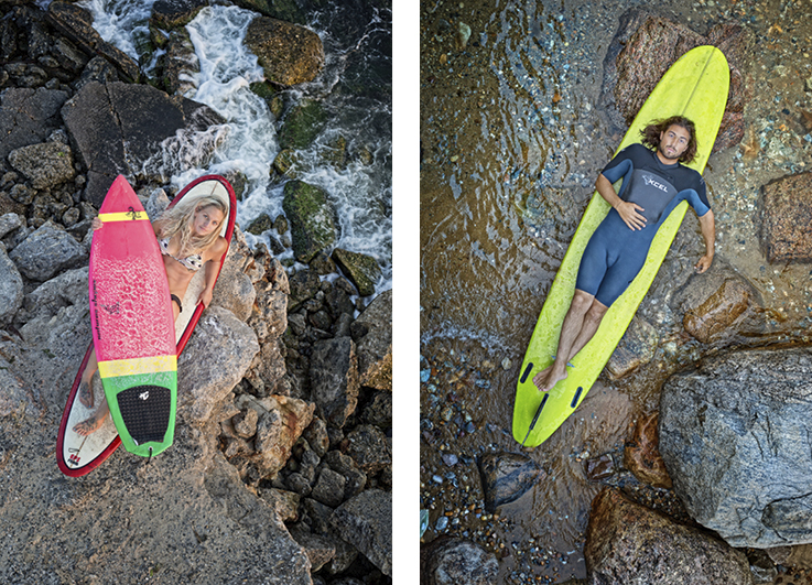
John Madere‘s “Tidal Anatomy” (above) is a Gold-winning photo series that explores the connection between surfers and their boards where the ocean meets the land. As Madere describes it, “A life of surfing has a profound influence on the faces and forms of those who are passionate about riding waves in much the same way that the sea sculpts the shore.” To depict this, Madere scouted New York and Long Island beach locations and recruited the most interesting-looking surfers he could find. Each shoot was carefully planned, and for each of the subjects, Madere balanced his camera on a 20ft high boom looking directly down on the surfers and their boards. Using a wireless connection to his laptop, he was able to direct and control the composition and all technical aspects from the ground. The collection of photos came together as a thoughtful tribute to his fellow surfer’s “beauty, dignity, and mystery,” depicting subjects of different ages on their personal boards, positioned against the backdrops of different beaches. The photos were soon published in the large format photo book Tidal Anatomy and were displayed in successful exhibitions hosted by New York City’s Site 109 Gallery and at the Rockaway Beach Surf Club.
