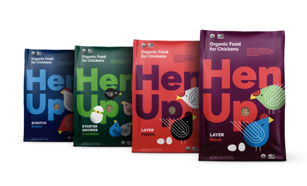
If you love birds, this week’s Packaging 10 entries are for you and any feathered friends you may have!
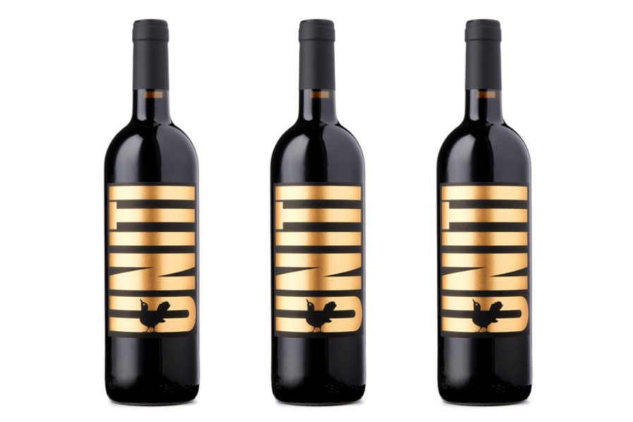
“Uniti – United” (above) was designed by Mattia Conconi from Gottschalk+Ash International. Founded by Fritz Gottschalk, this design firm has played a leading role in taking Swiss design, with its characteristics of honesty, sustainability, masterful craftsmanship, and deep visual literacy, out to the wider world. Over the past five decades, Gottschalk+Ash has produced successful solutions that are surprisingly simple, are always compelling mentally and visually, and are rendered at a human scale.
Swiss canton Ticino approached Gottschalk+Ash to design the label for their bottle of Uniti wine, which they made specially to help wine producers that suffered from the commercial impact of COVID-19. Along with Gottschalk+Ash, this project was a collaboration of different umbrella organizations: Ticinowine (promoting the local wine), GastroTicino (restaurants), Ticino Turismo (tourism), HotellerieSuisse Ticino (hotels), Associazione Campeggi Ticinesi (camping sites), Unione Contadini Ticinesi (farmers) and Centro di Competenze Agroalimentari (farming and nutrition). Twelve wine producers provided wines united under one label, which led to the name “Uniti” (which means “united”). A play on words gives the label its little bird image; the blackbird’s Italian name is “merlo”, and thus, the wine is a merlot! As wine is sold in restaurants and bars in Ticino at a very affordable price, the label is designed like a poster for all to enjoy.
