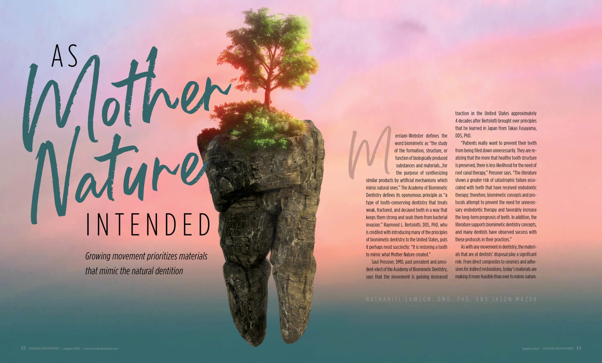
Innovation is key to human civilization; it’s made the world how it now is and will shape its future as well. Design is not only its own innovation, with new technolgies and styles being discovered, but it also promottes the innovations of others, whether it’s special funds or new teeth.
The LAGO Innovation Fund is a firm that provides venture debt financing for companies that “are engaged in disrupting the status quo in their native industries or creating de novo markets through the offering of innovative products, services or technologies, or by creating novel technology-enabled business models”. Referring to what they do as making an “innovation economy”, they believe that fortune favors the bold, and this applies to how they decorate their corporate headquarters in Chicago.
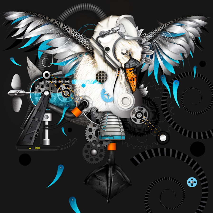
It’s no surprise LAGO reached out to designer and Graphis Master Michael Pantuso for a commission. Not only does Pantuso frequently takes on projects for charities, not-for-profits, social enterprises, and others groups where he can design with an impact, his style is original with an intriguing, multifaceted perspective. In “Serpentine Swan” (above), he harmonizes contrasting concepts: organic and mechanical, representational and abstract, symmetrical and asymmetrical. The titular bird taking flight is the central focal point of the piece, with geometric or machine-like constructs bursting outward to fill the surrounding area. One of the swan’s feet is reimagined as a rocket booster, and a helmet from a space suit crowns its head, allowing the animal to truly “take flight.” Decorative elements of bright blue and orange stand out among the otherwise high-contrast monochrome artwork, and the detail work is minute, capaturing feather fluff and gear teeth. While originally conceptualized as a pencil sketch, Pantuso expresses his final concept in full digital rendering with plans for a printed version, which the Lago Innovation Fund will hang in their headquarters in May 2022.
