Type Designer — Matthew Carter
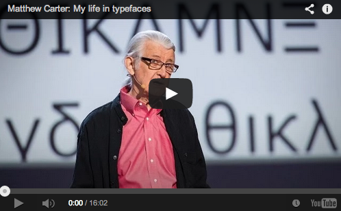
Matthew Carter, one of the most influential and prolific type designers of a generation, has thrived during the digital revolution. In March 2014, Carter delivered a TED Talk about the evolution of type design, something he witnessed and played a role in helping shape since he began his storied career in the 1950s in England.
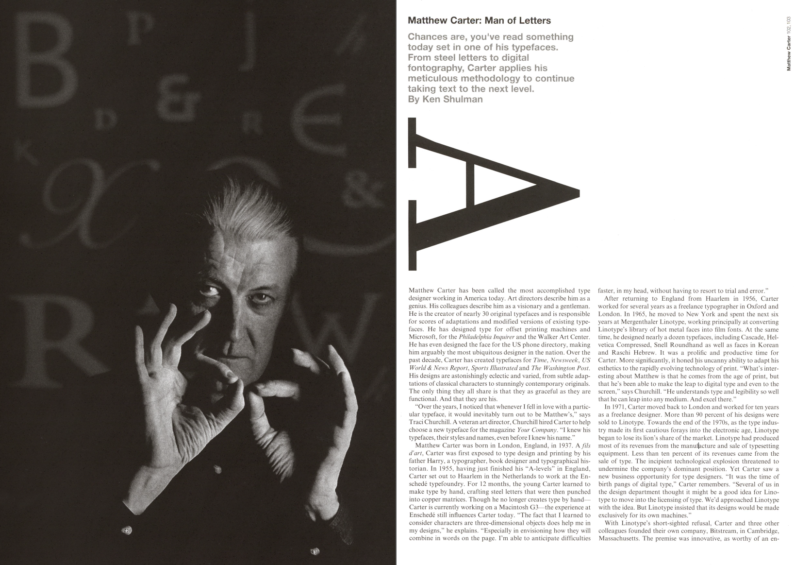
“Matthew Carter has been called the most accomplished type designer working in America today,” Ken Shulman wrote in Graphis Issue 325. “Art directors describe him as a genius. His colleagues describe him as a visionary and a gentleman.”
Carter, who was named a MacArthur Fellow in 2010, has designed more than 60 typeface families and more than 250 individual fonts. He created typefaces for Time and its rivals Newsweek and US World & News Report, as well as Sports Illustrated and The Washington Post.
Carter was first exposed to type design and printing by his father, Harry, who was a typographer, book designer and typographical historian. Carter learned to make type by hand at the Enschedé typefoundry in the Netherlands by crafting steel letters and punching them into copper matrices.
After unsuccessfully trying to convince Linotype to move into the licensing of type, Carter and three colleagues founded Bitstream, the first independent digital type foundry, in Cambridge, Massachusetts. The company was extremely successful in the 1980s, but the business and marketing demands did not allow Carter much time for type design. In 1991, he left Bitstream and set up Carter & Cone Type, in collaboration with his longtime colleague Cherie Cone, also based in Cambridge. He created the popular fonts Verdana and Georgia for Microsoft at Carter & Cone.
The venerable artist considers himself an industrial designer whose medium is type. For Carter, type is not a theoretical design or abstract problem. “They are tangible creations,” he told Graphis. “And it’s very important at the end of the day for me to know I’ve made something.”

