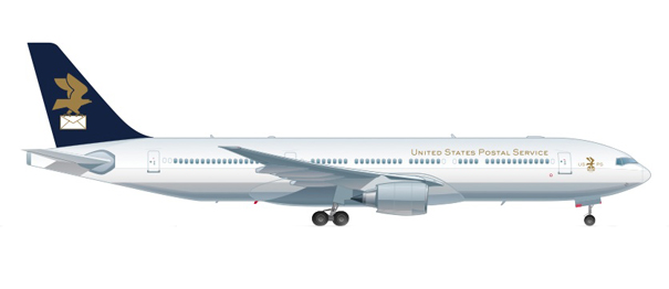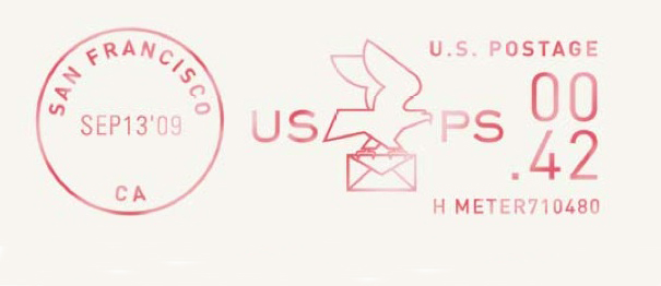
When Newsweek magazine approached Michael Vanderbyl earlier this year with a special assignment to rebrand the U.S. Postal Service, the San Francisco based designer didn’t hesitate.
According to Newsweek, USPS is projected to take a $7 Billion net loss by year’s end, putting the 234-year-old service in jeopardy of collapse. E-mail and other forms of electronic communication have, not surprisingly, cut into the postal service’s business.
Vanderbyl agreed a bold new look might help save the mail carrier.
Two other design firms—Air Conditioned [Design] and Werner Design Werks—were also tasked with the exercise.
The concepts were varied and well done, but Vanderbyl’s graceful contribution to the magazine especially impressed us. Vanderbyl, the principal creative force at Vanderbyl Design, recently wrote to Graphis to explain his postal design. Here’s an excerpt:
“I tried to create a refined look with a modern touch, while holding on to the importance of tradition. I’ve always thought it a little odd that the USPS has used the iconic eagle with no reference to actual mail service. As we become more connected globally, this new image — which incorporates a pictorial reference to mail — would be easily identifiable no matter what language the viewer speaks. I felt it was important to retain the image of the eagle, as it is symbolic of the United States… I wanted to create a more prestigious image for this institution, which we take for granted as part of our daily lives. I don’t believe there are too many companies or organizations founded in 1775 (with Benjamin Franklin being the first postmaster general) that are still in operation today. I felt the most successful solution would be one that leverages this staying power to reinforce their legacy of professionalism in the minds of customers.”
Graphis applauds Vanderbyl’s work and hopes USPS takes notice.
What does this design say to you? What would you change about the current USPS logo?


