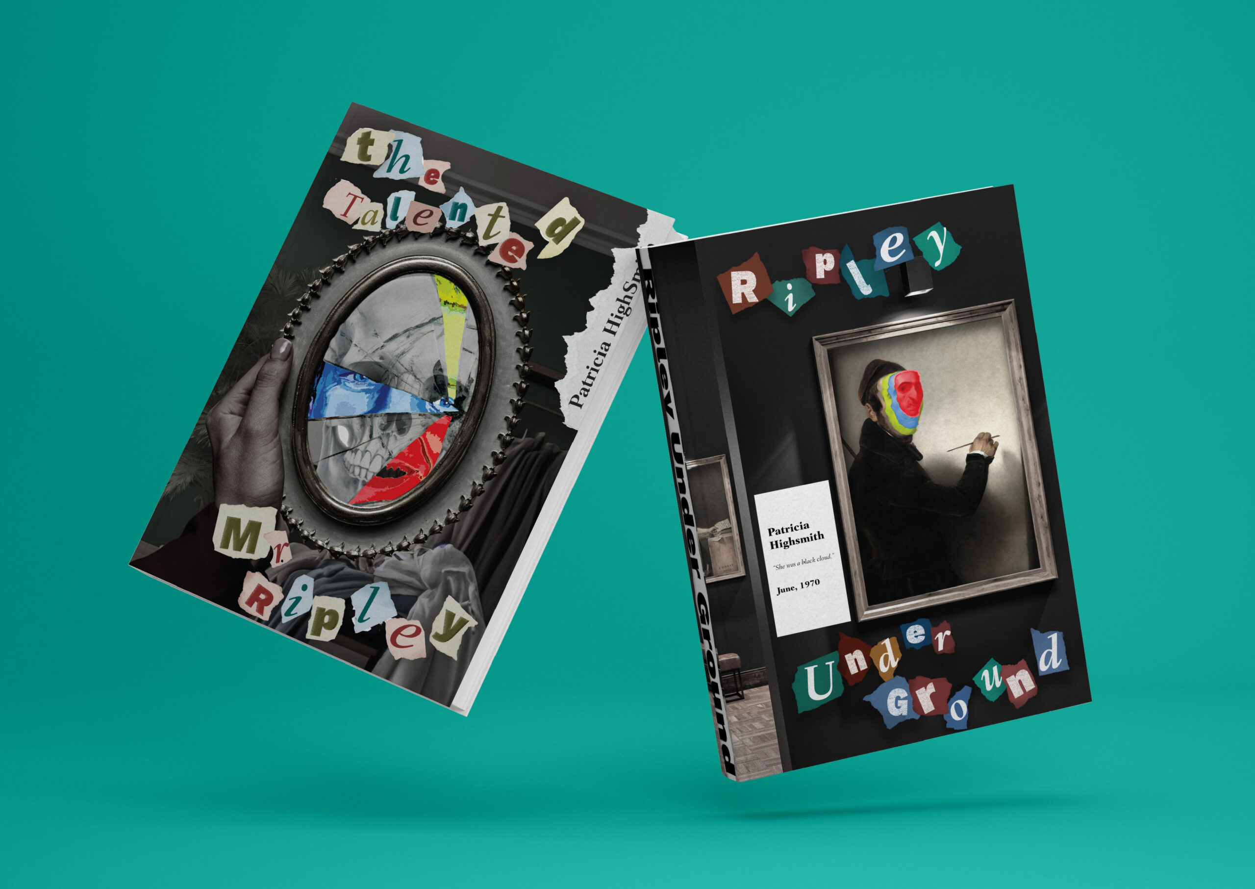
Lehigh University student Zoe LeiLi didn’t just redesign The Talented Mr. Ripley for her class project—she peeled back the layers of charm and deceit, letting the mystery grip you before you even cracked the spine. Her New Talent Gold Award-winning design captures the tension, danger, and allure of Tom Ripley’s twisted world.
By: Zoe LeiLi, Former Student & Freelance Designer
Have you ever been intrigued by the shadow side of the moon, the way it mysteriously reveals itself only to hide once more? This notion reflects a broader curiosity about the hidden aspects of human nature, which drives me to delve beneath the surface of everyday life.
Designers and psychologists share a fascinating common ground: Both must interpret and understand their clients’ underlying needs and intentions. This process can be mentally exhausting, especially when tasked with redesigning the cover of a renowned thriller series.
The Talented Mr. Ripley series, a classic psychological thriller, delves into the dark life of a charismatic yet dangerous individual. Tom Ripley, the protagonist, is a master of deception, seamlessly adopting various personas from an affluent youth to a sophisticated artist. In the first and second books, Ripley inherited considerable wealth from murder and sold fraudulent art to maintain his luxurious life. Despite his heinous crimes, his ability to evade justice keeps readers captivated and conflicted, often wishing for his continued evasion rather than his downfall.
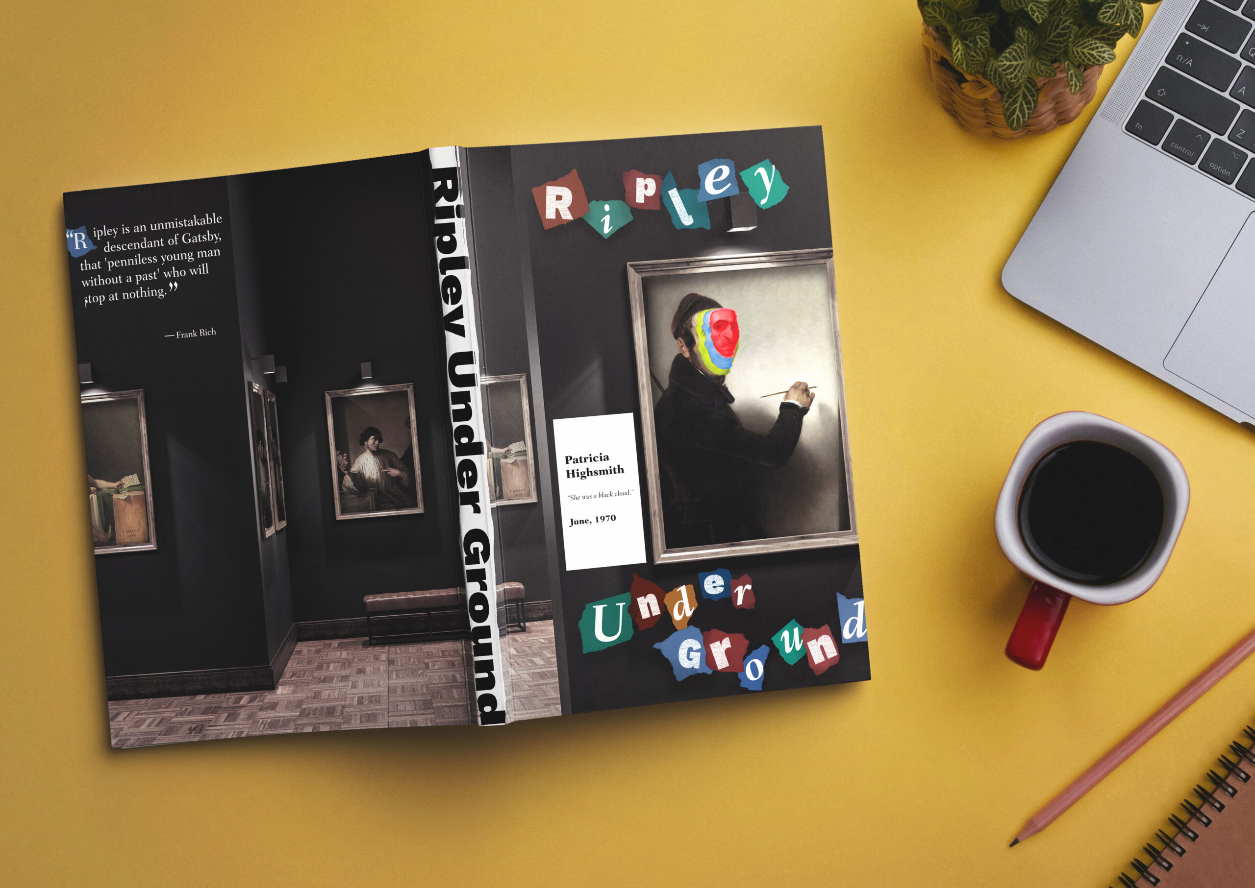
My fascination with the series was initially sparked by Matt Damon’s riveting portrayal in the film adaptation. This led me to explore the original works by Patricia Highsmith, whose portrayal of Ripley’s psyche is both compelling and chilling. Patricia’s writing draws readers into the mind of a brilliant yet malevolent character, and it was this deep dive into Ripley’s world that inspired me to redesign the book covers.
In redesigning the cover, I aimed to capture the series’ essence from a first-person perspective, creating a sense that readers are complicit in the unfolding drama. I wanted to evoke a sense of mystery without revealing too much, presenting a cover that intrigues and entices while remaining faithful to the book’s tone.
The design features a blend of mysterious scenarios and vivid illustrations that align with key plot elements, enhancing the suspense without spoiling the story. I chose Work Sans, a bold, etched font, to evoke a sense of gravity and foreboding reminiscent of archival documents and announcements. The stark contrast between the monochromatic backgrounds and the bright portrait illustrations highlights Ripley’s pivotal role in the series’ dark narrative.
This project has not only enriched my portfolio but has also offered a fresh perspective on design. It has allowed me to explore the designer’s role as a storyteller, author, or actor, embodying different personas to bring a creative vision to life. By stepping into these varied roles, I’ve discovered new ways to engage with the material and enhance my design process.