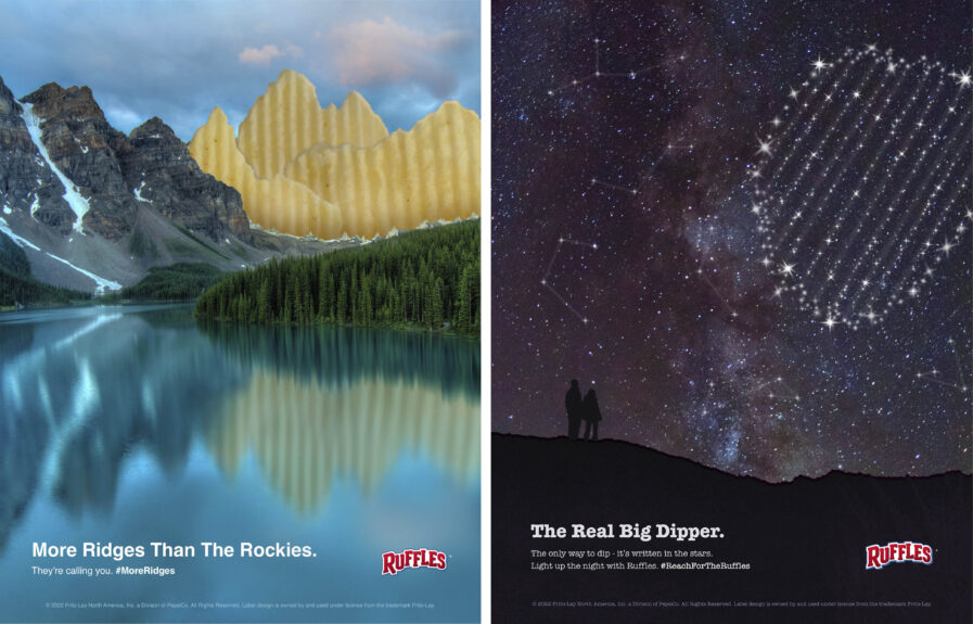
Rachel Stegall, a senior at Texas Christian University, earned accolades in the New Talent Awards 2023 for her mock advertising work for Ruffles under the mentorship of Professor William Galyean. Her projects, “More Ridges Than The Rockies” and the “Real Big Dipper,” take on these crunchy snack foods with a fusion of natural wonders in this imaginative approach. In “More Ridges Than The Rockies,” she cleverly juxtaposes the iconic ridges of Ruffles chips against mountain ranges, elevating the snack’s texture on a grandiose scale. The “Real Big Dipper” ad takes the concept to the cosmos, playing off the dip-centric nature of Ruffles and creating a whimsical and memorable narrative.
By: Rachel Stegall
More Ridges Than the Rockies
This piece, inspired by our very own beautiful Rocky Mountains, was created with the purpose of showcasing Ruffles’ bold product design in an equally bold context. When I was assigned this project in my Advertising course at TCU, I was tasked in choosing a popular snack brand and designing a print advertisement promoting their product. As a fan of the brand’s delicious chips, I chose Ruffles as my subject for the project.
The creative process for this design started with conducting extensive research on their branding, target market, and current marketing campaigns. With this, it was found that the brand prides itself in being the “Official Chip of the NBA,” which is emphasized in most of the company’s messaging and imagery. While this is an impressive title indeed, the company lacks a diverse advertising strategy and limits its target market to primarily millennial males. When a company has a product as uniquely engineered as Ruffles’ potato chips, its advertising should aim to highlight that, as well. The goal, then, was to promote the product’s unique selling proposition, their ridges, in a way that was more imaginative, eye-catching, and appealing to a wider audience. To accomplish this, more research was done in order to connect the product to different ideas and concepts that relate to its distinct features. After writing pages of headlines that reflected these ideas, and showing them to my professor, “More Ridges Than the Rockies” really stood out to us. The Rocky Mountains theme was ultimately chosen as the base for this concept, as it addresses the shared “ridges” of the mountains and the featured chips while emphasizing the chips’ significance through visual comparison.
For the technical execution of the advertisement, the iconic chips were photographed and composited into a scenic photograph of The Rocky Mountains. When planning the advertisement’s composition, I originally played with creating a mountain scene solely composed of the chips—however, this posed a challenge, as it didn’t communicate a clear comparison that connected with the proposed headline. To solve this, it was decided to include the photograph of the actual mountain range to hyperbolize the concept and create a more striking disposition. Finally, the visuals and headline were paired with body copy that strengthens the concept and calls out to the viewer.
The final advertisement was successful in bringing more creativity to Ruffles’ brand and promoting their chips in a new and unexpected way. I had so much fun getting to explore not only Ruffles’ unique story but also solutions and concepts that memorably told their story. My goal in design is to always bring these stories to life; I love connecting with whoever and whatever I am designing for so that I’m able to create meaningful work that viewers can experience fully and creatively.
This opportunity with Graphis means everything to me; I am so honored to have had a piece that positively reached this community and to have a chance to elaborate on such a significant time in my design journey. I am really looking forward to telling more stories through my work and deeply connecting with our world through something as special and beautiful as design.
The Real Big Dipper
This design for a Ruffles advertisement was inspired by the dazzling Big Dipper asterism and created to showcase the brand’s unique snack. When I was assigned this project in my Advertising course at TCU, I was tasked with choosing a popular snack brand and designing a print advertisement promoting their product. As a fan of the brand’s delicious chips, I chose Ruffles as my subject, aiming to highlight what makes their product out of this world.
The creative process for this project started with conducting extensive research on Ruffles’ branding, target market, and current marketing campaigns. With this, it was found that the brand frequently devotes its marketing campaigns to promoting its prestigious status as the Official Chip of the NBA. Although this title is very special in itself, the company limits its target market to primarily millennial males by not diversifying its advertising strategy. When a company has a product as uniquely engineered as Ruffles’ potato chips, its advertising should aim to highlight that, as well. The goal, then, was to promote the product’s unique selling proposition, their ridges, in a way that was more imaginative, eye-catching, and appealing to a wider audience. For this particular advertisement, I wanted to also highlight how these iconic ridges provided a better snacking experience for dips. To accomplish this, more research was done in order to connect the product to different concepts that relate to its distinct features and purpose. After coming up with dozens of headlines that reflected these ideas, “The Real Big Dipper” was one that my professor and I kept coming back to. The Big Dipper was chosen as the foundation for this design, as it plays off of the ridges’ main function for optimal dipping and uses a universal experience as a point of comparison for the viewer.
For the technical execution of the advertisement, a constellation of the Ruffles chip was rendered in a photograph of the dark night sky and composited with a couple of curious stargazers. When initially creating the constellation, there were difficulties in making its overall look consistent with the background image, yet distinct from it. To solve this, additional constellation shapes were subtly placed in the sky to create continuity with the chip constellation’s coloring and style. Finally, the visuals and headline were paired with body copy to strengthen the celestial theme of the design and create a call-to-action for the viewers.
The final advertisement was successful in bringing more creativity to Ruffles’ brand and promoting their chips in a new and unexpected way. I had so much fun getting to explore not only Ruffles’ unique story but also solutions and concepts that memorably told their story. My goal in design is to always bring these stories to life; I love connecting with whoever and whatever I am designing for so that I’m able to create meaningful work that viewers can experience fully and creatively.
This opportunity with Graphis means everything to me; I am so honored to have had a piece that positively reached this community and to have a chance to elaborate on such a significant time in my design journey. I am really looking forward to telling more stories through my work and deeply connecting with our world through something as special and beautiful as design.
Rachel Stegall is a BFA graphic design senior at Texas Christian University. As an ardent designer who loves storytelling, she finds great purpose in helping others bring their own ideas to life. She strives to create meaningful connections with whoever she is designing for, devoting her work to highlighting what makes them and their vision so unique. She’s not afraid to explore in her design process, as she looks to every person she meets, place she visits, and object she encounters for creative inspiration—give her a problem, and she will look in all directions for a solution.


