Everyone loves functional design. These featured Design 2023 submissions are hands-on with the happiness they provide their customers.
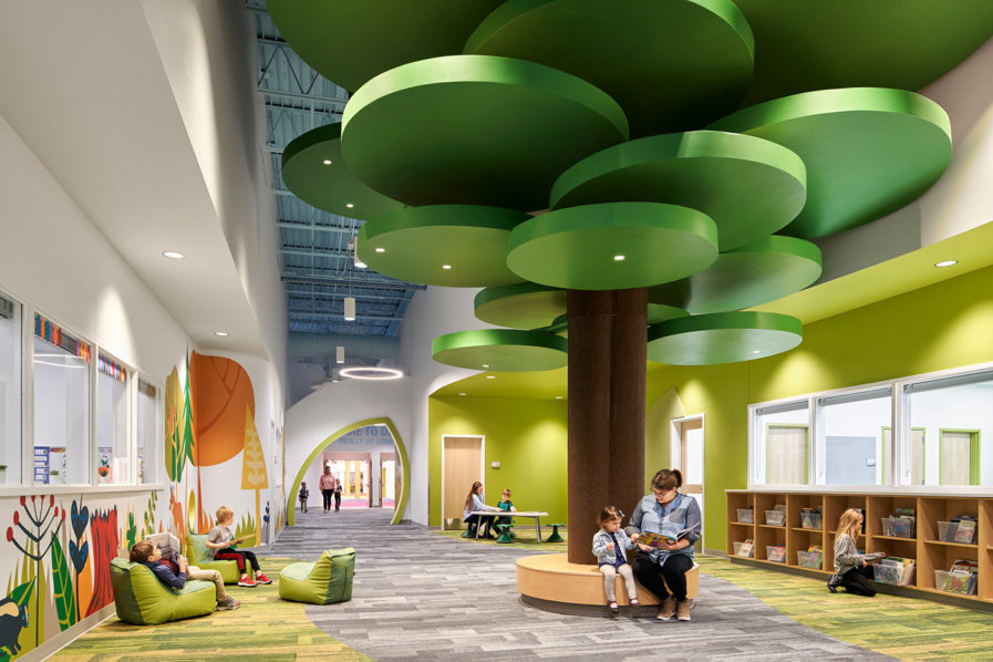
DLR Group‘s design for the “North Kansas City Schools Early Education Center” (above) responds to a unique group of early learners. The need to consolidate the district’s early childhood special education program, coupled with the need for more early childhood offerings in general, led the district to hire the DLR Group to adaptively combine and redesign an existing Hobby Lobby and Price Chopper. The result? One of the largest early childhood facilities in the state of Missouri, with 112,000 square feet to house approximately 900 early learners ages 3-5 (50% of who are special needs learners).
The facility’s interior finishes and planning are carefully considered to make sure all learners, both special needs and others, are afforded an equitable learning experience. Being such a large scale, the building is broken down into seven different learning communities designed around biophilic themes in nature, ranging from honeycomb to butterflies. Each community is meant to give learners a smaller cohort to interact and engage with while also having access to the facility’s many amenities, including multipurpose spaces with sensory experiences, expanded outdoor play, and pull out spaces for de-escalation and testing, as well as expansive discovery zones for additional indoor play. Equally important is the inclusion of teacher equanimity spaces, affording educators a space that is intended for adult interaction and collaboration. DLR Group even created a storybook based on the building’s environmental graphics.
So far, the results have been more than could have been expected. According to the firm, one of the greatest fulfillment of this project has been watching the children’s reaction to the graphics when they first see the space. The book that was spun off from the graphics is proudly displayed in all of their classroom windows and is available for the next storytime with the students.
