Did you forget that our Packaging 10 competition is open and still accepting entries? That’s okay! As a reminder of what kind of designs we’re looking for, here are the latest entries from our Packaging 10 competition.
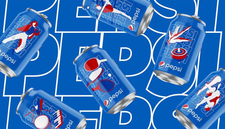
The “Pepsi For the Love of It 2020 Campaign” (above), created by PepsiCo Design & Innovation, was made to represents the passions and pastimes of China’s current generation. The design team was asked to make a series of six cans, with each design representing a favorite sport, activity, or locally trending interest that celebrates the passion points of China’s population.
Each can includes a depiction of a different sport such as rhythmic gymnastics, table tennis, synchronized diving, or shuttlecock/spinning top. Other can designs reference music and dancing, true to Pepsi’s heritage and brand spirit. The cohesive collection comes in Pepsi’s signature colors, completed with a bold and disruptive style. All together, the cans’ unique designs allow consumers to choose the can that most resonates with them to make Pepsi their own.
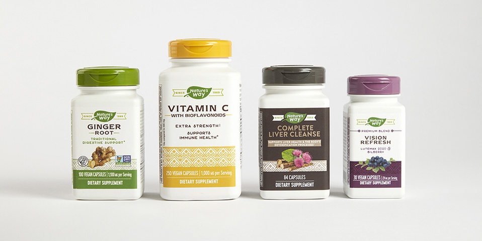
“Nature’s Way“, (above) was designed by Laura Healy of Ultra Creative for the brand of the same name. A trusted heritage brand in the vitamin, mineral, and supplements category, Nature’s Way was established in 1969 and boasts a loyal following. New entrants and fierce competition, however, became a threat to valuable shelf space and share of mind. To differentiate and assert credibility, the brand repositioned itself around their compelling sourcing story – that to have the purest botanicals you need to source them from the places they grow best, which Nature’s Way has always done.
This global story of respect for their farming and foraging partners and the places nature intended them to grow was the inspiration point for the brand strategy, package redesign, and logo refinement. With a portfolio in the hundreds, a disciplined and clean packaging architecture helped with product navigation; additionally, the color change established category differentiation between herbal supplements, minerals, standardized extracts, and premium tiers. Their brand longevity was also a point of difference and is celebrated in a banner framing a more modern take on their logo. To give the brand a design cue recognizable across multiple segments, Healy created an intricate and ownable pattern to frame the ingredient photography. The design has been rolled out across their full portfolio and implemented in all consumer touchpoints – TV, packaging, digital and social – with much success.