
Landor Associates submitted 9/11 Memorial Brand Identity to Graphis Branding 6, an elegant solution for The National September 11 Memorial & Museum at the World Trade Center.
From their website:
Defining a memorial’s public identity
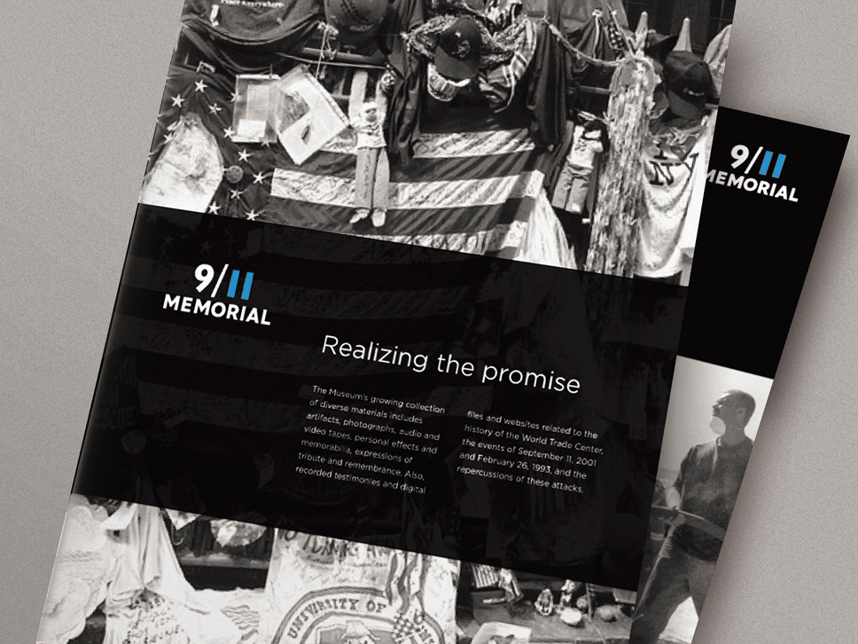
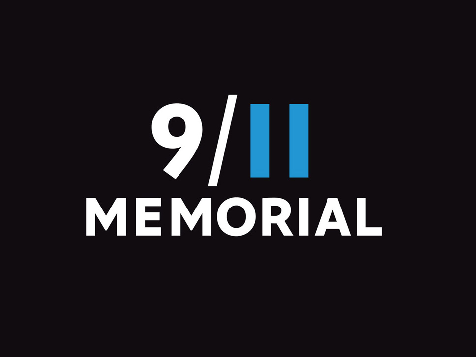
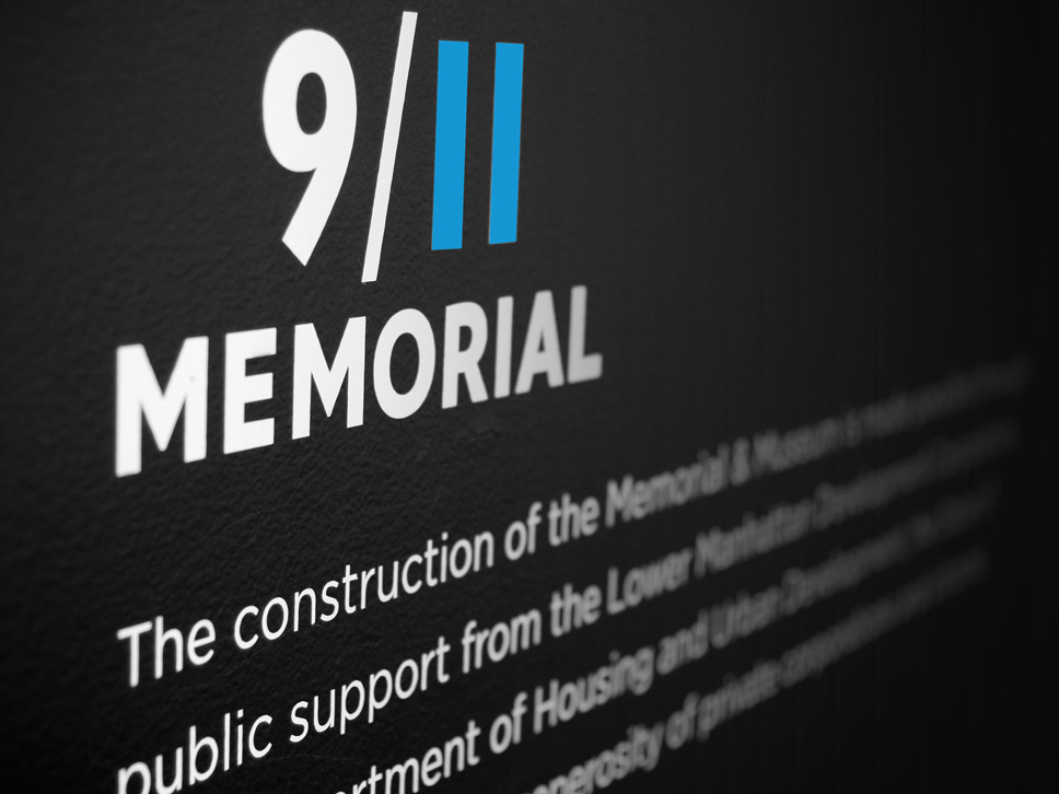
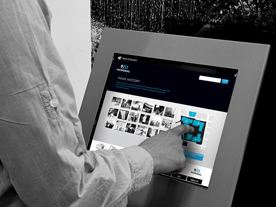
As development of the 9/11 memorial proceeded, many practical issues arose about its identity. Finding a balance between a compelling visual style and the proper mood was important. Our design uses modern yet timeless typography with the “11” crafted from two austere blue rectangles that reference the shapes missing from the New York City skyline.
Overview
The National September 11 Memorial & Museum is the nonprofit organization responsible for operating and overseeing the memorial being built at the World Trade Center site, and for programming and raising funds. Landor first donated our strategic expertise to the Memorial & Museum in July 2007 as part of our annual founder’s-day celebration. Our entire New York office participated in a Brand Driver™ workshop on the organization’s behalf. Its leaders were so impressed with our ideas that they called on us again in February 2009.
Challenge
As development of the memorial continued, leaders of the organization realized there were a number of practical issues with its identity. Its full legal name–The National September 11 Memorial & Museum at the World Trade Center–was too long and unwieldy for most applications. This caused various audiences to create their own shortened versions of the name, leading to inconsistent use and public confusion. The identity, which included the full legal name, was also limiting–it was hard to read, lacked impact, and did not reproduce well.
Solution
We created a new 9/11 memorial identity that is effective in its simplicity. This idea was the guiding principle of our work and informed the type choice, weight, color, and arrangement. Finding a balance between a compelling visual style and the proper tone and mood for the memorial was important. The typography is modern yet timeless, and the eleven is crafted from two austere blue rectangles that reference the shapes missing from the New York City skyline. Combining the date with the building silhouettes creates an essential connection in people’s minds. It is also elegant: a characteristic required by a historical institution whose role is remembrance and education.
Designer: Rietje Gieskes
Client: 9/11 Memorial
Title: 9/11 Memorial Brand Identity
Creative Director: Craig Dobie
Design Firm: Landor Associates
Branding 6 presents interviews, company profiles and visual histories of some of the biggest names in design and retail today, including: Q&A with Pentagram, WAX, People design, Cue, Firewood, The General Design Co., Studio International, and Alt Group. All that, plus hundreds of images from the year’s Graphis Gold Award-winning branding campaigns.


