As the Chair of BFA Comics & BFA Illustration at the School of Visual Arts, Viktor Koen’s work hits you like a slow burn—creeping in with striking visuals before unraveling into something more profound. His Gold Award-winning posters for the School of Visual Arts (“The Yellow Wallpaper” and “SVA Blood Drive”) showcase his ability to turn the eerie and unexpected into visual statements. With a ghostly house that seems alive and a blood drive poster channeling Nosferatu, Viktor mixes dark allure with a fine-tuned design sensibility, creating haunting narratives waiting to be unraveled, one detail at a time.
The Yellow Wallpaper
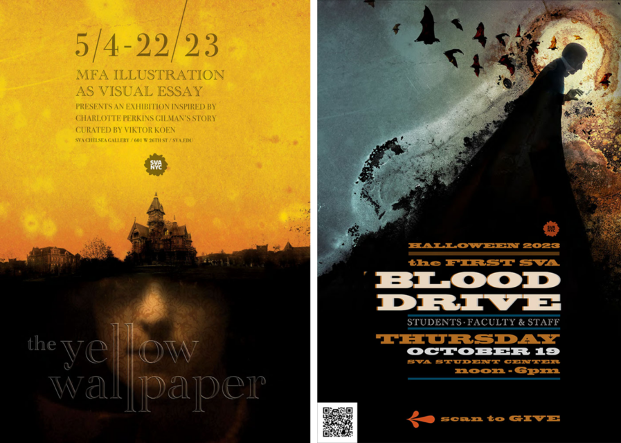
The announcement for the School of Visual Arts MFA Illustration Department exhibition is based on the short story The Yellow Wallpaper by Charlotte Perkins Gilman. A ghostly house, a haunted wallpaper, and the color yellow inspired this cryptic composition where everything happens under the surface. As a result, this mysterious poster attracts attention with its stark composition and atmospheric depth while inviting the discovery of hidden clues layer after layer. This mirrors the gradual succession of events to the narrative’s eerie conclusion.
Designing a hauntingly anthropomorphic wallpaper texture was my first inclination, but after sketching what this could look like, it felt limited, repetitive, and flat. Featuring the house as a protagonist presented a better solution as I researched for period ingredients that could compose an intimidating structure with enough character to make it stand out as the central focal point but also morph into a shadow for the bottom part of the poster.
Adding some delicate textuality to this bold composition, the large portrait was adorned by a faintly detectable wallpaper I photographed at a once grand hotel in New York some years ago. Bates Motel aside, leaving the light on in the second-floor bedroom proved irresistible.
At first, typography scratched by fingernails seemed like a solid idea (I like to first opt for type solutions organic to the illustration), but my initial tests looked nothing like what I had in mind, and I found this to be a dead-end. In retrospect, an overdramatic type solution would have competed with the hunting yet alluring atmosphere the image tries to project. The design required a typeface that would not look like an obvious period choice but wouldn’t over-modernize it either. As a final touch, embossing the type unit adequately wallpapered it; the rest is history.
SVA Blood Drive

