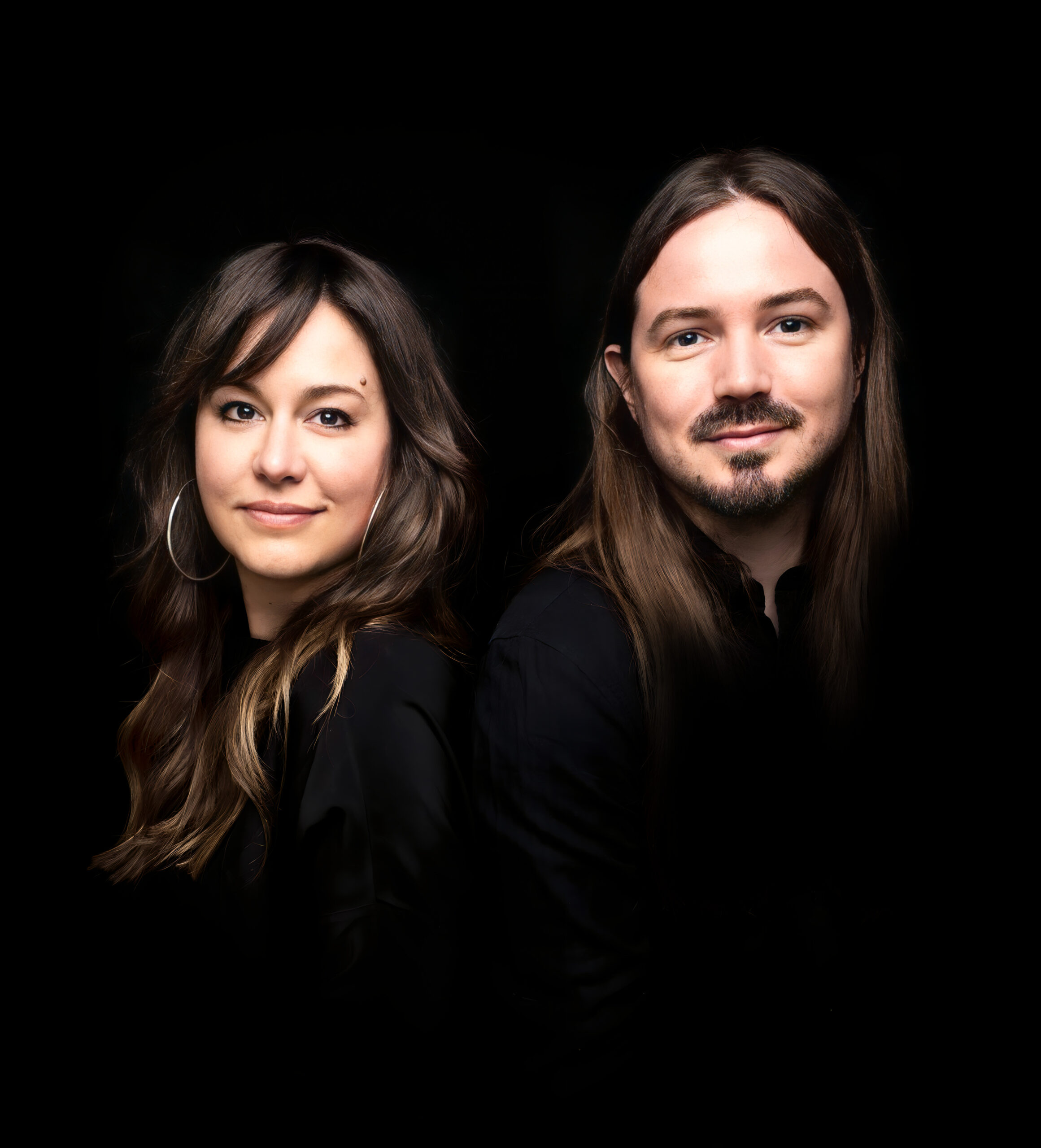
Some artists create posters. SEAN & EVE craft experiences. The UK-Canada creative duo, Sean Freeman and Eve Steben, have built a reputation for turning type into something you can feel—sculptural, dynamic, and alive. Their latest projects for Ed Sheeran and Lewis Capaldi, commissioned by Another Planet Entertainment, are more than concert posters; they’re collector’s pieces, visualized emotion, and a masterclass in how typography can transcend words. Infused with movement, texture, and rich storytelling, these designs transform Ed’s stripped-down intimacy and Lewis’ sweeping melodies into stunning, tangible forms.
By: Eve Steben, Co-founder, SEAN & EVE
The Beginning: A Love for Words
The spark for creative lettering started many moons ago with illustrating song lyrics—a way to visually translate the emotions embedded in music. We really love the beauty and impact of lyrics and the way they cleverly tell a story. This naturally marries well with our fascination for words and their deeply evocative visual power, which became a defining perspective in our work. Through our creative lettering practice, we embrace craft to create something that speaks beyond words. It’s about turning language into a visual experience, making people feel something before they even read the message. Words inherently explain something, but when you add shapes, texture, layers, and unexpected materials, they take on a new life, resonating with meaning in a way that’s instantly understood. That’s the magic of typography—it’s universal, immediate, and endlessly powerful.
Designing concert posters is our creative playground, where the brief is to bring a name and a music aesthetic to life as an image without boundaries. It’s our special place where we get to experiment together, explore our creative wishlist, and have fun. These music pieces are always developed as an open-ended process, a refreshing image-making journey that always brings us to beautifully unexpected places.
A Flight of Type & Texture: The Making of Ed Sheeran’s Poster
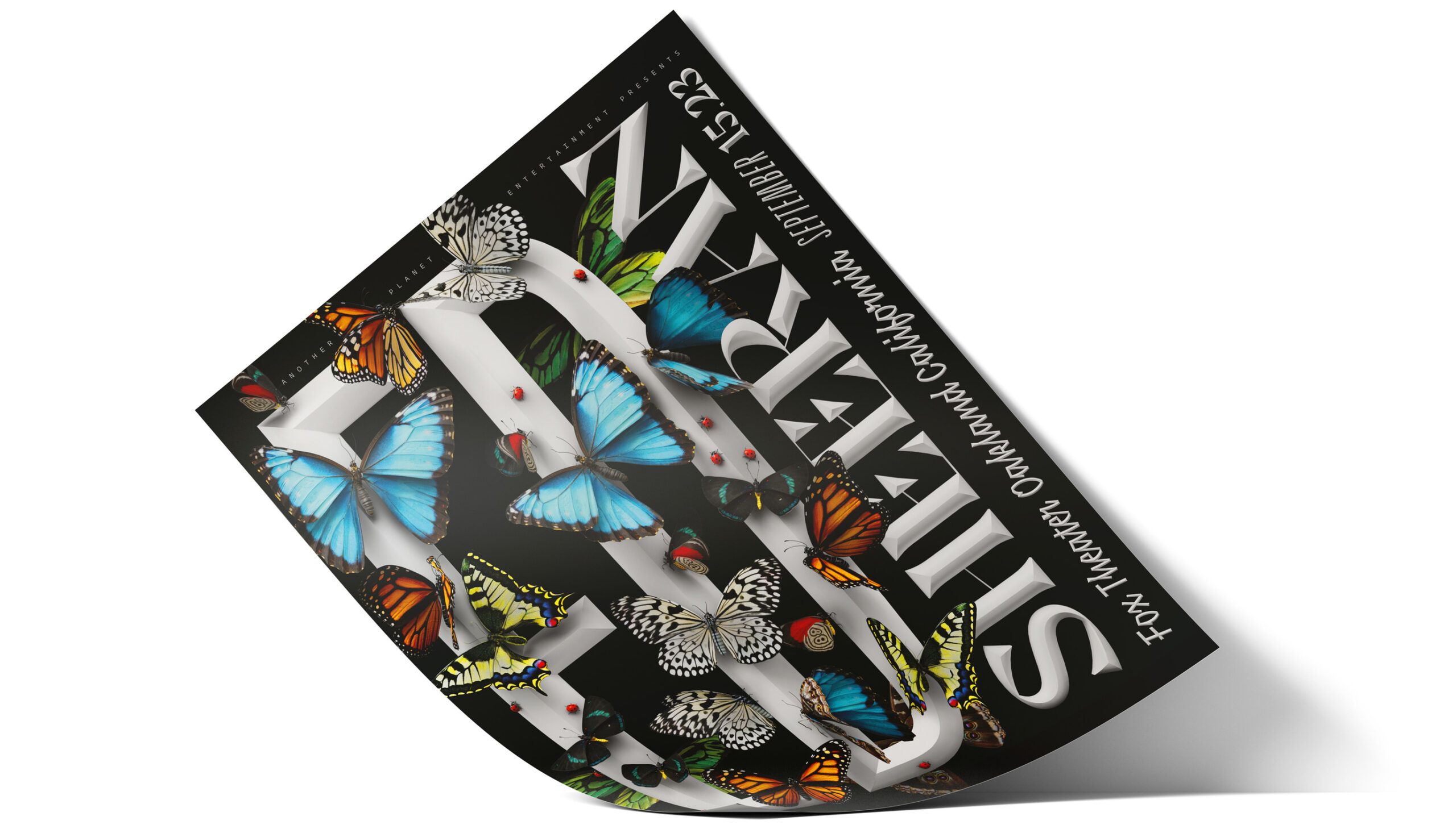
When we were commissioned to create an exclusive poster for Ed Sheeran’s one-night-only acoustic solo show at the Fox Theatre in Oakland, we saw an opportunity to design something that felt as intimate, organic, and full of life as the performance itself. At its core, this project was about celebrating the balance between boldness and delicacy, structure and spontaneity—just like Ed’s music.
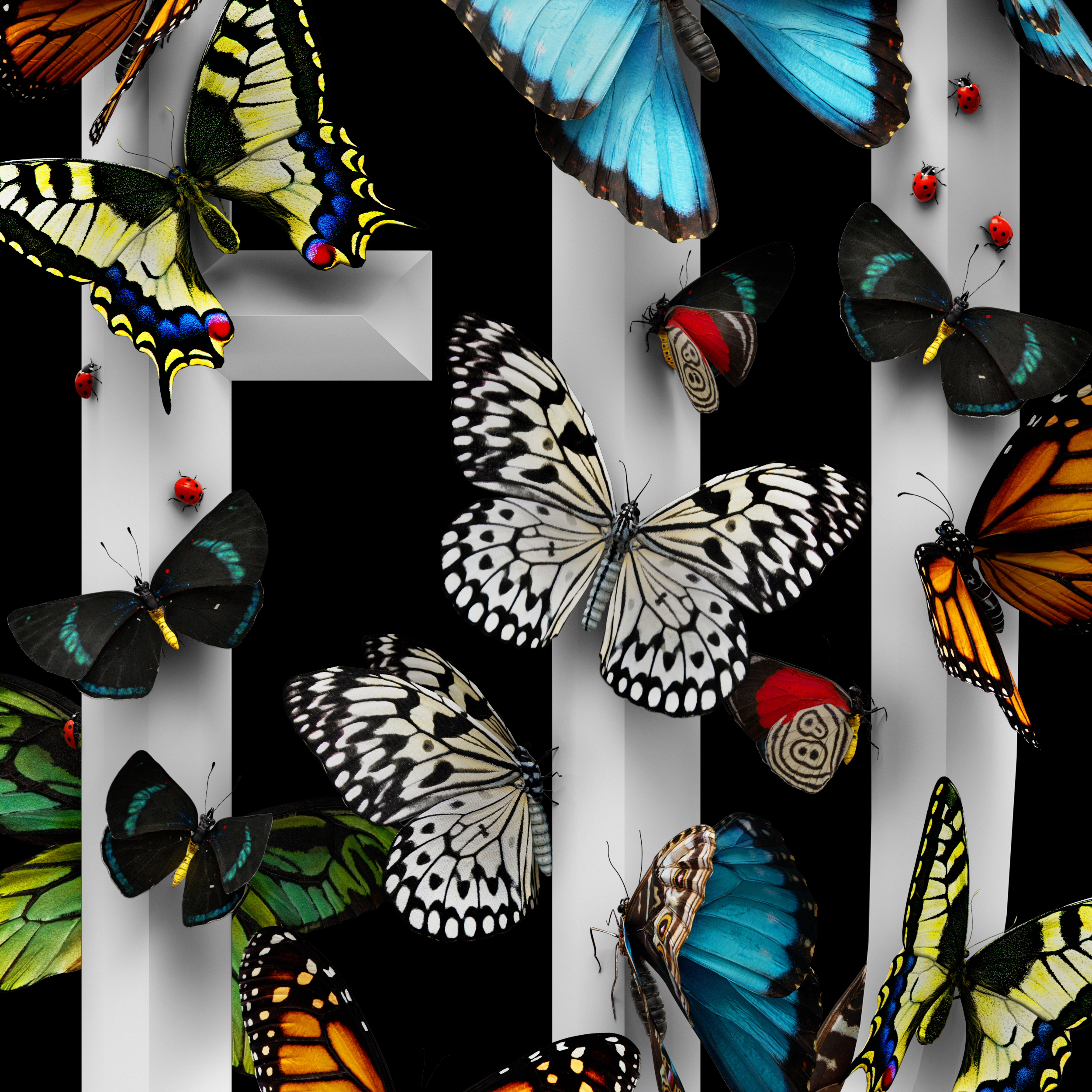
This gig poster design was pretty much all about typography—big, graphic, and contemporary. We wanted every letter to have a strong dynamic presence, much like Ed’s stripped-back yet emotionally charged sound as a solo performer. With his first name being so short, we opted for a maximal impact format, occupying the space as big as we could and fleshed out the rest of the layout to fill the entire space word by word, using complementing fonts for each element. Playing on the boldness of the design, we went for a high contrast dimensional black and white, enhanced with dimensionality.
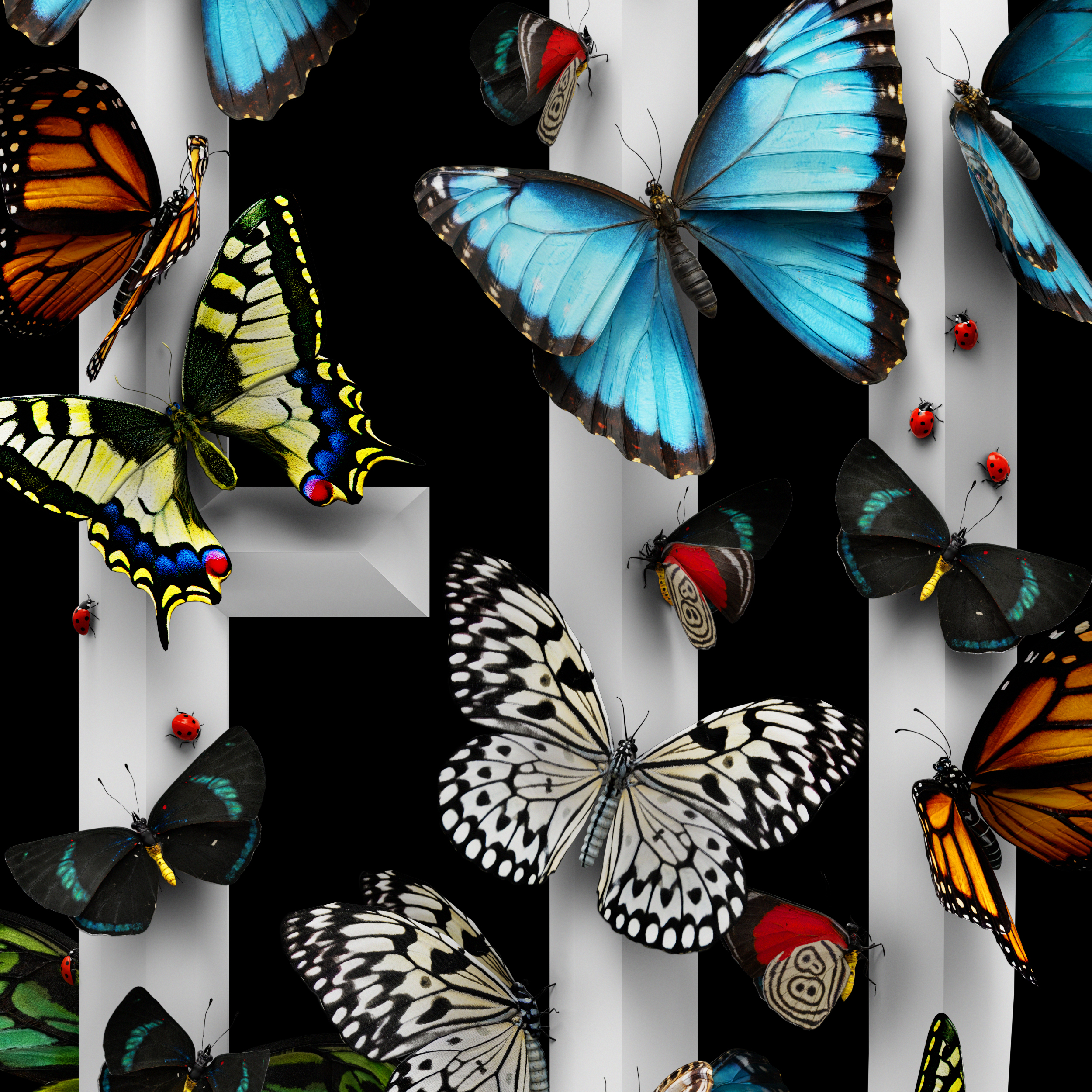
A key inspiration for the illustrative part of the design was Ed’s love of butterflies—a recurring motif in the work that was featured prominently on his album Subtract. They felt very much suited for this artwork as symbols of transformation, fragility, growth, and beauty, which were themes deeply embedded in the show’s raw, introspective tone. We were drawn to the delicate, transient nature of butterflies, which aligned perfectly with the songs’ themes of impermanence, love, and loss. From an art direction standpoint, we also felt that butterflies provided a visually striking, organic balance to the weight of the lettering and overall enhanced the visual storytelling.
Rather than simply illustrating our winged beauties, we wove them into the lettering. A variety of highly detailed, photogrammetric specimens were brought together, covering the boldest letters delicately perched front and back, making his name shine through the colorful wings—creating a luminous and tactile composition. To add an extra touch of whimsy, we peppered tiny ladybugs on the hero lettering, bringing movement and charm to the piece.
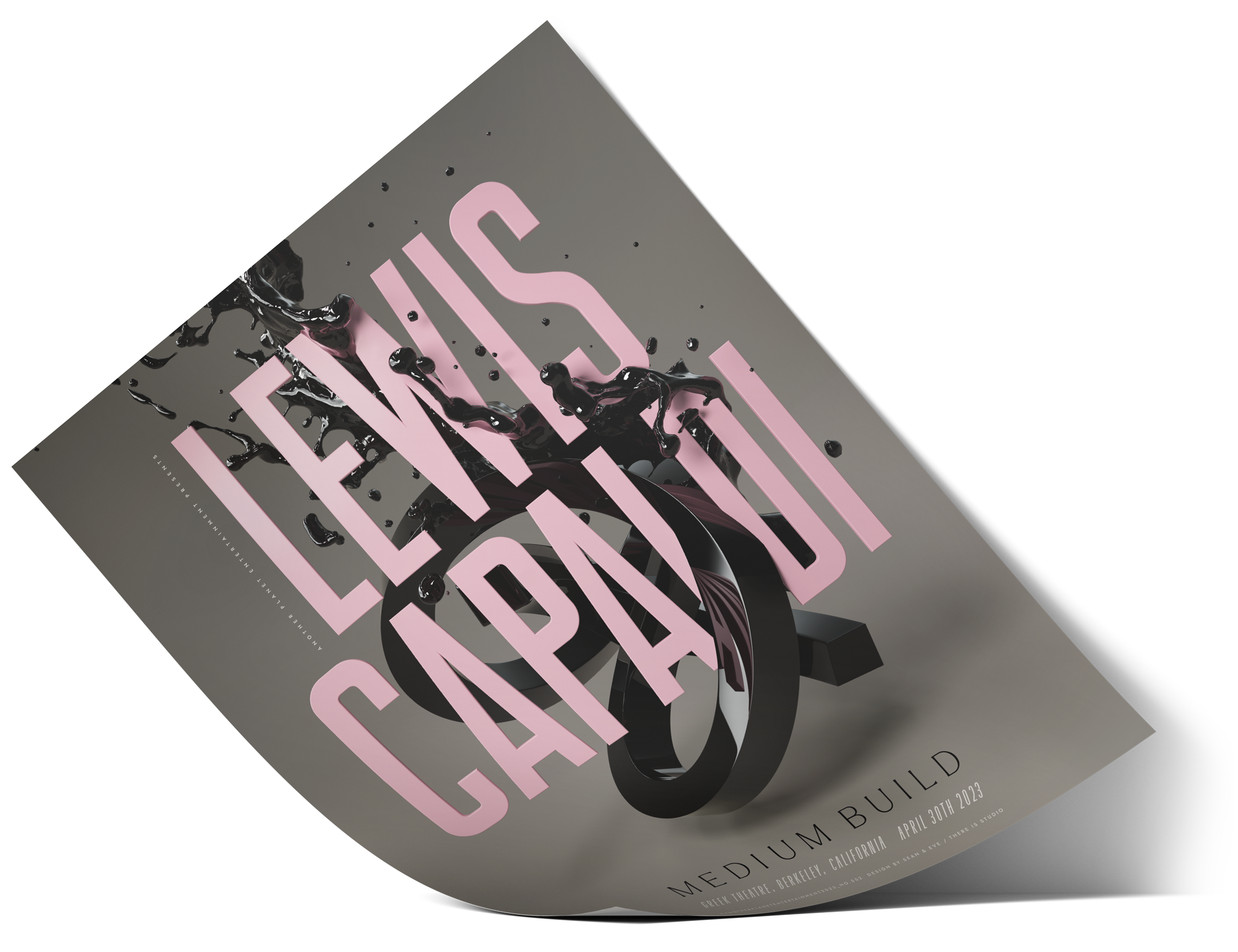
Crafting Emotion in Motion: The Making of Lewis Capaldi’s Poster
When we were commissioned to create an exclusive poster for Lewis Capaldi’s one-night-only performance at the Greek Theatre in Berkeley, California, we knew it had to be something special and emotionally powerful.
Drawing inspiration from the visual language of his album Broken by Desire to Be Heavenly Sent and the aesthetic of his live shows, we wanted to translate that energy into a single, striking composition with an architectural feel. We started looking at elements at their root and proceeded to explore stairs, water movement, and fonts in various ways—settling on a condensed sans serif stacking of the lettering as a departure point, simply inspired by the graphic quality of the name.
The overall concept was to blend organic curves juxtaposed with rigid geometric elements to create a composition with a contemporary, almost futuristic aesthetic, making it feel both timeless and modern. For our color palette, we went for a warm gray to create an intimate sense of space while retaining the album’s signature soft pink for a romantic touch to contrast against the deep, glossy blacks.
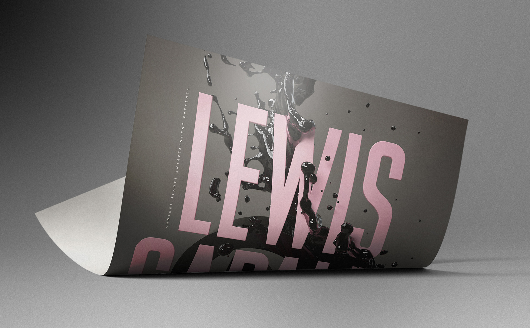
In terms of composition, we came up with the idea of a fluid-meets-sculpture piece, where movement is approached in a simple yet deeply expressive way—just like the melodic highs and lows of Lewis’ songwriting. The sculptural elements were created to evoke a sense of motion frozen in space, with its looping form suggesting themes of infinity, connection, and balance. We explored transitioning shapes as shifting states of matter through surface tension variations to convey a sense of motion and lightness, enhanced with a sleek, highly reflective material that performs beautifully as a solid-liquid hybrid.
The abstract form made of a swirling extrusion could also be interpreted as a visual metaphor for complexity and interdependence, a bit like a Möbius strip or an impossible knot, where individual elements seem to fold into each other seamlessly. The lettering interacts with the composition as if floating within—an echo of Lewis’ storytelling, capturing the idea of something both fragile and monumental, mirroring the way his music balances intimacy with grandeur. To elevate its presence, we introduced a lush spot gloss finish on the prints, adding a layer of richness, deepening the blacks, and enhancing the interplay of light and texture.
Collectors’ Pieces for Intimate Nights
For us, these projects are more than just gig posters—they’re creative opportunities to capture a sound in visual form, emotion in texture, and experience in print. With each printed in a very limited edition, these posters became coveted collectibles for fans attending the shows. The details were designed to be discovered—subtle layering, rich color contrasts, and a sense of depth that made it more than just a poster but a keepsake.
Beyond the audiences, for each show, a special copy of their poster was gifted to the artists by the management team, and a hero-signed piece of each artwork was subsequently framed and featured as part of a music poster collection: a lasting tribute to an unforgettable night.
We truly love making music posters.
Sean Freeman and Eve Steben’s studio is a creative powerhouse known for its innovative and multidisciplinary approach to visual communication—with an award-winning portfolio widely recognized in visual art features and campaigns worldwide. Their creative process is characterized by a dynamic fusion at the intersection of digital and analog worlds, resulting in tactile, contemporary, and timeless artwork. Driven by a passion for image-making and visual storytelling, Sean and Eve seamlessly blend design, textures, craft, and art experiments to produce compelling hybrid work mixing typography, illustration, photography, and CGI—with a keen sense of balance between form and function.