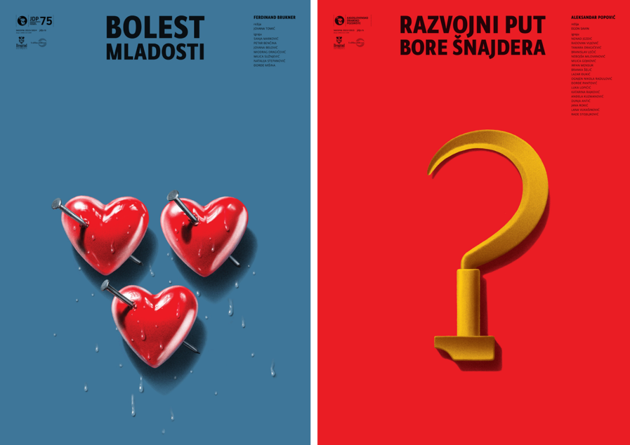
Mirko Ilić has once again proven his mettle in the design world, clinching Gold in the Poster 2025 Awards competition for his electrifying work with the JDP-Yugoslav Drama Theater in Belgrade. Known for his sharp, thought-provoking visuals, Mirko’s posters for “Pains of Youth” and “The Development Path of Bora Šnajder” are a masterclass in storytelling through design. From heart-wrenching glass hearts skewered with steel nails to a deconstructed hammer and sickle reimagined as a question mark, Mirko captures each play’s emotional and ideological undercurrents with unparalleled precision. A testament to creativity under constraint, his posters are as much works of art as they are promotional pieces, cementing his reputation.
By: Mirko Ilić, Designer & Founder, Mirko Ilić Corp.
This is the 8th season that I am creating posters for JDP-Yugoslav Drama Theater. For each season, I try to create a slightly different illustration and design look.
For Season 6, I decided to create posters with my illustrations in the middle, and for the background to have a single complementary color with simple black type on top.
Here are examples of seven posters created for Season 6.

For the last seven seasons, JDP, like most institutions in Serbia, has been required to use both Latin and Cyrillic scripts in its posters and promotions, which means each poster needs to be designed twice with Latin and Cyrillic scripts. That limits the typographic part of the design, not only because of the mutation between Latin and Cyrillic but also because there are very few fonts with both scripts. On top of that, Cyrillic letters are considerably wider than Latin letters.
Pains of Youth
Pains of Youth is a shocking, erotically charged play by the Austrian writer Ferdinand Bruckner.
The play depicts the moral corruption and cynicism of a group of medical students with unprecedented candor in Vienna in 1923. For these young people, the idea of death by suicide is always present in their minds. A discontented post-war generation diagnoses youth to be their sickness and do their best to destroy it.
In the play, there are multiple love triangles and broken hearts, which gave me the idea to create an image out of three fragile hearts that almost look like they are made of glass. The hearts are positioned in a triangle shape, being penetrated by big steel nails instead of Cupid’s arrows. The nails are not only hurting them but also pinning them down.
To give some human, organic touch to the poster, I added drops of sweat, tears, and other fluids. For the background color, I decided to use the color of a medical scrub uniform.
The Development Path of Bora Šnajder
Aleksandar Popović’s play The Development Path of Bora Šnajder follows several themes, the most important of which are the socialist/communist social milieu in which incompetent and unprepared careerists rise, the conflict between social and private work, and the meeting of an anonymous person with ideology and its laws.
To illustrate that, I used two symbols of socialism/communism—the hammer and sickle. Of course, the choice of the two symbols automatically led to the red background of the poster. Because of the protagonists’ questionable behavior, I twisted the hammer and sickle symbol, turning it into a question mark. The hammer crashing down is also a good symbol of Bora’s unfortunate end.
The Creative Process
JDP Theater is one of the major theaters in Serbia, but compared to major theaters in New York, they have limited finances for design and promotion. That allowed me to negotiate a process where I don’t show sketches/comps of the poster. Instead, I deliver the finished posters to the theater. Short deadlines helped with my negotiation to have no comps—very often, I find out about the next play a month before the opening, and I have only two weeks to finish the poster.
Personal Reflection
So far, I have created 37 posters for JDP-Yugoslav Drama Theater. Those posters are primarily seen in Serbia and some surrounding countries where the theater sometimes performs its plays.
In that aspect, with my work for JDP, I am in the same position as designers from other smaller countries. The only way to show what they do outside their environment is to send their design to competitions and annuals. Appearing on and especially receiving awards from Graphis enables other people/designers to see what I am doing and ensures my client, JDP, that making the no-sketch arrangement with me was a good idea. The awards are proof of it.
Mirko Ilić was born in Bosnia. He drew comics, illustrations, and art-directed posters, books, and record covers in Europe. In 1991, he became the art director of the international edition of TIME magazine. In 1992, he became art director of the Op-Ed pages of The New York Times. In 1995, he established his firm, Mirko Ilić Corp. His company designs for a wide range of clients, from pro bono organizations to high-luxury hospitality clients. His work is in collections of institutions such as Die Neue Sammlung in München, the Smithsonian, and MoMA-San Francisco. MoMA-New York has 38 of his designs in their collection. He is co-author of the book The Design of Dissent with Milton Glaser. He has also co-authored 10 books with Steven Heller; the latest is Milton Glaser: POP (The Monacelli Press, USA, 2023).
He also organizes and curates shows and lectures around the world. The most well-known is the Tolerance Poster Show, which has appeared more than 200 times in over 48 countries worldwide. He taught advanced design classes at Cooper Union with Milton Glaser and the School of Visual Arts in New York. In 2023, Mirko Ilić received an honorary title as a university professor from MOME, the Moholy-Nagy University of Art & Design in Budapest, Hungary.
Click here to read more about Mirko.
