Regarding design that transcends borders and time, Leo Lin of Leo Lin Design is in a league of his own. The award-winning Taiwan designer showcases his mastery in two boldly expressive projects for the National Taiwan Normal University. From the visually rich “Genealogy of Japanese Graphic Design” to the culturally vibrant “Fifty Years of Design Exchange Between Taiwan and South Korea,” Leo taps into deep historical roots and the pulse of modern typography and print. These posters reflect the past and boldly represent design’s role in shaping cultural dialogue across generations. In this blog, Leo shares the inspiration and creative process behind his next-level works.
By: Leo Lin, Graphic Designer, Leo Lin Design
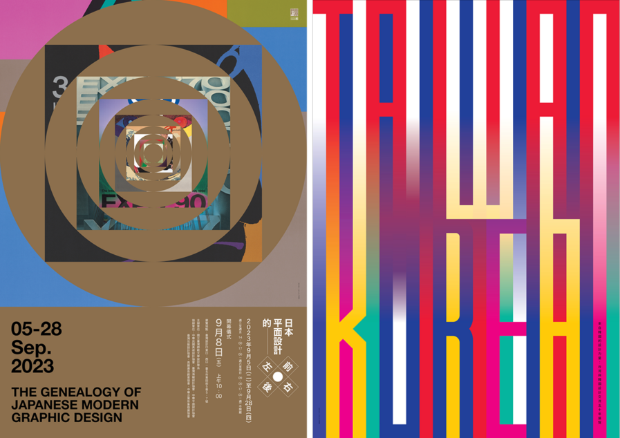
The Genealogy of Japanese Graphic Design
This exhibition is a document and poster exhibition introducing the development and influence of modern Japanese graphic design. It mainly uses this exhibition to explore the relationship between associations, activities, events, and figures in the development process of Japanese graphic design and to sort out the development context behind it. It also traces the origin of the Japanese graphic design term “图案” (tu an) during the Meiji era and the important historical documents on its subsequent evolution, which can serve as a reference for future Taiwanese design studies on the development of Japanese graphic design.
Therefore, how to present the contextual image of Japanese design has become the focus of visual communication. “Hinomaru” is the symbol of Japan. In 1964, Yusaku Kamekura used “Hinomaru” as a classic image to design the logo for the Tokyo Olympics.
This poster incorporates the works of modern Japanese graphic design masters into the square Japanese Chinese character “日” and the circular “Hinomaru” image, forming a visual effect of time and space deduction, symbolizing the context of Japanese graphic design.
Poster of Exhibition on Fifty Years of Design Exchange Between Taiwan and South Korea
In the 1970s, the Korea Ensemble of Contemporary Design (KECD) and the Taiwan Amoeba Design Association (TADA) kicked off the design exchanges between the two countries. Headed by Professor Baik Kum-Nam, he led Korean designers to Taiwan many times after that. In the 1980s and ’90s, he began communicating with the Graphic Design Association of the Republic of China and the Taiwan Poster Design Association (TPDA). In the 2000s, he began communicating with the art director team of the Fine Arts Department and the Department of Design at the National Taiwan Normal University (NTNU) to conduct academic exchanges. This half-century-long design exchange demonstrates the deep friendship between the two countries.
To commemorate the 50th anniversary of design exchanges between Taiwan and Korea, organized by the NTNU’s Department of Design and co-organized by various design associations in Taiwan, Taiwan, and South Korea each invited 25 designers from each country, a total of 50 designers to create works to commemorate these 50 years of friendship. This poster uses text to combine the national and cultural colors of Taiwan and South Korea, presenting an image of mutual exchange and integration to express the long-term cultural exchange and understanding between the two countries’ designers through design.
Leo Lin is a graphic designer, educator, and curator. He was a dean at the National Taiwan Normal University College of Arts and a consultant at the Taiwan Poster Design Association. He is keen on exploring visual graphic experiments and focuses on the social and cultural exploration of design. Leo’s works have been recognized by leading design organizations and publications worldwide, and his posters have won and were selected by international poster biennales and triennials in countries like Japan, Mexico, Finland, and Poland.


