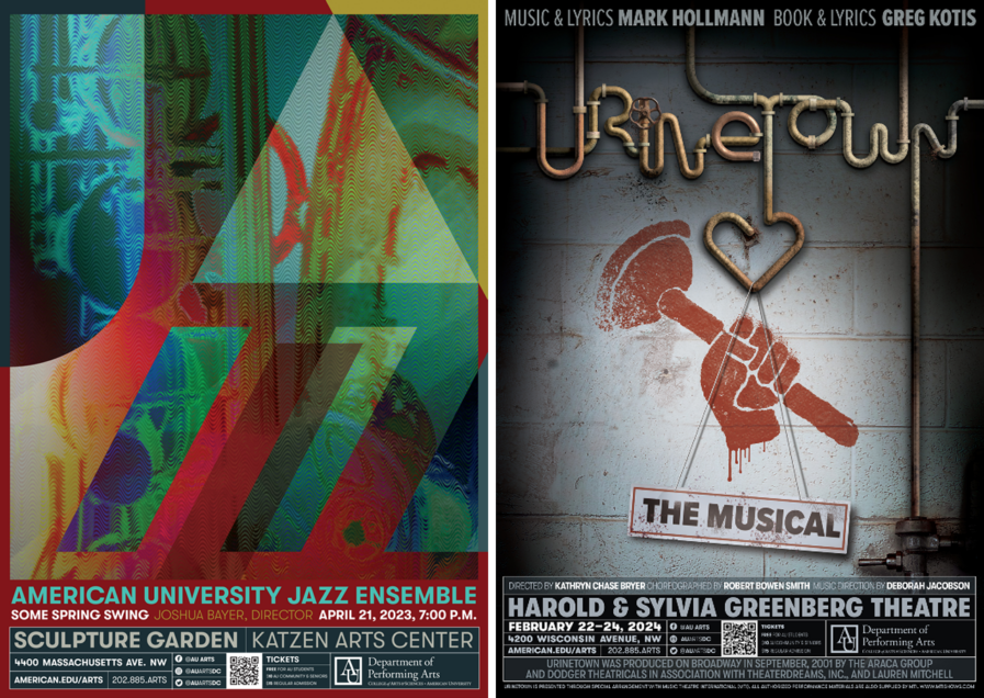
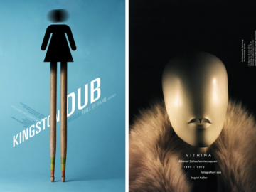
Chemi Montes’ latest poster designs for the American University Department of Performing Arts are each a distinctive reflection of the performances they promote. For “Some Spring Swing” (above, left), a jazz ensemble concert, Chemi channels the genre’s improvisational energy into a syncopated dance of geometric abstractions and textured patterns punctuated by fragments of brass instruments. In stark contrast, the poster for “Urinetown: The Musical” (above, right) revels in theatrical satire. Rusted pipes snake through a decayed urban scape, their industrial grit punctuated by graffiti-like flourishes that mock revolution and authority alike. Chemi sidesteps the temptation to lean on existing imagery tied to the production, instead crafting a design that stands as both homage and reinvention. Together, these posters transcend mere promotion, serving as vivid extensions of the performances they represent—each as dynamic and layered as the theatrical art they celebrate.
By: Chemi Montes, Designer & Professor, American University
Posters (be they printed or distributed through digital platforms) merge many fundamental aspects of design: typographical, visual, conceptual, and communicational. If we get lucky and all efforts succeed, a poster is a persuasive appeal, a tap on the shoulder that is rewarded with engagement. For performing arts events, awareness and subsequent attendance are the primary goals, but so is reinforcing the brand of an ensemble or an institution. Because these two posters promote the performances of university-based ensembles, there is no temptation to rely on the star appeal of any one performer by using their likeness. Thus, these two posters for two different performances are good examples of the complexities and diverse challenges embedded within each design. One is a jazz concert showcasing various works, whereas the other is “Urinetown: The Musical,” a musical theater performance.
For the jazz performance poster “Some Spring Swing,” my approach to this and prior iterations of this ensemble’s performances is to attempt to capture the dynamic, playful modernity of the genre. The visual elements are primarily semi-geometric abstractions of typographic forms, shifting positions, and figure-background interactions as a way to create a visual rhythm, a syncopation of sorts. Textural patterns combined with fragments of brass winds introduce an organic warmth that contrasts with the stylized geometric rendering of the word “jazz.” Musical performance posters can sometimes be focused on a composer, a soloist, or a dominant piece in the program, but when the range of work performed is somewhat eclectic, the poster aims to become yet another member of the ensemble, playing jazz works along with the other musicians, but visually and, hopefully, on key.
By contrast, “Urinetown,” like any theater performance, has a visual component in its own right, with staging, sets, and wardrobes all defined by the artistic vision of the director in order to tell a story on stage. These attributes, along with the text, the plot, themes, etc., are all tangible aspects that inform my choices. The satirical nature of the performance meant the poster could not take itself too seriously. Rendering the title of the performance as a series of rusty pipes in a derelict space presented an opportunity to create a visual that rang true to the work while not re-purposing or imitating the pre-existing commercial visual treatment for the title. The presence of graffiti that parodies political, clandestine, revolutionary imagery completes the staging of what would be otherwise a mostly typographic solution.
Once upon a time, Chemi Montes was born in Spain, where he studied fine arts and graphic design at the University of Salamanca. He later crossed an ocean to pursue an MFA in graphic design at the Pennsylvania State University and has been bound to this hemisphere ever since. His design career includes professional practice and a long-term dedication to higher education. He currently teaches graphic design at American University in Washington, DC, where he tries to keep artificial intelligence at bay by pushing for the engagement of natural intelligence. He does not live for but sincerely appreciates the design accolades he has received, whether they be from Graphis, Communication Arts, Creativity Awards, or, back in the day, HOW magazine, Print magazine, Applied Arts, and being included in various books. He has also published writings about semiotics in relation to design and its cousin, advertising, and found writing about himself in the third person stylistically alienating but oddly appropriate for this paragraph.


