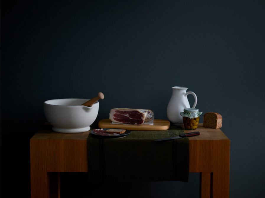
In Laurie Frankel‘s Gold Award-winning project “Pitcher and Prosciutto,” still life photography is elevated to art. Laurie, a maestro of light and composition, conjured an image for upscale home decor store MARCH that’s as evocative as it is meticulously crafted. Here, the rustic allure of a butcher block table becomes the setting where prosciutto and a pitcher come together, creating a visual narrative that’s both homey and heavenly. With a touch of natural light, Laurie transforms everyday objects into a timeless tableau, each element placed with the dedication of a true artist. No wonder this work earned high honors in the Graphis Photo 2024 Awards competition.
By: Laurie Frankel, Photographer
MARCH is an upscale home decor store located in San Francisco. Their media presentation, like many of their competitors, is exceptionally tasteful and typically inspired by artistic movements. They have covered modernism, art deco, and more. Unlike most other retailers, their imagery does not focus on the product and instead subverts the usual marketing and photographic composition standards. This is one of the reasons why their partnership with Laurie Frankel works so well.
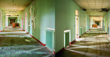
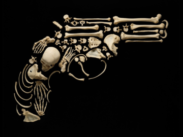
One can see Laurie challenging photographic conventions while embracing great masters in many of her images, which have appeared previously in Graphis, such as those in her “Recycled Beauty” series or her floral images.
This approach is in sync with MARCH which also prefers a combination of historical reference and subversion in their imagery. For example, they almost never put the product first and foremost. They are more interested in the process of serving the art of the photo and the photo establishing a mood, a sense of life, in the scene.
The creative process begins with MARCH’s merchandising chief and creative director, Katharine Lange, deciding on the color palette and historical or artistic movement from which she and Laurie will draw inspiration. Katharine then organizes products and props to create the environment desired. At the shoot, she and Laurie finalize the arrangement and composition. Laurie largely shoots with natural light, sometimes sculpting accents to capture the mood and the desired aesthetic.
That aesthetic embraces imperfections and imbalance. Objects or props could be off-kilter. A stool could be upside down. Fresh food might be placed on a table with an almost empty pitcher of water. There’s always something slightly off. These imperfections create an entry point into the image for the viewer, a curious glimpse into the kind of life represented; they invoke questions about the scene and do not just present a product.
MARCH’s overall approach is clear in “Pitcher and Prosciutto.” First, there is the overall mood. The earth tones and simplicity of the objects recall 17th-century natura morta that inspires much of this season’s imagery.
Then, there are the objects in the image. Central to the composition is the leg of prosciutto, but MARCH sells no food. Other retailers would make it an accessory to the products. Instead, to the extent that MARCH presents its products, the one in which they are most interested in promoting is the butcher block table, yet this is left in shadow and shown only as a base to the other objects in the image both in terms of composition and color.
The piece of bread hanging off the edge of the table creates a sense of unrest in the viewer, why was it left in that almost precarious state? As with other high end retailers, photos like this depict a life that is desired, but unlike the others, it need not be perfect.
Laurie Frankel has been photographing for MARCH since 2021. This creative approach has blossomed in the partnership between Lange and Frankel over this time.
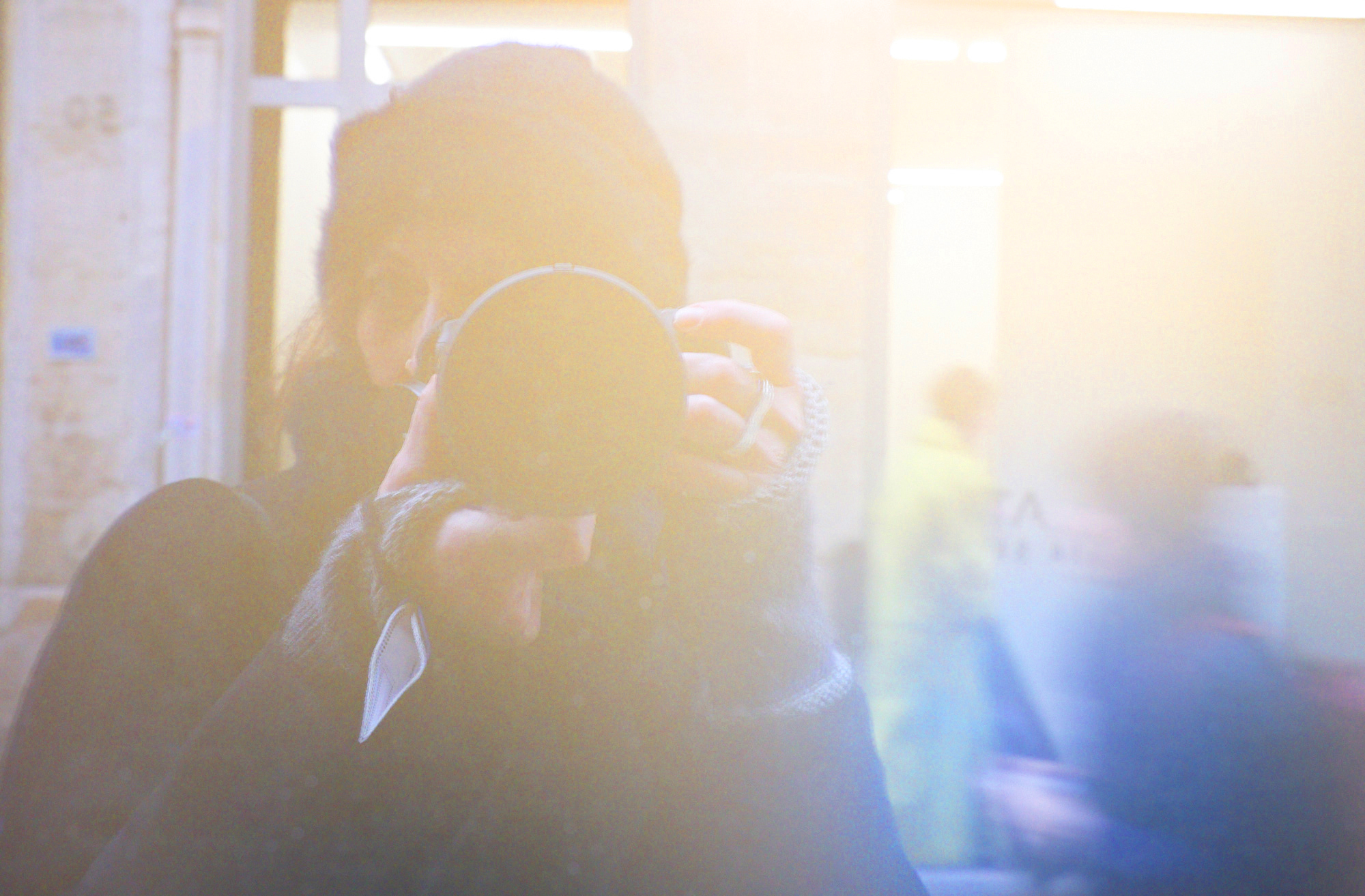
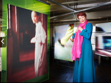
Laurie Frankel has been known to tromp through swamps, bribe giraffes, and hang precariously from ceilings in order to capture the right image. With a strong design background, her images are carefully considered, elegant, and playful all at once. A natural collaborator, Laurie’s experience as a creative director continues to shape both her graphic sensibilities and her approach to photography. The warmth of her personality, her enthusiasm, and her commitment to detail are evident throughout her work.
