Students from the ArtCenter College of Design have immersed themselves in both the silly and the serious in these entries for the New Talent 2023 competition.
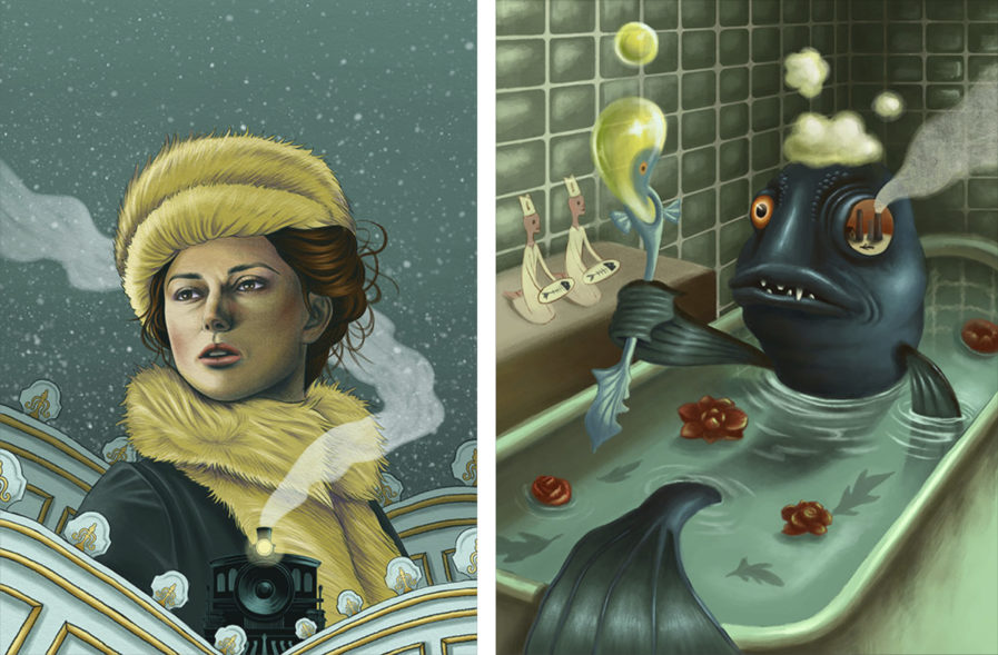
Studying at the ArtCenter College of Design, student JiYun Choi created two fascinating illustrations. Studying under professor and illustrator Paul Rogers, the prompt for the first piece was to create an image for the 2012 film of the same name, “Anna Karenina” (above, left). Seeing as Rogers is known for many different poster designs, this prompt makes perfect sense for him to assign. The main character, Anna, is depicted with detailed line work, and stands front and center, as the largest element, in the center of the illustration. Visual elements such as the snowflakes, stage lights, and the train recall themes and motifs from the book; for example, several major plot points take place either on passenger trains or at stations in Saint Petersburg or elsewhere in Russia. The color palette of blues and yellows, with some variations and a few other colors, also works well to convey the mood of the character and film; while Anna herself is bright and passionate, the world around her is cold and less than kind.
Choi also created “Fish in the Bathtub” (above, right) based on another assignment prompt, this one from Professor Cliff Nielsen, a graphic artist, designer, and fantasy illustrator. Based on the saying “fish out of water,” Choi’s disfigured fish is staring at the viewer as if in shock, with one eye socket showing the image of a factory with smoke blowing out of the eyeball and out of the illustration’s frame. Choi says the illustration is demonstrating some of the dangers presented by environmental destruction, and it does reek of toxicity between the factory, the poisonous colored bubbles, the leaves in the bath water, and the fish’s fangs. While the piece is serious, Choi also gives it a humorous take by setting it in a bathhouse, with the two characters on the side seemingly offering fishbones to the fish itself. All in all, this illustration’s contrast to “Anna Karenina” shows the breadth of Choi’s ability as an illustrator and their ability to adapt to any given assignment.
