Dan Cosgrove Design’s Yellowhammer Takes Flight
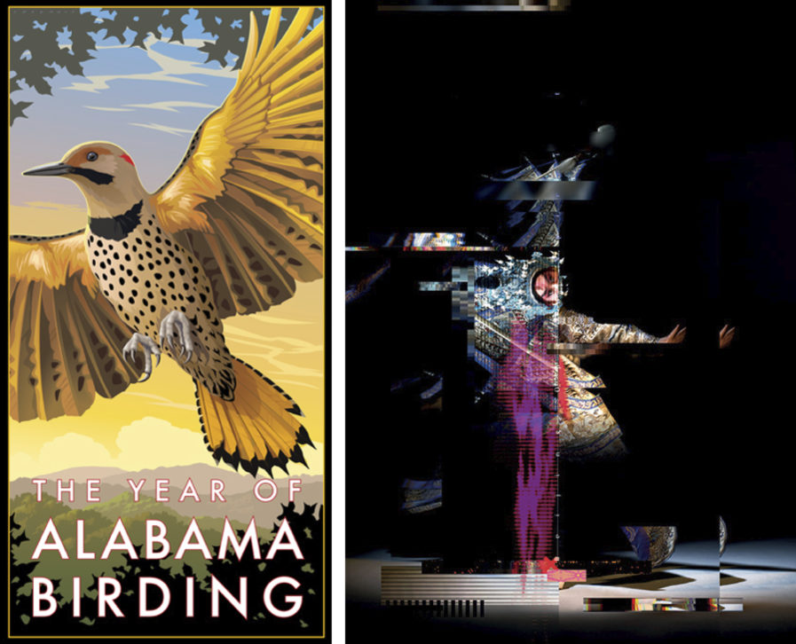
The Alabama Tourism Office recently commissioned Dan Cosgrove Design to illustrate a poster celebrating the beauty of the state’s official bird, the northern flicker. Also known as the yellowhammer, this beautiful bird symbolizes pride and joy for many Alabamians. With Dan Cosgrove’s graphic design expertise, he crafted a stunning image featuring the yellowhammer in flight that celebrates birding and promotes tourism in Alabama.
Cosgrove approached this project with an eye for detail and precision. To capture the true beauty of the yellowhammer and its vibrant colors, he first did his research, studying photos of the species in their natural habitat and paying attention to subtleties such as feather patterns and wing positions. Armed with knowledge about how these birds move and look in flight, he crafted an illustration that accurately represented what he envisaged and brought it to life. To further emphasize movement through space, Cosgrove used color gradients within each feather that would give off an impression of motion even when standing still. He also used bright colors throughout his illustration that reflected light off specific parts of the bird’s body to make it appear more dynamic. Finally, subtle textures added throughout helped to round out the design and make it pop off the page even more when printed on paper or viewed online.
The posters created by Cosgrove were printed in various sizes so they could be hung up all over Alabama promoting birding tourism in “The Year of Alabama Birding” (above) campaign sponsored by the Alabama Tourism Office. From restaurant lobbies to shops around town, residents and visitors alike were mesmerized by their artistry and intricate details. Thanks to Cosgrove’s stunning illustrative and meticulous attention to detail combined with the office’s mission to promote wildlife conservation through this project, everyone involved can feel good about being part of something special!
Exploring the Design of Beijing Opera Posters
The Oblikovalski Center pushes the boundaries of design with its vision for the Beijing Opera Art International Poster Biennale. This biennale strives to represent modern-day art and culture, fostering collaboration among international designers worldwide. The team at the center conjured up some boundary-breaking creativity in their quest to produce posters that capture this creative event’s essence—where the artwork comes together for a one-of-a-kind celebration!
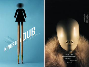
The poster design for “Four=Four” (above, right) is based on the interweaving of visual elements with expressiveness based on the parables that are characteristic of the Beijing Opera, such as rhythm (singing), color (dialogue), texture (dance), and space (martial arts). The attractiveness of visual art with various sung tones is emphasized in the visual medium of the poster with variations in rhythm and tonal structure. There are coloraturas in the constant dialogue; the rounded singing fills the musical feel. This combination creates an aesthetic experience that encapsulates traditional Chinese opera.
The movement of the body in the dance requires exceptional capacity and fitness, expressed in the texture of the design surface of the poster. Different shades, hues, and tones blend to create a unique representation that captures every aspect of this complex performance art form. Traditional martial arts and the Beijing Opera are renowned for their captivating movements, which create an immersive spatial illusion. The skillful manipulation of lighting styles adds complexity and tension to the motion in the poster. In creating a spatial illusion, martial arts express their sublimity through soft movements and wavering lines. The composition allows an array of dynamic images to be built on one canvas, resulting in a beautiful piece that communicates action and emotion.
With its intricate blend of visuals, rhythms, colors, textures, and martial arts, this poster is a work of art. Each element plays a vital role in creating an engaging experience for viewers—from capturing the audience’s attention to conveying messages through symbolism—all within one image. As you can see, there is much more than meets the eye when designing effective posters!
Sun Design Production’s Poster for Matilda
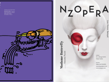
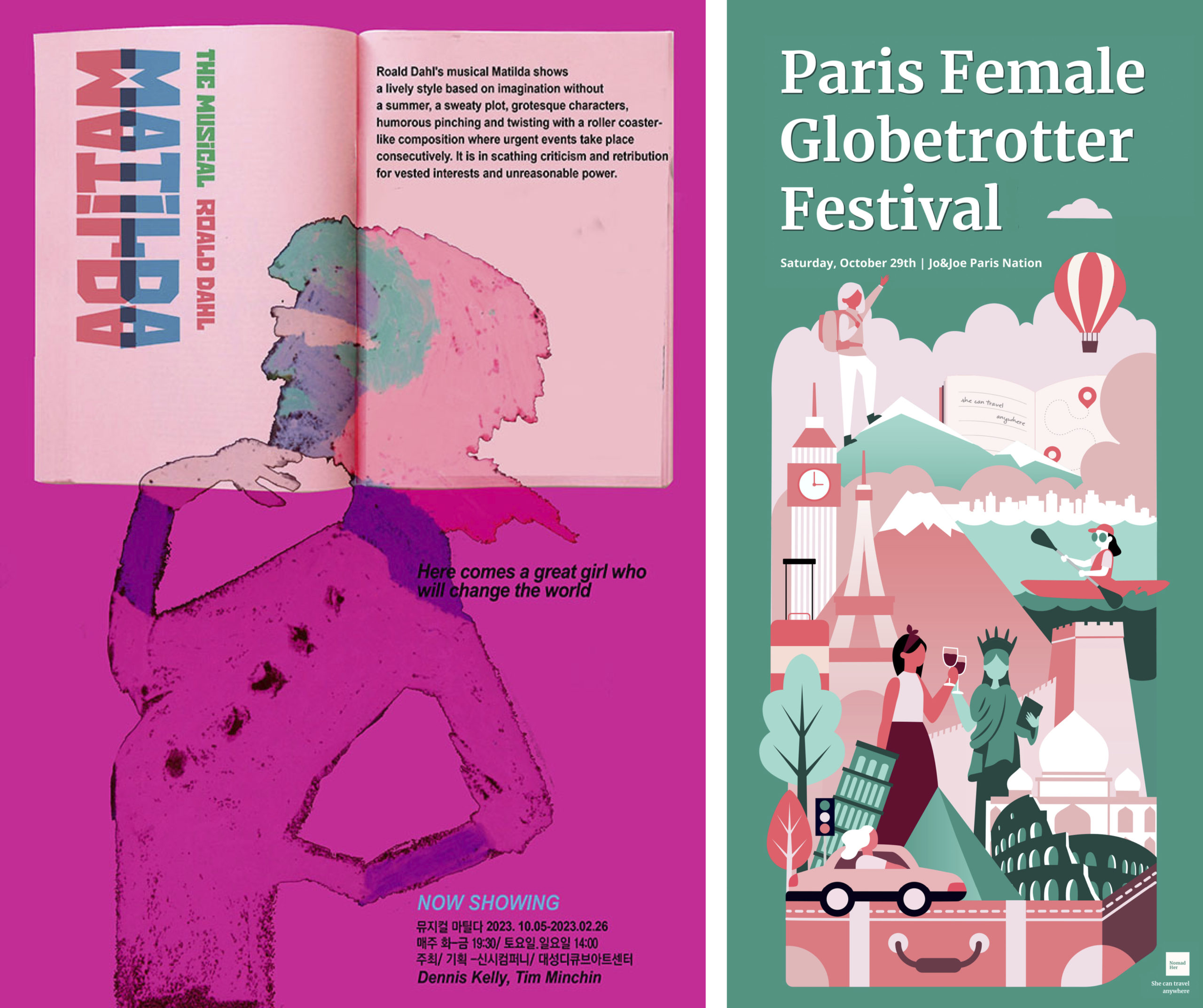
China’s Sun Design Production‘s Poster 2024 entry is for “Matilda” (above, left), Roald Dahl’s beloved musical, at the Dcuve Art Center. Designer Xian Liyun’s eye-catching poster is a carefully crafted piece celebrating the powerful story of an independent young girl in a whimsical yet sophisticated style. Through its intense colors and imagery, the designer conveys themes of perseverance and joy that capture Matilda’s spirit. Sun Design Production’s entry is an excellent example of how compelling design can communicate complex concepts while remaining visually captivating—something any designer or marketer can appreciate!
Sun Design Production is no stranger to creating award-winning posters; they’ve been in the business since 2014. For Matilda, they wanted to create something that was both visually appealing and emotionally evocative. They opted to focus on Liyun’s art style creating a grotesque character with a humorous expression as the centerpiece, aiming to express a whimsical yet powerful message about individual strength despite adversity. As part of their creative process, they also used vivid colors paired with bold typography to emphasize the youthful energy of Matilda.
Sun Design Production’s poster proved successful because it captured the spirit of Matilda—a great girl who will change the world—and presented it in an accessible way that was visually stimulating and immediately relatable. While the play depicts a life filled with harsh criticism and retribution brought on by vested interests and unwarranted yields of power, at its core is the more important message that resonates: great things can happen when determined people stand up to injustice. This poignant reminder of individual strength captured the imagination of audiences around China’s Dcuve Art Center and helped spark the production’s success.
Sun Design Productions’ entry into Poster 2024 was an innovative take on a traditional poster design that captured audiences’ attention. Their emphasis on conveying Matilda’s inspiring story through this striking visual has earned them much acclaim—and rightly so! It is safe to say that Sun Design Productions’ poster has been a success for the studio and the client.
Nomadher Globetrotting Illustration

