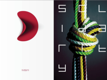
This week’s Platinum and Gold poster winners from our 2022 competition serve to show us that elaborate images aren’t always the most effective way of conveying a message. Sometimes, less really is more, as these winners prove with their simple yet striking designs.
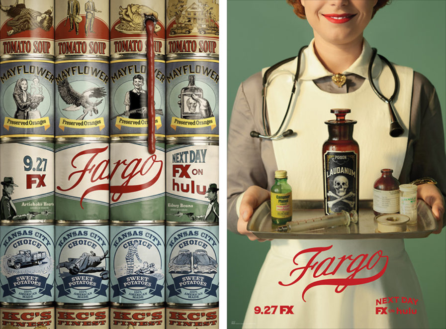
First up, design studio Graphis Master ARSONAL, along with Icon Arts Creative, Eclipse Advertising, and LA, bring us this set of Platinum-winning posters for “Fargo Season 4 – Key Art” (above). The FX show Fargo shows viewers what happens when homespun meets dangerously-in-over-your-head, as the series travels from the snowy north to a violent 1950 Kansas City, Missouri, and pits rival gangs against each other in their search for their slice of the American Dream. To promote this fourth season, the team wanted to communicate the folksy façade, time period, Midwest feel, and violence that characterizes it. As such, the team paired typical homey 50s iconography with a disturbing twist, such as a nurse handing you a tray of poison, or an array of cans with deadly imagery and a single bullet hole dripping red tomato sauce in place of blood. The images allude to how the folksy facades put up by the characters in the show hide death, darkness, and brutality just below the surface.
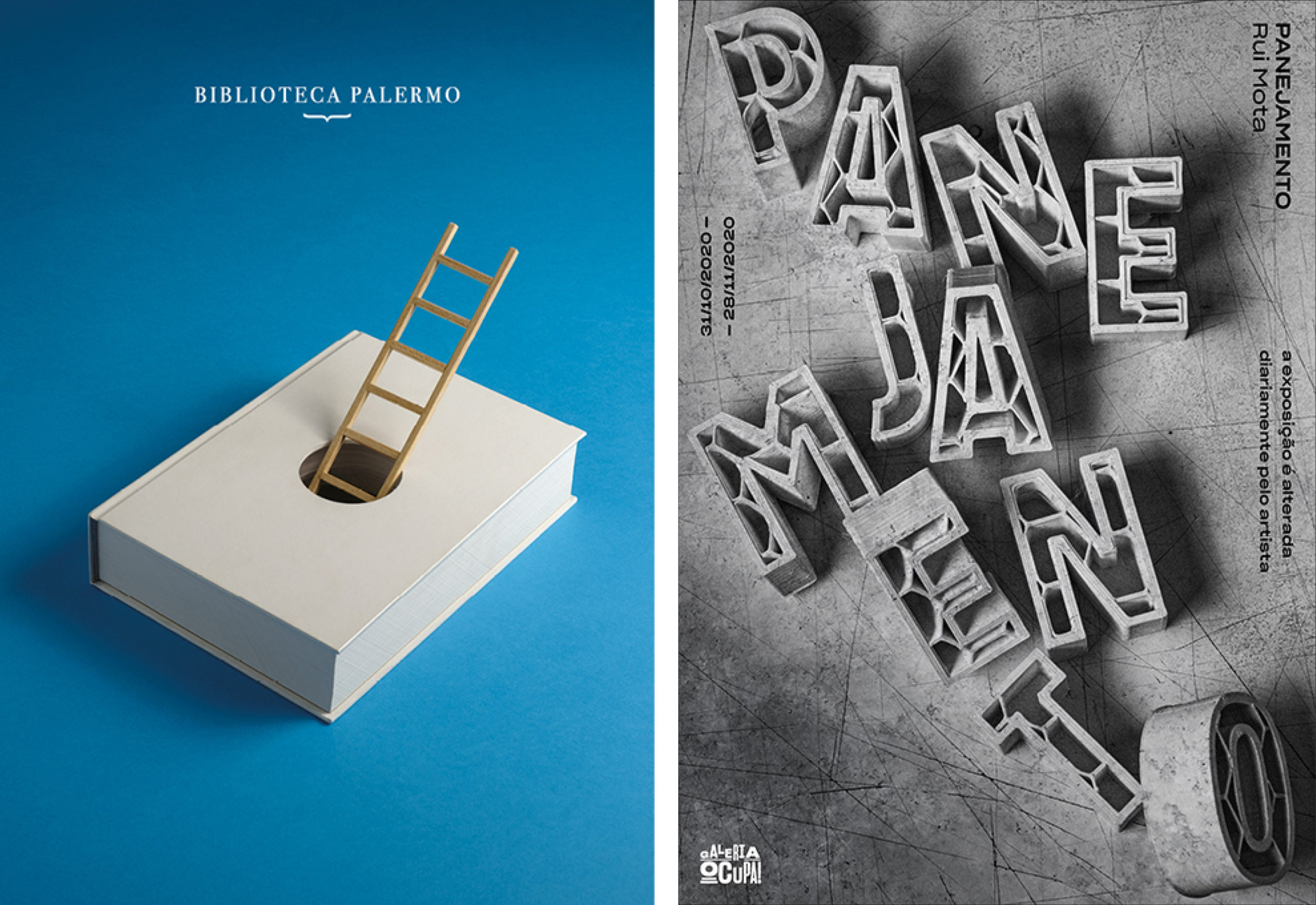
Our second poster is “Biblioteca Palermo Libro/Escalera” (above, left), a Gold-winning entry from Estudio Pep Carrió. This poster served as a promotion for Artes Gráficas Palermo, a publishing company that specializes in printing art books. The two companies have worked together since 2014, creating a number of images where books and poetry go hand and hand. The poster itself is deceptively simple, showing a book with a hole in the middle, through which a ladder rises out of. The simple image hides hidden depth, however, as the image has a deeper meaning connected to the Covid-19 pandemic. The ladder is a symbol of hope, while the book serves as a support for the ladder, creating the visual metaphor that books are able to provide hope during difficult times.
Finally, we have “Panejamento” (above, right), another Gold-winning entry from 1/4 Studio. Created for Galeria Ocupa!, the poster is meant to announce a new sculpture exhibit involving large concrete volumes occupying the space in different ways, forcing the crowd to interact with the pieces in order to move through the space. This exhibit was also mutable, as the artist changed the layout of the volumes daily, in essence creating a new exhibit every day. To exemplify the core elements of the exhibit, the team turned the type itself into concrete molds, ensuring that the resulting typeface both had the characteristics of the molds used in the exhibit, but also contained the wire structure that lived inside the concrete pieces. The result is an industrial and bold design that catches your attention, in spite of its lack of color or flashy visuals.
You can check out the full collection of our Poster Annual 2022 winners here. To enter our 2024 Poster Annual Awards competition, click here.