Smelling Good and Eating Well: This Week’s Packaging 10 Entries

If you’re looking to refresh your daily routine, look no further than this week’s Packaging 10 entries!

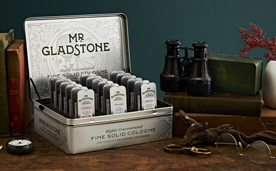
First is an entry from Canadian-based designers Chad Roberts and Joanna Todd, “Mr. Gladstone Solid Cologne.” Roberts and Todd work together at Chad Roberts Design Ltd., as creative director and senior designer respectively. The studio specializes in brand strategy and positioning, package design, and art direction and photography, among other things. Their client, Mr. Gladstone, Inc., was looking for a studio to help them establish their brand for a wax-based solid cologne from the ground up, and luckily found Roberts and Todd!

The team overlooked no detail when it came to building the brand — from the name and brand voice to the identity and package design, Roberts and Todd worked hard to build a fully-fledged narrative. They implemented a historically-influenced wordmark and identity system, and designed postage stamps of mythological creatures to go on both the boxes and cologne tins. Complete with expressive writing and highly illustrative packaging pieces, they made sure consumers were guaranteed a “glad” experience. As for the results, we’ll leave you with the designers’ own words: “Mr. Gladstone transcends time and place to weave rich, imaginative stories into each of the cologne scents, elevating the product beyond that of a traditional solid cologne.”
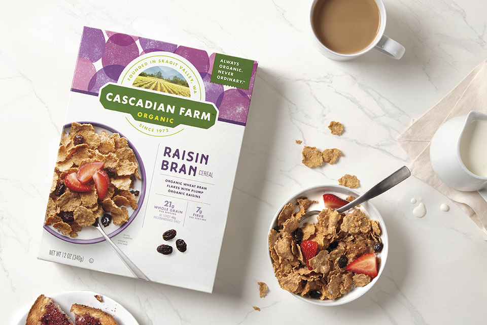
For our next entry, we’re going down to the farm — “Cascadian Farm,” that is! A staple brand of organic cereals, granola, bars, and frozen fruits and vegetables from General Mills, they desperately needed a reimaging to bring more energy, personality, and taste to their food. The brand team at design firm Ultra Creative, led by Sarah Howley and Michael Guite, were able to do just that. Based in Minneapolis, Ultra Creative focuses on design, innovation, strategy, and engagement when it comes to brands. When working with Cascadian Farms, the team intentionally shifted away from the literalism found on their previous packaging and returned to the original spirit of the brand — growing wholesome, organic, delicious food that’s simple and enjoyable for all.

The new packaging design from Howley and Guite is clean, sophisticated, and seeks to simplify navigation through grocery store shelves. The team also uses artful hand-stamped illustrations that allow the sun-lit food and brand personality to shine, ultimately conveying a sense of whimsy, joy, and great taste. The team also brought back the original logo to retain a tie to Skagit Valley farm in Washington and made sure every box featured the brand’s signature motto: “Always Organic. Never Ordinary.” Though the team took a risk with this unconventional redesign, Cascadian Farm’s sense of style, personality, and taste continues to be supported with a full rollout of their cereals, bars, and frozen foods.

To find out more about these entries and others, check out Graphis’ main website for our Packaging 10 competition, and don’t forget to submit your own!

Author: Graphis

Leave a Reply

Your email address will not be published. Required fields are marked *