Redesigning Self-Care: This Week’s Newest Packaging 10 Entries

Have you been keeping up on your own self-care recently? Need a reminder to take a break, take a breath, and take a minute for yourself? Look no further than this week’s featured entries in our Packaging 10 competition!

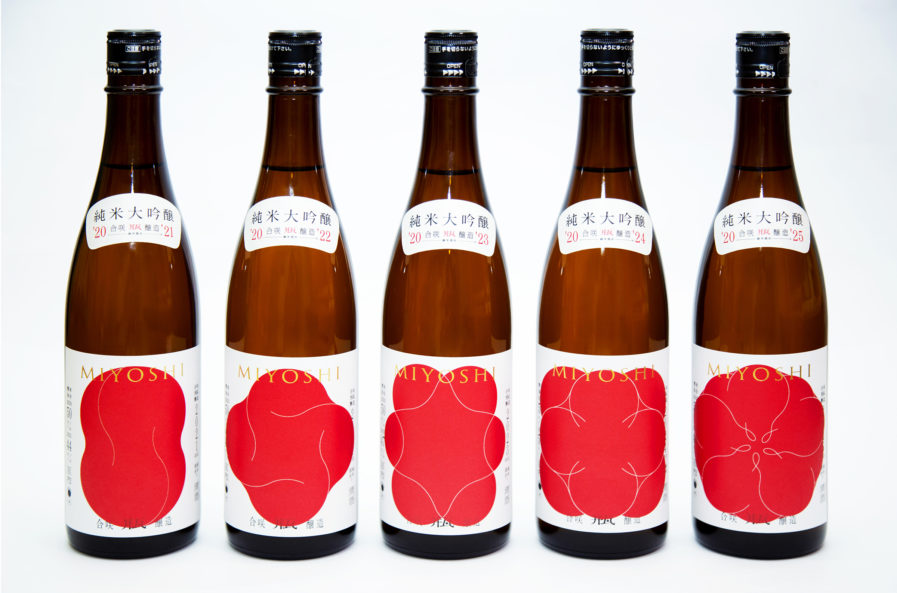
Sip some sake for some self-care! Specifically, “SAKE MIYOSHI HANA,” (above) designed by OUWN design firm in Japan by founder, creative director, and art director Atsushi Ishiguro. Ishiguro founded OUWN in 2013, and since then the company has earned several accolades, including a Tokyo ADC Award in 2019 and Gold and Silver Design Awards from Graphis. Ishiguro was approached by his client, Abunotsuru, and asked a very difficult question: in a world where it’s difficult to have high hopes for the future, especially with the addition of the coronavirus, can Miyoshi HANA create hope for the future with some sake? In response, he submitted a proposal and began the project, starting with the sake production. Ishiguro’s overall project spanned five years, reviving the brand the same way that Miyoshi revived their sake cellar. The process involved carefully storing sake that was brewed in 2020 so that it can be mixed with sake brewed in later years so that it’s enriched with the passage of time.

By announcing five years’ worth of label designs, it was possible to share concepts, wishes, and thoughts through the labels. The design itself contains a flower that repeats harmonization over the five-year period and blossoms while becoming rounded. The label for the first year paired very well with the delicious sake, ultimately resulting in a product that’s filled with hope for the future as people look forward to each year’s bottle. Many stores sold out through pre-orders, and given the additional sense of growth from the labels’ blooming flowers, many people have voiced their desire to obtain this series of sake, making Ishiguro’s project an endeavor that led to undeniable energy for Japan.
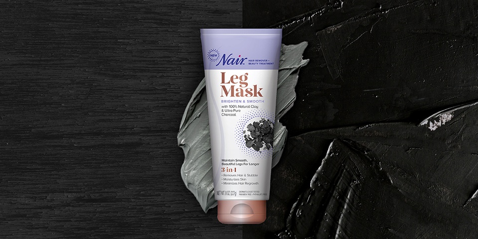
After indulging your eyes and taste buds, why not indulge the rest of your body? Try the “Nair Leg Mask,” (above) designed by Diana Luistro from the NYC-based design agency Wallace Church & Co. Founded by Stan Church in 1975 with the desire to do “great work that people cared about,” Wallace Church & Co. specializes in brand strategy, design, immersion, and activation. They were approached by their client, Church & Dwight, to design packaging for a revolutionary new product. Nair Leg Masks are an innovative product from Nair, the global leader in hair removal. Inspired by the continued considerable growth of masks in the beauty world, Nair took the opportunity to launch the first-ever leg mask in the hair removal category.

The creative goal for this project was to elevate the hair removal process from a functional need to an indulgent beauty ritual and launch Leg Masks as a first-of-its-kind, premium offering. To accomplish this, Luistro and Wallace Church & Co. knew they had to bring their best, and boy did they! Their package design leverages graphic elements and production techniques in order to make the masks stand out on store shelves and makes the line feel modern and sophisticated. The understated color palette and treatment of the core ingredients — seaweed and charcoal — recall a spa-like experience, and touches of rose gold grab bring the design into the beauty space, making the product feel like not just a hair removal device but also a luxurious treat. As a result of their design, the launch of Nair Leg Masks shook up a sleepy beauty category and brought an unexpected look to hair removal. Since launching, the product has received excellent reviews from consumers and consistently outperforms other products in the category. And based on the success of the two initial masks, a third was recently launched!   

Feeling sufficiently relaxed? Be sure to use this chill-out time to check out other entries in our Packaging 10 competition!

Author: Graphis

Leave a Reply

Your email address will not be published. Required fields are marked *