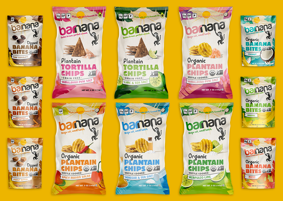
Shenzhen Tigerpan Packaging Design Co., Ltd launched a new product for their client, Niulanshan. Because 2021 is the year of the ox in the Chinese zodiac, this new product celebrates the Chinese spirit represented by the brand and its limited-edition liquor. BexBrands’ client Barnana struggled with communication clarity concerning their packaging for their plantain chips. Designer Jeremy Dahl was tasked with visually executing a more accurate reflection of their new brand strategy with an emphasis on fun and flavor.
Niulanshan is a representative brand of Chinese spirits with a light flavor. Its name means “a mountain looking like a golden ox” and is derived from a Chinese myth about a golden ox that brought fortune and happiness wherever it went. For the limited edition bottle titled “Niulanshan – Limited Edition for the Year of the Ox” (above), designers Tiger Pan and Xue Xia break the routine image of the brand; the bottle is much taller than their typical packaging and its shoulder is cut straight so as to look stronger and sharper. The inspiration for the cap comes from an ox’s nose, and it looks the nose ring oxen tend to wear.