Japanese art director Atsushi Ishiguro was born in Tokyo in 1983. Following a career at the MR DESIGN firm under the supervision of owner Kenjiro Sano, he established his own firm, OUWN Co., Ltd., in 2013. “OUWN is a term coined to allow us (OWN) to empathize and share with you (U),” says Ishiguro. “It is an organization which has always kept this feeling in mind, that is always the front line, and that probes into the creative.” At OUWN, he’s involved in much design planning ranging from art direction to graphic design, sign planning, and web design. Since the firm has been established, Ishiguro has won numerous design awards both domestically and internationally.
At Graphis, he has won several Gold awards in various Design Annual competitions along with a Silver award in the Poster Annual 2022 competition. In addition to design work, Ishiguro energetically undertakes artistic activities, exhibitions, and the production of work he calls “People and Thought,” which, while placing design as its standard, is based around the theme of “discovering questions” in response to thought which has been made basic, including people’s thoughts and the modern sense of what is reasonable. In looking at Ishiguro’s work, it becomes obvious why he’s won so many accolades. Take, for example, his design work with “Japanese Sake Miyoshi Winter” (above, left), “Maturity” (above, right), and “Miyoshi” (below). The first two designs received Gold awards in Graphis’ Design Annual 2020 competition, while the third received a Gold award in Graphis’ Design Annual 2018 competition.
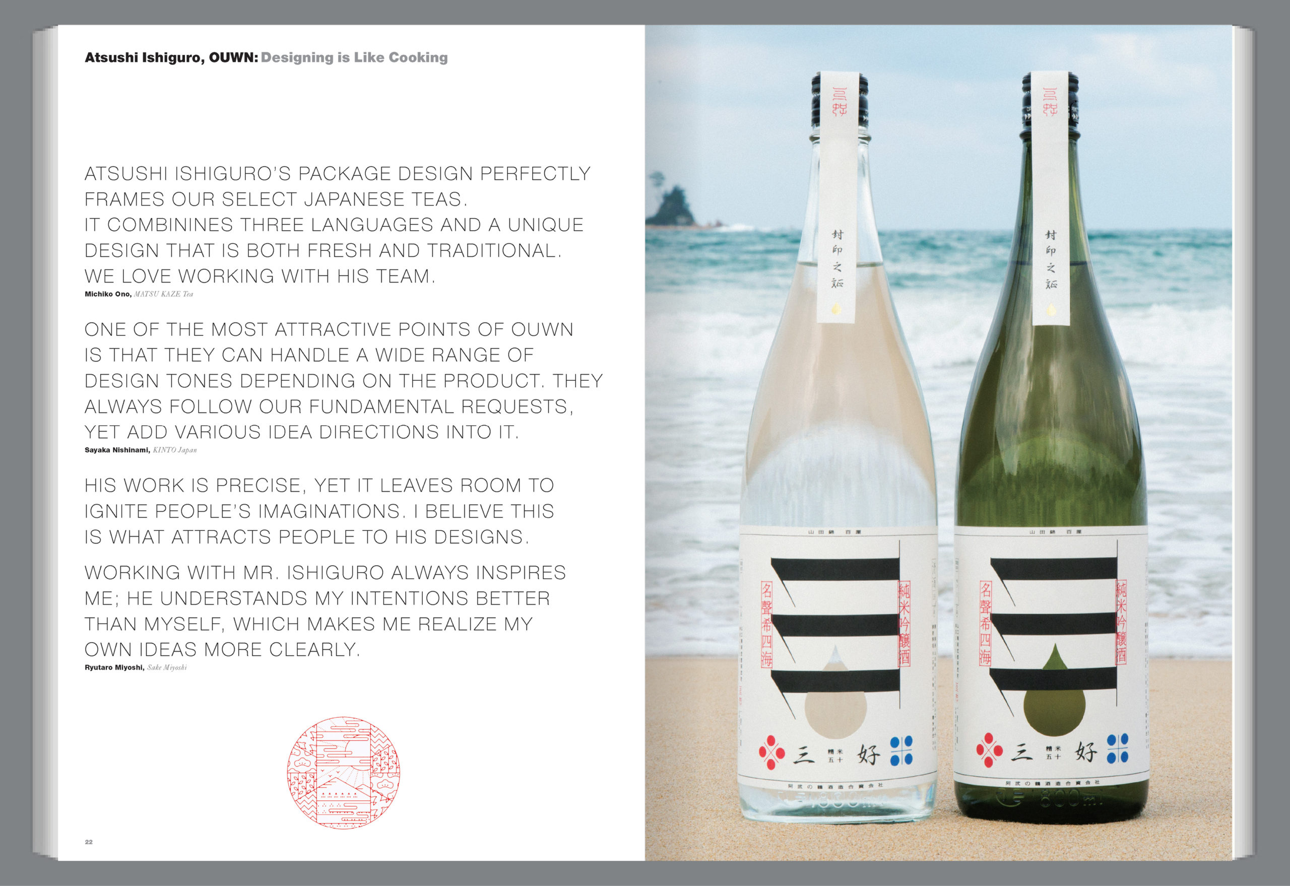
For both Miyoshi sake designs, Ishiguro wanted to pay special attention to the number three, as it is an important number in sake brewing, while showcasing the individualistic attention that’s given to every bottle. To do this, Ishiguro designed a logo using the Chinese character for the number three and stacking three horizontal ones vertically. The choice not only refers to the careful brewing process and its ingredients, but is deeply connected to the brand’s ideals and development, and helps the product stand out in both Japanese and global markets. For “Maturity,” Ishiguro took the letters of the alphabet and colored them to represent real fruits, while also using acrylic to make the letters look as if they were in a stringed bag similar to the one used for carrying fruits.