
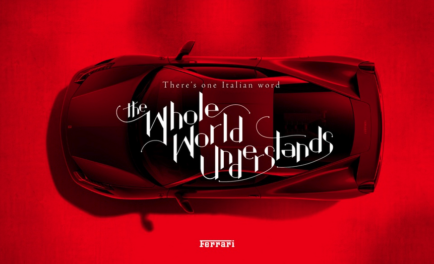
 One Italian Word the Whole World Understands
As Ferrari North America began to roll out the red carpet for The Ferrari Challenge — a series of racing events for the country’s most affluent demographics — they knew that a well-designed ad would be the best way to appeal to the elite group of individuals and brands for sponsorship. Enter 160over90.
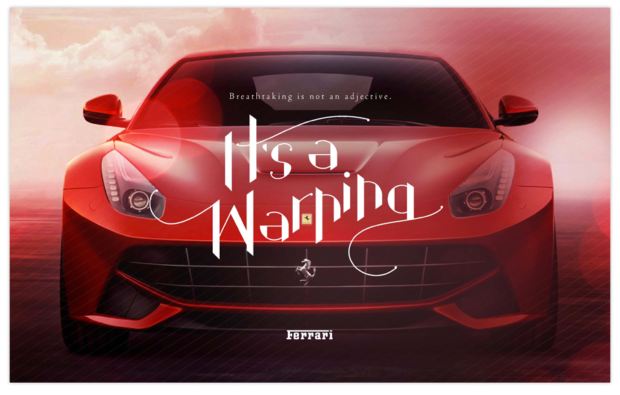
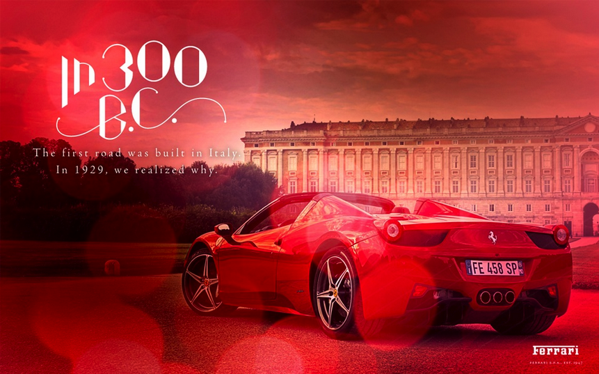
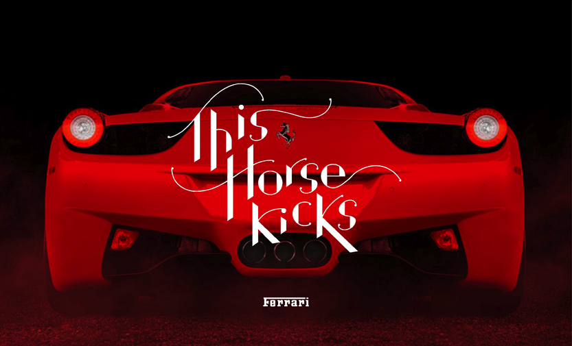
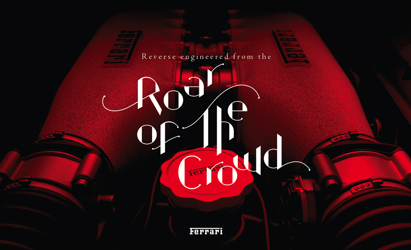
160over90’s Ferrari ad series spoke to its niche audience. Beyond the glistening, blood-red Ferrari and posh Italian backdrop — lighting effects suggesting the glint of sunlight — a graceful, stylized font sweeps across the page in witty commentary. Quintessential Ferrari.
For a sneak peek into the creative process, Graphis spoke with the creatives behind the ad:
What was your approach to this project?
We knew we had to communicate the prestige of the Ferrari brand and capture how unique and exclusive this event series is in terms of sponsorship opportunities with such an elite audience. It was imperative that we engage and thrill potential sponsors of the North American Ferrari Challenge with a bold extension of the established brand.
160over90 developed custom iPad kits for use at in-person meetings with potential sponsors – including a presentation and video that showcased the power and influence of the Ferrari brand and the impressive, much sought after demographics of the participants. The presentation featured a custom, hand-drawn typeface to complement the Ferrari brand, while allowing this event series to have an identity of its own.
What were the results?
The client began using the sponsorship pitch presentation in the spring of 2013, and has been incredibly pleased to date. The new sponsors that have been added to the limited roster will be announced in the months to come for next year’s series.
In general, what is your creative approach to a project?
We’re very story-oriented in our approach to branding. We begin by uncovering the fundamental truth of a brand, and allow the strategy and branding work to build off of that. All creative is guided by an overarching Brand Concept, based on the approved Brand Strategy. This concept shows how the big idea can translate across any number of media, and any number of relevant audiences.
What are the biggest difficulties and triumphs entailed in the process?
Taking a story-oriented approach to branding requires a lot of digging in the Discovery phase, which marks the start of the process. We go at it with such rigor that it requires a lot of initial work on the part of our clients to make sure it’s as productive and accurate as possible. Later, in the Brand Concept phase, we ask clients to focus on the big picture and see the idea for its potential to move their business forward, rather than focusing on the specifics of logos, the exact colors employed, and so forth. This requires a bit of a faith, and an understanding of the conceptual – which can be quite a challenge for some clients.
When a client invests the efforts in the upfront alongside the agency team, the strategy and brand concept to follow usually blow them away. We go to great lengths to “prove” a brand concept out, and many of those sample executions translate into real, innovative executions shortly thereafter. So while it can sometimes be the challenging phase, it’s usually the most exciting and positive part of the process.
160over90 is a Philadelphia-based branding agency that specializes in branding, design, photography, advertising and interactive. An innovative group of passionate creatives, the company has quickly flourished, ranked among the top 100 fastest growing agencies in the U.S. by The Agency Post in August.
The ‘Ferrari Challenge’ has been submitted to our Typography competition, an ongoing competition of the world’s finest typography. Join our team and submit your work for a chance to be featured among the most compelling and influential work from international designers. To submit your work to the Typography competition, click here.
Chief Creative Officer: Darryl Cilli
Executive Creative Director: Jim Walls
Creative Director: Siegfried Gross, Greg Ash
Design and Typography: Greg Christman
Copywriter: Elliot LeBoeuf
Strategy: John Campanella, Ryan Brown
Client: Ferrari
Title: ‘Ferrari Challenge Brand’


