Design: Canada Shows Packaging Matters with Gold Award-Winning Pieces

These Canadian designers show why packaging and print matter

Packaging design is key. If anything in 21st century advertising has shown us anything, it’s that how a product looks matters almost as much as the product itself. From Apple to Sony to Supreme, many of the world’s most successful company’s have showcased why presentation is vital for an item’s sell. After all, we feast with our eyes as much as we do with our tongues. And the same can be said of design.
Julie MacKinnon’s packaging for Halo Brewery (ABOVE) is unconventional, and because of that, supremely alluring. Reflecting the company’s out-of-the-box sensibilities, The gold award-winning work from MacKinnon does an excellent job of replicating their eccentric company ethos via their logos, labels, packaging and promotional materials. From bottles to taproom pumps, MacKinnon thought of everything in how to rebrand the company’s look and aura.
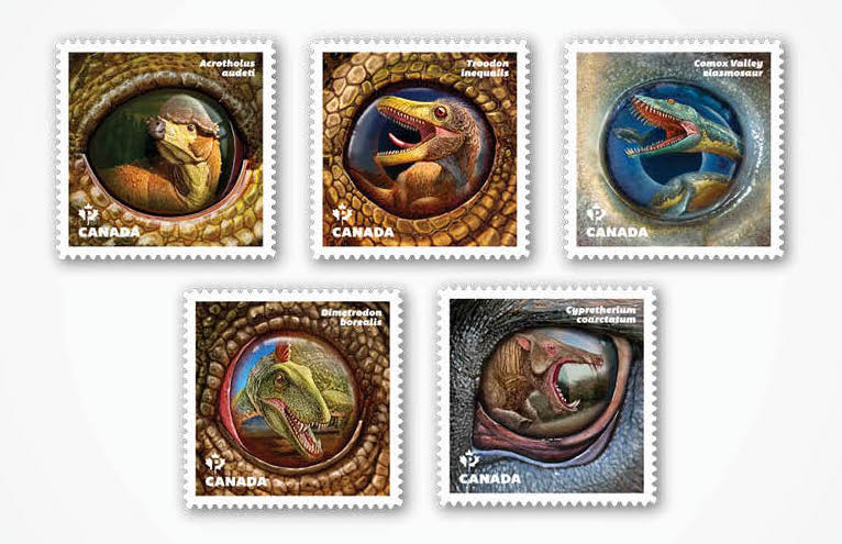
Similarly tantalizing is Liz Wurzinger and Steph Gibson’s approach to Dinos of Canada (ABOVE) for Canada Post. Utilizing a 70’s-style approach, Gibson and Wurzinger present an aesthetic that is more closely aligned with the American Museum of Natural History than with anything Steven Spielberg might have imagined. Furthermore, the stamps’ informative presentation is one that will satisfy dinophiles everywhere, presenting each species’ latin name.
It isn’t too late for you to see your work up here too! Submissions for Graphis’ Design Annual 2020 Competition run till March 13, 2019. Winners will have the opportunity to see their work published on our website, blog, newsletter, and social media platforms!
Author: Graphis

Leave a Reply

Your email address will not be published. Required fields are marked *