Design: California Designers Usher in a Groovy Style

The West Coast continues to prove that it knows cool and isn’t afraid to flaunt it

The West Coast has always been known as the easy-going, surf and skate obsessed side of America. It’s where the weather is perfect all year-round and everyone always has a sunny (no pun intended) disposition. It’s a beautiful place with even more beautiful people. And nowhere is that more prevalent than California, where the Beach Boys’ aura, awe-inspiring ocean views, and folk culture seeps into everything. So it’s no wonder that the same can be said of the advertising that comes out of the Golden State.
Turner Duckworth’s Silver award-winning work for Subway (ABOVE), is a kaleidoscopic collection of primary colors. Utilizing Subway’s yellow and green company colors, head of design David Turner and Bruce Duckworth have rethought the branding of a sandwich staple. Inspired by Silicon Valley aesthetics, this new approach will surely revitalize the stagnating chain.
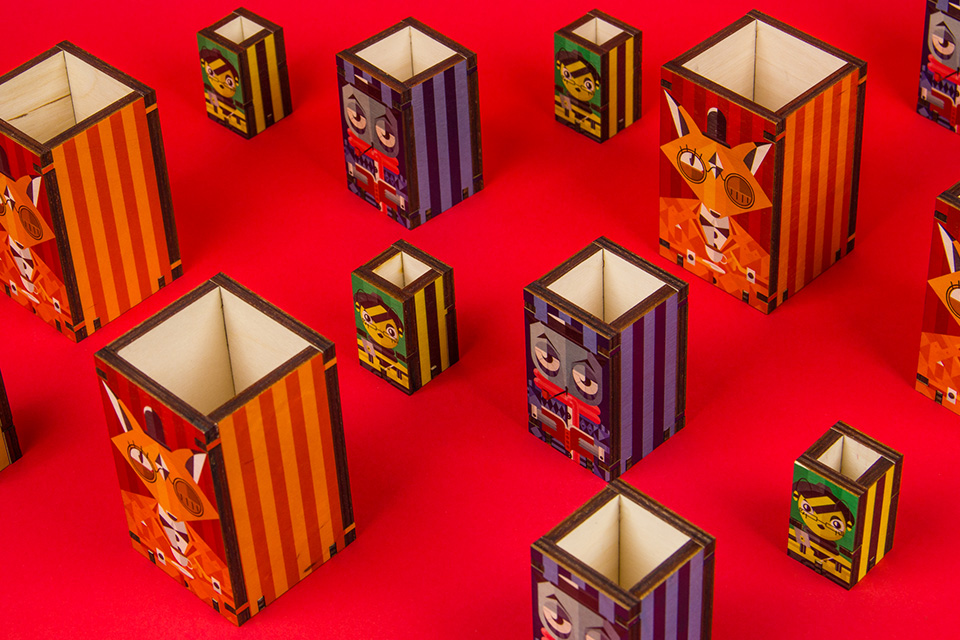
More understated and somber is PS Design’s self-initiated work (ABOVE). Entitled Layers of a Creative, Petre Spassov’s campaign for his agency points out the serious nature of their work and yet also suggests there is a whimsical, Wes Andersonesque visual that they adhere to. The Silver award-winning work is indeed a testament to the firm’s modernized look and feel.
It isn’t too late for you to see your work up here too! Submissions for Graphis’ Design Annual 2020 Competition run till March 13, 2019. Winners will have the opportunity to see their work published on our website, blog, newsletter, and social media platforms!
Author: Graphis